
Not too hot. Not too cold. This one is just right.
I’m diving into the realm of Personal Recommendations systems, and it’s like the never ending task of peeling an onion. Fascinating, but there are lots of layers with some known knowns, as well as a few known unknowns.
As a UX professional, I’m well versed in the display best practices and interaction experience required in order to make it a purposeful, worthwhile tool and delightful experience for the user.
What’s been interesting (and a little unnerving) is how many people in my industry and those connected to it don’t understand what it means when they say, “we want to deliver a relevant personal recommendation.”
It’s becoming a phrase that makes me twitch a little when I hear it.
So, without further ado, allow me to indulge myself and share my research so that maybe some day you won’t have to.
What is a Product Recommender System or Engine?
Recommendation Systems collect user, product, and contextual data, both on- and off-site, in order to predict products or services to a specific user. It is a technology that uses machine learning and artificial intelligence (AI) to generate product suggestions and predictive offers, such as special deals and discounts, tailored to each customer. The design of such recommendation engines depends on the domain and the particular characteristics of the data available.
Suggestions for books on Amazon, or movies on Netflix, are real-world examples of the operation of industry-strength recommender systems.
What is the best strategy for a Product Recommender system to achieve personalized recommendations?
In order to be able to run, one needs to learn to crawl first, then walk. The same for “personalized” recommendations. The key word here is “personalized.” Just like a new user is “new” (you’re only a new user once), a personalized recommendation can only be achieved after establishing a well known profile of the customer via segmentation, implicit and explicit data, etc.
Product recommender systems require a “crawl, walk, run” implementation strategy to successfully build a comprehensive system and account for both product and user status. From dynamicyield.com, there are three broad tiered strategies to achieve this outcome:
• Global
• Contextual
• Personalized
Global strategies
These strategies tend to be the easiest to implement, simply serving any user – both known and unknown – the most frequently purchased, popular, or trending products in a recommendation widget.
Contextual strategies
These strategies rely on product context, assessing product attributes, such as color, style, the category it falls under, and how frequently it is purchased with other products, to recommend items to shoppers.
Personalized recommendation strategies
Personalized strategies, the most sophisticated of the tiers, don’t just simply heed context, but also the actual behavior of users themselves. They take the available user data and product context into consideration to surface relevant recommendations for each user on an individual level. This means, in order to effectively deploy them, a brand must have access to behavioral data about the user, such as purchase history, affinities, clicks, add-to-carts, and more.

Popular filtering systems
It’s likely that some of the approaches listed in the three tiers sound familiar, so let’s quickly unpack their meaning and how they work.
Content-based filtering system
A content-based filtering system analyzes each individual customer’s preferences and purchasing behavior; it analyzes the content of each item and finds similar items.
This type of filtering system is usually behind the “Since you bought this, you’ll also like this …” recommendations.

Collaborative-based filtering system
A type of personalized recommendation strategy that identifies the similarities between users (based on site interactions) to serve relevant product recommendations

Hybrid recommendation model
A hybrid recommendation system offers a combination of filtering capabilities, most commonly collaborative and content-based. This means it uses data from groups of similar users as well as from the past preferences of an individual user.
Affinity based recommendations
Affinity-based recommendations are product or content recommendations that are made based on the individual shopper’s profile. These recommendations are usually shown to the shopper on a website or app, in an email or in a notification.
Profiles that determine recommendations are derived from the shopper’s online behavior, the transactions they make, and their demographic data. All this data is used to map the shopper’s preferences—or affinities—across a wide range of visual and non-visual attributes, all of this is captured at every point in the shopper’s journey on the website or app.
In apparel retail, visual attributes could include colors, patterns, the length of a sleeve, or neckline and hem length. Non-visual attributes could include occasion, weather, etc.
Profiles map a shopper’s affinities to these attributes based on their activity and intent on the site.

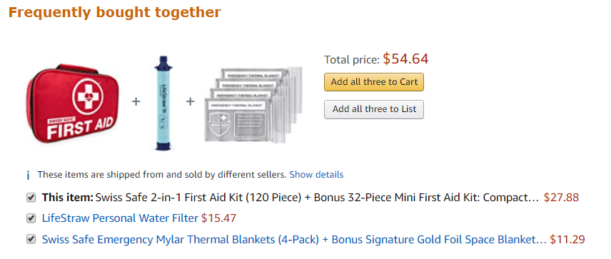
Product bundling
When two products, such as a scarf and coat, were popular choices together, or diapers and disposal bags, commonly referred to as “Frequently bought together.” This is a common recommender strategy on Amazon.com.
Now you know what it’s called, if you didn’t already.
It’s important to note the underlying purpose of each model: utilizing types of context and data that is either available or not available to essentially look for gaps to fill at the right place, right time. In other words, recommendation systems find the space that users share, and then fill or that space with the best possible product/service “match” it can.
A Recommender System will never be able to match User A to User B with perfect results, as their tastes will diverge at some point. The truth is, recommendation engines don’t set a threshold when looking for compatibility between people .
Source: Murimee
They look for the best possible match.
Data requirements. The more detailed and accurate, the better.
Product recommender systems run on data, constantly ingest data, and produce data to stay relevant and evolve. Data is at the heart of engine. When I first started researching and gathering insights, I decided to capture data types and collection methods to better inform and set expectations for a personalization strategy including but not limited to:
Customer data
Personally Identifiable Information, or PII. PII involves any data tied to an individual, including email, address, phone number, an ID number — or anything else that can be used to identify a person.
Demographic data describes a customer’s characteristics. Demographic information can detail gender, geography, occupation and age.
Engagement data details the interactions a user has across all brand channels. This metric enables marketers to gauge a user’s level of interest, preferences and intentions, no matter the touchpoint.
Behavioral data is all about action. Site browsing, purchasing and email sign-ups are all considered behavioral data that aims to observe and infer customer intent. This type of data is similar to engagement data, however, it only tracks customer interactions with the brand online.
Source: https://signal.co/resources/what-is-customer-data/
Implicit and Explicit data
Implicit data tells you what a customer does, but forces you to guess about the why behind it. A customer views a product but does not make a purchase. A user watches a film trailer or reads an article about something. This is a statement of intent but no clear, affirmative action.
Implicit data is easier to collect, and there’s more of it. But, implicit data is harder to interpret, often requires clarification and observation. For example, websites where people browse and view but do not always leave a rating. In such cases, there is exponentially more implicit than explicit data being created by user activity.
Explicit data is information that a consumer deliberately volunteers. It validates implicit data and provides much-needed context, uncovering things like the preferences, motivations, and desires that inform a consumer’s behavior and allowing for more nuanced audience segmentation and personalization—in short, the why behind the buy.
A customer buys a product, rates a film, or gives a thumbs up or down to a post. The customer is clearly showing how they feel about a product. The data is clean and actionable.
Explicit data is a clearer signal than implicit data, but is harder to collect because it requires purposeful action on the part of the user. Simply listening to a song is not explicit data in itself. The system does not know for sure that the user likes that song. Actual explicit data is when the user adds a specific tune to a playlist or hits the heart icon to say that they enjoy listening to it.
Explicit data can also be shallow because while it does have a clear signal, that signal maybe no deeper than a like/dislike, thumbs up/down; a binary reaction.
Source: https://blog.mirumee.com/the-difference-between-implicit-and-explicit-data-for-business-351f70ff3fbf
Once you’ve got your arms wrapped around your user and product data, it’s time to start grouping and segmenting it passed on specific parameters, such as behaviors, affinities, demographics etc in order to begin “personalizing.” Be careful not to interchange segmentation for personalization and vice versa.
Segmentation and personalization
Segmentation involves dividing customers into audiences based on broad factors like location or product interest. It usually requires a CRM or CRM-type system, normalized data and attributes tied to a targetable ID, as well as some broad-based understanding of different buyer types that coordinate to different product or offer affinities.
Segmentation: it’s about the Marketer
Segmentation is a principal marketing strategy that involves identifying similar groups of potential customers according to relevant information that can be used to deliver a mix of strategies to receive results.
Segmentation typically follows a set of descriptors, including a potential customer base’s demographic or psychographic variables.
Source: https://www.progress.com/blogs/segmentation-vs-personalization

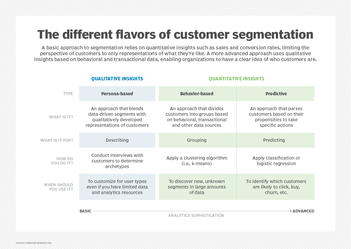
Timeout: I really love this customer segmentation graphic from Forrester Research. So I’m sharing it.
Personalization
Personalization takes segmentation much further by drilling down on specific behaviors and actions of an individual to provide her with the necessary information to move to the next step in her buyer’s journey.
Personalization: It’s about the Customer
Personalization involves identifying a specific customer within a segment.
Personalization is all about how the brand can solve that individual’s pain point or need. That involves understanding the customer’s intent and creating personalized experiences around that intent. Identifying a customer’s intent means that considering various data points using rules-based logic.
A customer’s intent can change each time they interact with a brand. Their intent can also change throughout one interaction.
Source: https://www.progress.com/blogs/segmentation-vs-personalization

Irrelevant Personalization (is bad, you don’t want to do this)
When segmentation and personalization are interchanged, we hear cases like a shopper being recommended mosquito nets after purchasing a mosquito net a week back. Or a person waking up to a dozen of promotional emails about baking trays after buying an oven.
This example doesn’t imply that they aren’t ‘personalization’. It implies ‘irrelevant personalization’, which would be regarded as a failure.
For example, out of the 100% oven buyers, there might be a percentage that needs trays. However, sending all of them a prompt to buy ‘tray’ reflects that the brand has put everyone from that group under one category, instead of mapping their individual needs. This illustrates the outcome of confusing segmentation with retail personalization.
Source: https://www.progress.com/blogs/segmentation-vs-personalization
Segmentation vs Personalization: A side-by-side comparison

Macro and Micro segmentation
I briefly want to introduce macro and micro segmentation. Macro segmentation is more or less segmentation as described earlier: larger groupings customer based on similar attributes. Micro organization takes it a step further with applying additional refinement. Not quite personalization, but getting closer. This could also be interpreted as a curated segmentation; creating smaller segment slices from larger pieces of the pie.
Macro segmentation refers to the practice of dividing online traffic into a few sub-groups of visitors who differ from one another in one or two basic attributes like location, gender, or an identified browsing pattern.
Demographics: age, gender, education, income, children, ethnicity, marital status
Geography: Country, area, population growth, population density
Psychographic: lifestyle, beliefs, social classes, personality
Behavioral: use, commitment, awareness, affection, buying habits, price sensitivity
Micro-segmentation is a marketing technique that uses knowledge to classify people’s interests and to influence their perception or behavior. We have all the data that we need to answer our client’s questions in the ideal world. However the ideal is not always our reality, so we need to find new approaches to meet the needs of the consumer.
Micro-segmentation encourages customers to be grouped into more targeted, oriented markets within the segmentation and market of the customer—enhancing specificity and, amid limited customer data, creating a micro-segmentation marketing strategy.
Examples:
Upscale Tourists & Buyers: consumers interested in elevated goods and travel amenities with high discretionary travel and shopping budgets.
Good Living: buyers interested in good and sustainable living as well as wellness and fitness (including advertisements and articles on these subjects)
Cultural Fanatics: Consumers involved in performing arts and entertainment
Source: https://vue.ai/glossary/
User types
User types can be described as user profiles associated with different categories of user groups. Each user type is characterized with a particular usage pattern. We identify user types in order to understand how the site or app is being used; where users are coming from, new vs repeat (return) users, how often or frequency of visits and time in-between visits, etc. Depending on the visitor and visit frequency we can better set recommendation expectations and more accurately implement them.
Plus it’s a great refresher.
New visitors or new users are defined as people visiting your site for the first time on a single device — so each first visit on your laptop, smartphone, and tablet counts as a separate new visit. You can only be a new user once.
A user makes “sessions”, therefore a first session on a website receives a ‘new’ label. Subsequent sessions receive a ‘returning’ label.
(Google Analytics defines a new visitor as anyone who has never been on your website before, according to their tracking snippet.)
Return visitors are users who have been to your site before.
Unique visitors, or new users, describe the number of unduplicated visitors to your website over the course of a specific time period.
Return visitor labeled as a new visitor
If a person is on a website in incognito or private browsing mode.
If a person visits a site initially from their laptop and then browses it later on their smartphone. If they are not logged into Chrome on both devices, then when they view the site again on their smartphone, they’ll be counted as a new visitor.
If a person visits a site once and then comes back a second time.
If a person visits a site, and then clears their browser cache before viewing it again.
Frequency and recency data
Frequency and recency data are helpful to better understand the customer journey of your users, as well as their needs and behaviors. They can help create or maintain your personas, and also discover how to better support not only your visitors, but also your business goals.
Frequency of site visits indicates the overall number of visits made by each user on your site. This metric allows you to assess the percentage of new users on the site as well as the familiarity level of all returning users
Recency measures the number of days that have passed since each user’s last visit. This measure allows you to see the average amount of time between visits for your user base.
https://www.nngroup.com/articles/frequency-recency/
I hope that you’ve found this information helpful and useful. Stay tuned for Part 2 where I delve into an audit to discover best examples of design and implementation of Product Recommender systems.
