
Customer service experiences have been really top of mind lately, for me anyway. Doing some digging for a project, I found this FANTASTIC article, “Customer Journey Nightmare: Best Buy” from The Usability Blog. Core to nightmare the writer experiences is the inability of Best Buy to get its cross-channel crap together.
Using Good Design to Eliminate Medical Errors

Recently, a British research team studied life-threatening hospital errors and then designed devices to help reduce them. One of them, called the CareCentre, is a single, free-standing station that can be situated at the foot of any patient’s bed, complete with hand gel, gloves and aprons, drug locker, waste and needle bins, chart surface and storage slot. It brings together all these items where they can be easily managed and located, instead of across the room or in multiple bins carried around by medical personnel. Medical manufacture Bristol Maid is now producing the CareCentre for commercial distribution and newer hospitals are signing on to use it.
What makes a live chat experience successful?
By now, those of us who use the internet regularly are familiar with a live chat experience. You can initiate a live chat on practically any website that sells or supports something. The live chat UI is pretty standardized with conventional elements: a field for the user to type in her query or information and a “Send” or “Enter” button to send/submit what was typed to the agent or customer service representative on “the other side.” As the chat or conversation continues, the user and the agent responses are visually distinguishable with time stamps, customer name and agent name or roles represented, and additional graphic elements to further separate the two, such as colored backgrounds and horizontal rules, are often implemented. Like I stated, pretty standard stuff.
Recently during a live chat “optimization” project, I was asked if any of the recommendations I made were based on a “heuristic analysis” of other chat experiences across the site (it’s a large site with lots of different product groups). The answer was No, partially because that was beyond the original scope of the project, but also because the other chat experiences were standardized. It did, however, get me thinking about what makes a live chat experience successful for both the user and the customer service representative? Is it the UI? Is it the context and placement of all the chat elements, starting with the chat button? Or is it the human element – the personality, empathy of the agent?
The answer is, all of them.
Starting with the live chat UI, it should meet the expectation of the site’s visitors. While the UI design should align to standards and conventions (discussed above), audience familiarity also needs to be taken into consideration. For visitors unfamiliar with the concept of live chat, it may mean more emphasis on directions/information to set proper expectations, whereas a site with more savvy users wouldn’t require such emphasis, and minimal direction is likely appropriate.
If the site has more than a single live chat experience (they do exist), unifying the look and feel of all the UIs under a single brand standard with a secondary nod to the product look and feel shouldn’t hurt the consumer experience. It would most likely enhance the perceived brand value. But implementing and maintaining a standard UI is also imperative as well.
In my search for what’s out there on live chat user experience, I came across an article on Usability.com that discusses a best practice, holistic approach to chat, starting with the look and feel of the chat icon button, the availability and placement of the live chat option, and content and interface design of the live chat screen.
Look and feel of Live Chat icon
Live chat buttons/graphics/tiles vary across sites, and deciding what type of visual representation to adopt should depend on the demographic segment of the site’s target visitors. However, if the site has a broad swath of gender, culture and geography, than a gender- and culture-neutral icon or text link may be more appropriate.
Availability and placement of the Live Chat icon
Some sites attempt to aggressively establish live interaction with their site visitors by presenting visitors with a chat window within a few minutes of visitors arriving at the site. This could become a distraction which may cause visitors to leave the site altogether. To that end, discretion should be used when considering whether to push unsolicited live chat onto visitors.
Many retail sites choose to place the chat option link in the text links area at the bottom of site pages and the homepage (often within a Customer Service category of links). Placing the chat link at the bottom of the page still gives access to the option, it may be easily overlooked or unnoticed. Users may think the live chat option doesn’t exist.
However, there is an emerging trend of placing the chat feature in the general area of the top navigation bar could serve visitors better by making the chat icon fairly inconspicuous, but at the same time giving it more visibility than a text link located within the page footer.
Many retail sites are placing the chat option in the vicinity of “Add to Cart” buttons on product pages, as well as possible points within the site where customers may need to seek answers to questions, such as the Check out process, as well as Help, Customer Service and Contact us. Placing the icon next to the search field may also increase the visibility of the chat option, as search typically generates a significant amount of use.
Content and User Interface design of the live chat screen
Once visitors access the chat functionality, the site needs to provide them with a user-friendly and seamless user experience. Usability.com gives us the following guidelines to be mindful of:
- Avoid requiring users to enter personal information such as their telephone number and email address, as this may discourage users from initiating the chat.
- When a visitor initiates a chat, ideally, a representative should be available to respond immediately. If that is not possible, the visitor should be shown a message displaying the estimated wait time.
- In situations where representatives have to leave the chat momentarily to check records or obtain additional information, ensure the representative informs the visitor of this by saying something to the effect of “Give me a moment and I will check that for you.”
- When representatives are typing their response, display a message on the chat screen that reads, “Representative is typing a message.” This will keep visitors informed and they will be less likely to question a delay in response time due to a lengthy message.
You could leave it at placement, look and feel, availability, and best practices UI. But in a live chat experience the customer/visitor is interacting with and having a conversation with another human being. How can that exchange NOT affect a successful user experience?
Recently, Netflix made headlines when one of its customer service chat representatives took on the persona of a Star Trek captain during a live chat. Mike Mears, a Denver-based Netflix customer service rep and fan of Star Trek started a chat with “Norm,” a Netflix customer who was having problems with streaming “Parks and Recreation.” “Norm” played along, and both stayed in character the entire time.
In any other company, this might have gotten Mears reprimanded or fired. But apparently not at Netflix. The company doesn’t allow its agents to follow a script and supports the agents letting them be themselves. Apart from asking customers to take a one-question survey at the end of a chat, the agents can say whatever they want, joke with a customer, and do their absolute best to relate to the customer all while solving their problem successfully (transferring the customer to another agent is discouraged).
Once upon another lifetime I worked for Nordstrom, and while I never had a customer try to return any tires, the mantra of “ownership” was loud and clear. Literally, the only rule we followed was build the best customer service relationship ever. Later in life, I did a stint as phone customer service representative for a large insurance company and then a water sports company. The difference between customer service as culture vs a department was never more obvious.
Which brings me back to live chat experience. Any online company can implement a branded, targeted, best practices chat experience. But don’t overlook the power of the human element at the other end of the chat experience. At any given moment, chat agents are the company representative. A poor chat experience can affect the how the customer perceives the company. (Not to mention, the company may want to reevaluate the chat agent job requirements and training).
Failure to give the right representatives ownership and authority to solve problems means the overall user experience of the live chat will only be partially successful, if at all.
My Cup Runneth Over
Didn’t think I was going to become a magnet for this kind of stuff, but it would appear another water dispenser with bizarre dispensing rules has found me. Or I found it. Or one of my coworkers told me to go check it out. Whatever.
Yet another counter-top model, this particular design has three, flush buttons across the top on the angled surface, with a filter status indicator to the left. The buttons read, from left to right, Hot, Cook, and Cold. The labels are accompanied by icons supposedly representing the water temperature, Steam for “Hot,” C for “Cook” (whatever temperature that is; the button is in between Hot and Cold, so it’s Lukewarm?) and a Snowflake for “Cold.”
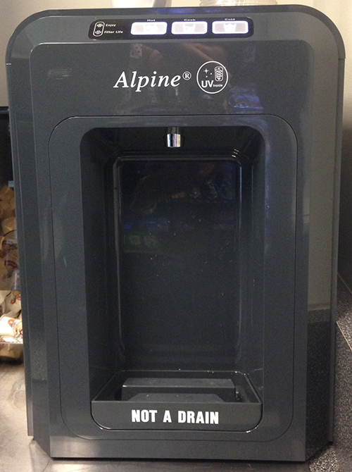
In order to dispense cold water, you press and hold the button labeled “Cold.” Pretty self-explanatory and it behaves just as expected. If you want “Cook” temperature water, you press and hold the button labeled “Cook.” 2 for 2. Now it gets crazy. If you want hot water, you logically press and hold the hot button and expect hot water to dispense. Wrong. No hot water dispenses. WTH? The only thing that happens is the Hot water button flashes at you and you stand there like an idiot, wondering what’s going on, is it broken, did I miss something, etc?

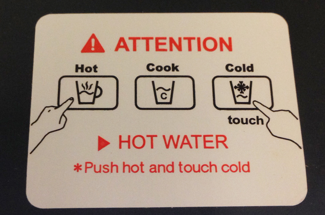
Yes, you did miss something: the very small instructions on the top of the machine that instruct you to push the “Hot” button and touch “Cold” button at the same time in order to dispense “Hot” water. Not only are these instructions so small that you easily overlook them, they’re also not in your line of focus. Furthermore, the “hot” and “cold” in the instructions aren’t capitalized like they are in the button label, causing a brief disconnect. Last but not least, what about having to “push” and “touch” two different buttons simultaneously. In an office environment where at least one of my hands is most likely clutching a phone, laptop, paperwork or any number of other objects.
I can only guess that the reason this particular dispenser works this way is to avoid people suing them for accidentally burning themselves by not paying attention. I get it. But, multi-tasking to get a cup of hot water for tea. Who would have thought?
My continued fascination with Healthcare.gov
I really can’t wait to read the case study (novel?) on Healthcare.gov – the design, development, the rollout, the hearings, the politics, and beyond. I wonder what would have happened if we’d had the internet when Social Security was implemented.
Members of Congress continue to compare the shortcomings of the website to ecommerce giants Amazon, ProFlowers, and Kayak. I find it interesting how suddenly members of congress are ecommerce design, analyst, and development experts. (I know, I know, we’re all “users.”)
Security of the site was a topic in the hearings today, with lawmakers buzzing over the fact that the site security was not vetted enough (according to a warning memo). Ironically, Rep. Mike Rogers R-Michigan told Health and Human Services Secretary Kathleen Sebelius that, “Amazon.com would never do this.” Welllll…maybe not intentionally. Remember how awesomely bad Amazon.com and Apple cloud services were hacked last year?
Older articles published prior to the rollout show that Sebelius asked for patience, acknowledging there would probably be glitches in the coming days and weeks after the launch of the site. And that glitches are common, particularly in what the industry commonly refers to as public beta period. The key being that during a beta period, glitches and hiccups are identified and resolved as quickly as possible.
Sebelius also hoped that users would cut them some slack if things don’t go 100% smoothly, referencing unpopular updates to Apple products, “No one is calling for Apple to not sell devices for a year or to get out of the business because the whole thing is a failure. Everyone just assumes there’s a problem, they’ll fix it, let’s move on.”
It’s curiously amazing how consumers give tech companies leeway when using their products while they suffer through their growing pains. Apple’s iPhone wouldn’t let you copy and paste text for over a year after it went on sale. Windows 8 Start Button anyone? How quickly we forget.
Also, large technology companies like Twitter, Facebook, Amazon.com and Google are used to rolling out new features and fixes all the time from small, nimble deployment teams. Obviously, many of Healthcare.gov’s problems stem from the fact that there were 47 different contracts awarded; so exponentially multiply the anticipated number of code flaws per person on the team x the teams x the different contracts and companies involved. Oh yeah, add all the different databases that had to talk to each other.
Clay Johnson of the Department of Better Technology, a company that designs and builds software for the government, has been doing a great job of pointing out “you get what you pay for” when it comes to government procurement processes (my summary, his is more eloquent and evocative) and building this kind of site. If Amazon.com was the government ecommerce website selling everything under the sun, designed and built the same way as Healthcare.gov, launching the week before Christmas, how do you think it would go?
I was reading the most recent blog post on Healthcare.gov “Healthcare.gov: Improving the Account Registration Process” (yes, the site has a blog) which lists the biggest improvements the site has made to Account Registration since the site launched.
In combination, the following fixes are allowing users to successfully create an account and be able to continue through the application process. We can now process nearly 17,000 account registrants per hour – or five per second – with an error rate near zero:
- We replaced the virtual database with a high-capacity physical one, which allowed more efficient, effective processing and significantly reduced the error rates, or account registration failures;
- We’ve optimized software configurations to increase efficiency in system interactions;
- We added capacity by doubling the number of servers;
- We swapped out a directory component for another that can process more transactions simultaneously;
- We improved the efficiency of database look-ups through software changes;
- And we pushed through a patch release with four software fixes to address users that were having a hard time logging in to their accounts.
Unfortunately, the site crashed in the midst of hearings today, October 30, just when the congress person was pulling it up for reference. But if what they say holds true, 17,000 registrants an hour is no small feat.
Healthcare.gov, meet Congress

The anal probe of Healthcare.gov continues with agency representatives involved in developing and building the site appearing before a congressional hearing to answer questions about the glitches in performance and site requirements.
Some interesting UX revelations thus far:
Features are now basic expectations:
On two separate occasions different congressional representatives referred to online giant Amazon (and Ebay) stating: 1) Product comparison on Amazon is not as difficult as it is on Healthcare.gov, and 2) Amazon doesn’t crash the week before Christmas under the heavy load of users on the site.
1) Comparison capabilities. Amazon practically invented the ecommerce we know today. Once a feature, product comparison has now become a basic expectation of retail sites. Healthcare.gov has it, but it’s “difficult” to use comparatively. The UX side of me wants to know what portion of the experience made it “difficult to compare” insurance plans compared to the experience of comparing TVs on Amazon.com.
2) Obviously a working website is beyond a basic expectation. But in Healthcare.gov defense, Amazon didn’t launch less than 30 days ago to tens of thousands of users. And, despite ramping up, websites will get glitchy when there is heavy user traffic. Case in point: First day of the Nordstrom Anniversary Sale–trust me, they learned when no one could check out online a few years back. Never did go back and buy my shoes.
I think an even more logical comparison scenario would be to try merge Amazon, Ebay, Etsy, Macy’s, Zappos, Best Buy, and Apple into one ecommerce website and launch the day before Black Friday.
Last minute requirements/unnecessary hurdles:
Apparently, it was a “last-minute” requirement to make users create accounts prior to being able to browse insurance products. OMG. Why, why, why? That’s the equivalent of making users create an account to browse ANY ecommerce site. I would have punched the individual who mandated that. (Or the closest wall.) Can you imagine the shit-storm that created in the contractor ranks? The whole site was more or less bogged down due to concurrent registration. Fortunately, it’s been updated so that users can “window shop” insurance products without having to create an account first. Thank goodness.
Business as usual:
Congressional members seem to be fairly alarmed that one or more of the agency representatives are looking at the website problems as just another day in the realm of website launches of this nature (aggressive deadlines, last minute requirements, multiple vendors, numerous database reconciliations, millions of lines of code to test, etc).
In her prepared testimony, Cheryl Campbell (of CGI) said that “unfortunately, in systems this complex with so many concurrent users, it is not unusual to discover problems that need to be addressed once the software goes into a live production environment.”
“This is true regardless of the level of formal end-to-end performance testing — no amount of testing within reasonable time limits can adequately replicate a live environment of this nature,” she added.
Notably, many Republicans equated the problem-plagued website to a failure of the Affordable Care Act (aka Obamacare) itself. As Senator John Cornyn, R-Texas stated, “Obamacare is coming apart at the seams and it’s time to put this broken law to rest.”
As a UX professional, I will concede that a poor user experience can negatively affect brand perception in the mind of the user. But, as a UX professional that has seen the launch of many sites and interactive experiences, I confidently state there are always small glitches or scenarios that only reveal themselves, despite all the user flows, scenarios, Q/A and testing you do. Not to mention clients with last minute requests. (Anyone who says otherwise is lying.) Unfortunately for Healthcare.gov, this isn’t just any site. Not with people’s livelihood in play, as well as political theater and re-elections in the balance as well.
And while the site is getting “easier” to navigate and glitches are being addressed, politics are still involved. Which means the entire nation is now getting an education on how websites projects are often managed, designed, tested,and developed. For better or worse.
Is this button necessary?

Behold, the water cooler, counter-top style–one of several versions in my office. What’s a little nutty about this particular design (and why I’m bothering to mention it) is that despite how basic it actually is (cold or hot water), the actual process of getting the water to dispense always gives me a little cognitive hiccup, no matter how many times I’ve used it.
If you want cold water to dispense, you push the blue button, labeled “Cold.” Similarly, if you want scalding-hot, first-degree burn water to dispense, you push the red button, labeled “Hot.” However pushing the button doesn’t immediately dispense the water. Pushing the button selects which temperature of water to dispense. In order to get the water to dispense, you have to push the large-ish gray button, labeled “Dispense.” (I don’t know what the little green light does. My assumption is that it just lets you know the unit is turned on. No pod-bay doors to open here.)

4 out of 5 times I stand and hold the “Cold” button for several seconds, expecting water to fill my glass, and nothing happens. Then I remember I need to push the “Dispense” button. It drives me nuts. Particularly when the other water dispenser, a floor model, dispenses water when it’s “Cold” button is pushed.
If the buttons are intended to select the water temperature prior to dispensing, why do they have to be buttons that look like they’ll dispense water when pushed. They scream it. Why not a little semi-raised version that looks more like a selector than a dispenser? I did a quick audit of small-ish, counter top water dispensers and the “less-buttony/more selecty” design seems more appropriate for the intended function.

Got a similar water cooler or misuse of physical buttons story (or rant)?
Feel free to share.
Eeny, Meeny, Miny, Moe
Seriously!? Which button do I click on in order to submit payment successfully? And what happens if I click on the wrong button?

I tried looking at it sideways, which is difficult to do. I moused-over the buttons to see if by chance there was an over-state that would provide readability. Nada.
By the way, it’s the button on the right.
Is the Hover State dead yet? Or just being redefined?
I sit in an “open office,” which is sometimes code for cheap, as in: shoving as many people and desks together in one area before you break fire codes and accessibility laws. Sure, yeah, it’s a collaborative environment, which can also be mistaken for unintentional eavesdropping or creative drive-bys. (BTW, I blame Herman Miller for the open office space concept. Even if they are never implemented the way HM originally designed them. I may devote a post to my experience about a poorly designed green building and it’s open office space).
Anyway, earlier this week a project manager approached an art director I sit next to, and asked him if there were any hover states on a particular page he was responsible for designing. Naturally, as part of the open space concept, I inserted myself into the conversation. Long story short, No–there were no hover states. But we started discussing what exactly is the state of The Hover State these days? The Answer, “it depends.” (I think this is one of Jared Spool’s favorite answers.)
Back in the early days of the web design there were basically three, common visual states of a clickable link, button, image, graphic): 1) at-rest or default, 2) hover- or over-state, and 3) visited-state. (You could argue four, if you count on-click, but whatever.) The hover-state was used to visually indicate the “click-ability” to the user when her mouse “hovered” or “moused-over” a link/button/image. A UX professional would tell you that for an optimized user experience, clickable objects, more specifically links or imagery, should be visually differentiated from content to avoid confusion with lists, copy, captions, static images; the hover state was an immediate visual confirmation that the object could be clicked.
Fast forward to June 29, 2007 and again to April 3, 2010. The introduction of the iPhone and iPad. Hello touch. Hello it doesn’t sense my finger “hovering.” Hell, now what?
So far I’ve only mentioned clickable links or buttons. Touch interaction revealed: 1) there is no “hover-state” (as we know it) on a touch device and 2) what do you do when you have navigation menus or drop-downs that reveal (open) themselves “on-hover” in a desktop environment? Tapping on an nav menu or drop-down that had a hover-state attached to it resulted in a variety of visual and/or interactive responses, my personal favorite being a nav menu opening while simultaneously navigating to the corresponding navigation page before I even had a chance to look at the menu options to decide if the menu contained what I was browsing/looking for. And it seemed that no two menus acted the same in the touch environment, which meant that not all hover-states were created equal in the desktop environment.
Fast forward to now: responsive, adaptive, hybrid, mobile site, app design, and all things future friendly. With queries and style sheets we can do a better job targeting viewports and devices and delivering a more appropriate interactive experience. However, I’d recommend a little interactive strategy planning up front. A quick audit of the topic reveals like minds; it seems that there are three logical options to start with:
1) Design hover-states for mouse events, and display everything on mobile
2) Design hover-states for mouse events, and gesture equivalents for touch.
3) Don’t use hover-states.
Note that #2, the key to implementing this approach is hover-state equivalency. In other words, if a rollover reveals a menu, ensure that a single tap reveals the menu, but no other functionality. A second tap (conceivably to make a selection from the menu) should result in the site/experience behaving accordingly. Similarly, tapping outside of the menu, implementing a close button, and/or time-out should close the menu, just as if the user had moused away from the open menu.
Obviously, with a “Mobile First” approach, how elements and objects work in a “mobile” scenario (as in viewport/breakpoint size) would be addressed first, and therefore would be more top-of-mind throughout the design process, instead of an afterthought.
Regardless, it would appear that the Hover State is here for now, but perhaps needs to be redefined in order to address the wider range of interaction capabilities that exist today. Google Glass anyone?
Healthcare.gov reminds us how not to build a website
3 years and an expected cost of half-a-trillion dollars ($638.81 million). And there you have it, Healthcare.gov. If ever there was a website that was going to be met with more scrutiny than an anal probe, this one is the front runner. Since the October 1 launch, the site has been fraught with issues resulting in a bug list that undoubtedly makes a Q/A want to curl up into the fetal position and wish they were considered “non-essential.”
Okay, I know. It’s a government site. That’s the first problem. According to dobt.com (Department of Better Technology) in a blog post “How Healtcare.gov Went Wrong“, there are a multitude of issues within the procurement process which have compounded the creation, development and launch of such a massive website. To begin with:
A High-Friction, High-Overhead contracting process: There was no competition for the Healthcare.gov contract. The Dept of Health and Human Services used an existing contract it already had with CGI Federal. (Which BTW, is the same company that built the portal for Massachusett’s “Romneycare”; you’d think they’d know what the hell they were doing already.) The contract was “greased”, meaning reduced friction. The normal procurement process would have taken about 18 mos, so in an effort to save time the government opted to take a contract they already had.
Requirements Written By People Who Don’t Understand Technology or Procurement: If you want (an IT project) to be a total disaster, let Congress design the requirements and set the deadlines. Enough said.
Building a Battleship like a Website: The process leans toward a write-down-all-the-requirements-then-build-to-those-requirements type of methodology–which makes sense if you’re building a space shuttle or a battleship. But this methodology doesn’t work when it comes to building a website, especially one over 3 years, where tools and techniques are bound to advance.
Lack of Pricing and Availability: In a functional, real-world marketplace, companies that do a good job at low cost will grow. Those that don’t will shrink. In the federal IT marketplace this isn’t how it works for two reasons: the federal government doesn’t know how much stuff should cost and doesn’t do a good job sharing performance-based information. The fed will track contractor performance based on misconduct, but not poor performance. And they don’t track pricing information.
Inappropriate relationships between Congress and Contractors: Contractors can lobby the federal government, and CGI Group, Inc lobbied the fed on the Affordable Care Act though there’s little data on what or why they lobbied. Still, it’s a question of ethics and the procurement process.
Pile all this on top of what appears to be a site that was never run through load testing, user testing, accessibility reviews, browser support and optimization, well then no wonder. People familiar with using the web expect things to work, and when they don’t, it damages the brand and perceived value of the website or experience they’re visiting. Unfortunately, this isn’t some bloated internal database that only government employees will have to suffer through. (The first page of the registration process (once you get to it) has 2,099 lines of HTML code, but it also calls 56 JavaScript files and 11 CSS files.)
This is a website For The People.
 ittybittyusability