The mobile web continues to grow, with reports over Christmas showing mobile commerce accounted for 37% of all online retail sales. While brands are improving mobile experiences for users, there are still pitfalls and problems out there for customers and users.
I love it when coworkers share websites or apps with me because of either great or horrible experiences. I love it when they proclaim, out loud, “WTF?” It’s the siren song for a UX person in an interactive agency. It’s also an affirmation because their reactions tell me I’m not the only one that notices kooky or poorly designed experiences that make a website difficult to use.
Case in point, Microsoft Surface website. Specifically, the product pages. At first glance, there is a fairly innocuous navigation panel on the right-side of the screen. A common website navigation element, the menu is a list of links that anchor or “jump” the visitor to a corresponding section of the page.
Location, location, location
The first thing that caught my attention was the location of the navigation panel itself in relation to the page. I generally encounter this type of navigation on the left side of a web page. My working assumption is that the navigation panel was placed on the right side in order to replicate, to some extent, the Charms bar in Windows 8 in order to familiarize potential customers with Windows 8/8.1 OS features. (For those unfamiliar with the Charms bar, it contains search, access to settings and contextual app menus. And it appears from the right side of the OS when activated by a swipe or click on the right.)
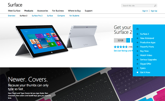
Default state of the Surface Pro 2 page.
Granted, I don’t have to use the navigation panel menu items to access the information on the page. I can scroll up and down. But like any good navigation labeling, the labels give me clues into the section contents and the information. Not too mention, it’s faster to use the menu if I want to skip around. Also, the panel location in relation to content (and vice versa) changes depending on the width of my browser window because it’s a responsive site. Which means that my mom is not going to know she can expand the width of her browser window to see the information or access the calls to action, and will call me to complain.
Navigation panel open
Label System
The first item at the top of the navigation is a single house icon with no descriptive label. I’m assuming that since it’s a house, it means “Home.” But which “Home?” Surface.com? Microsoft.com? Additionally, both the “House” icon and the first link in the navigation, “Surface Pro 2” go to the same anchor at the top of the page. So, the Home icon is unnecessary if there’s a better link to do the job and the use of the Home icon is misleading. The visitor isn’t going Home, they’re going to the top of the page.
Not to get too nit-picky, but whatever.
The label system is inconsistent. I prefer navigation labels on any site or app be similar, such as all descriptive or all actionable. The navigation across all three product pages is a combination of descriptive labels and actions.
Additionally there are two different navigation labels for buying the product, “Buy Now” and “Get it now,” even though all the buy buttons on the page are labeled “Buy Now.” Sure, it’s a minor discrepancy, but like paper cuts, they add up to one big painful experience.
Obscuring Content and Calls to Action
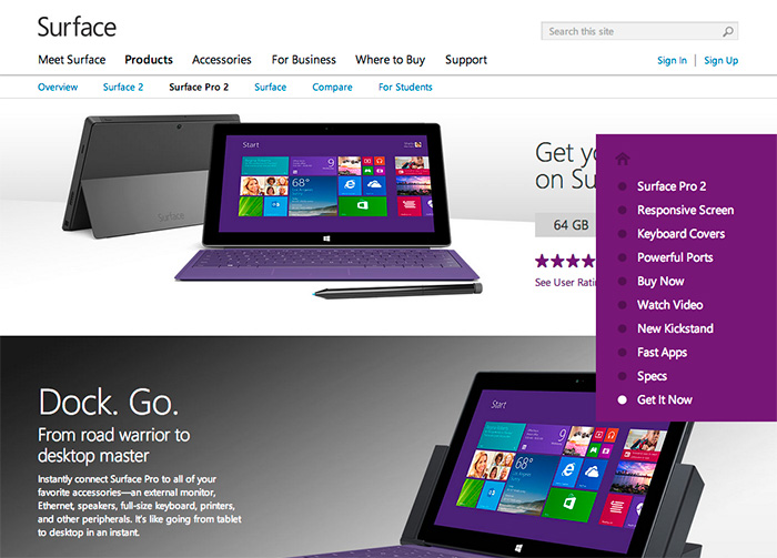
Moving into the page itself, using the nav menu, it becomes clear that the placement is not ideal. In fact, it’s questionable. The panel partially covers written content, details and primary imagery placed on the right side of the page, as well as the almighty “Buy now” buttons. Responsive or not, information on the screen is there for a reason and if it’s not accessible, then what’s the point?
I can’t believe that someone didn’t say, “woah, hang on” before the site went live. This is after all, the flagship website for Surface products. Every word and image of the product on the page is critical to influencing potential customers and selling the product.
Product feature information obscured by the navigation panel.
And it isn’t just one instance of the navigation covering critical information and CTAs (calls-to-action) on the Surface Pro 2 product page, all three of the product pages suffer from this debilitation.
For example, “New Kickstand” is hidden by the navigation panel. In order for the visitor to see it, she has to move her mouse out of the panel in order to close the panel (or expand the browser, if she’s savvy enough). If she wants to continue using the panel to navigate the page, she has to position her mouse back over the closed panel to open it, then click on the next menu item she wants to see. A lot of unnecessary actions and movements.
Kickstand imagery is obscured by the navigation panel.
Additional Content Each product page has a content section not included and therefore not accessible via the navigation panel. For example, in the screenshot below for Surface 2, the section about the new touch and type covers is not in the navigation menu. In the screenshot for Surface 2 Pro, the section for the docking station is not evident in the menu either.
This “approach” is implemented across all three product sites. As mentioned previously, since visitors will often look for keywords or phrases in navigation to determine if what they’re looking is on the page or in a section (aka “information scent“), why are these sections not included? Yet, there are two different ways to get to the top of the page and two different versions of Buy Now? I’m at a loss.
Information section about the new and improved Touch and Type covers is not in the navigation menu.Information section about docking stations is not in the navigation menu.
E-commerce From a make-it-super-easy-to-purchase-the-product-and-feel-confident-about-it perspective, two no-no’s that would bring Amazon.com’s KPI’s to their knees: Obscuring price and ability to purchase. In the screenshot below the price for the Surface Pro 2 is obscured by the navigation panel in the “Buy Now” section of the page, and in the second screenshot “Get It Now” is also hidden by the panel. These, in addition to the differently labeled Buy Now CTA’s mentioned in the above Navigation section.
Price point is hidden, next to the Buy Now button. Also, the nav panel cover and the background color are identical, creating a bizarre affect.“Get it Now” in the navigation panel vs “Buy Now” label on the button, which is obscured by the panel. Brilliant. Also, the Docking section isn’t even in the menu.
So what does it say about Surface when information is obstructed by navigation and by a potentially poor implementation of responsive design intended to help the customer learn about their product offering?
Putting on my black hat here, this is not how you design an e-commerce experience and expect to sell product. Nor is this the best example of an responsive, information-based website intended to generate interest, shift perception, and be accessible.
In this constantly connected world, people use their smartphones throughout the day to find information, shop, and stay connected. Google commissioned Nielsen to conduct a study of smartphone users who recently made a purchase to better understand the role of mobile in the research and shopping process. Through a combination of surveys and metered data of actual mobile consumer behavior, Google uncovered five key findings:
Consumers spend time researching on mobile: Consumers spend 15+ hours per week researching on mobile sites and apps. They visit websites 6 times on average in the purchase process.
Mobile research begins with search: 48% of consumers start mobile shopping-related research using search engines, more than they start on branded apps or websites.
Location proximity matters: 69% of consumers expect a business to be within 5 miles of where they’re located.
Purchase immediacy is key: 55% of consumers want to purchase within an hour, 83% within a day.
Mobile influences purchases across channels: Of those who made a purchase and researched on their phones, 82% purchased in-store, 45% bought online (desktop/tablet) and 17% purchased on mobile.
With smartphone penetration in the US nearly doubling year-over-year from 31% to 56%1, it’s clear that the mobile savvy shopper is here to stay.
Key Implications
Below are ways that advertisers can use these insights to better reach the mobile consumer and drive more business:
Ensure you have a mobile-optimized site
Consumers expect a business to have a mobile-friendly website. To create a mobile-optimized experience, you’ll want to start by analyzing how your consumers currently interact with your website, what they’re looking for, where they’re visiting from, etc. These insights will provide hints for creating a mobile website that meets your consumers’ needs. For more information on building sites that are optimized for mobile and other devices, check out these resources.
Tailor your search ads for the mobile shopper
As search is the most common starting point for mobile shopping research, it’s important to have mobile ads running so you’ll be there when consumers are looking for you. You can help consumers get the information they need by designing your search ads with mobile-preferred creatives, such as “Call now” or “Visit our mobile site.”
Use location extensions so consumers can find you Location extensions allow you to attach your business address to your ads, which lets consumers know how close they are to your business and provides directions for consumers to get to your store.
Facilitate faster checkouts
Showing local in-stock inventory with local PLAs, enabling click to call and building fast, seamless mobile checkout experiences with tools like Google Wallet Instant Buy are several ways advertisers can help consumers complete their purchases quickly.
Measure conversions across channels with cross-device conversion tracking
Consumers purchase across channels, often times starting their research on mobile, then buying in-store or on their computers. Advertisers can better understand how mobile ads drive purchases by using estimated cross-device conversion to measure conversions that start from mobile research.
To explore more of the findings from the Mobile Path to Purchase research, view the full presentation at the Think with Google site.
From Inside Adwords, posted by Bao Lam, Performance Ads Product Marketing Manager.
I consider myself to be a savvy internet user; I’ve shopped at eBay and Amazon for years, I do my banking and investing online, pay my bills, etc. I’ve also designed e-commerce experiences and workflows–so it’s safe to say, I have some serious expectations of how certain things SHOULD WORK.
Which brings me to the subject of this post: when something happens opposite of what I expect to happen, and I actually catch myself thinking about calling customer service. And that really IRRITATES me because I think at this point in time that with all the analytics, data, testing, best practices and conventions, I shouldn’t find myself thinking “What is going on?”
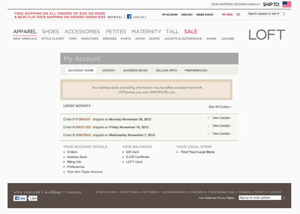
Case in point: I love shopping at The Loft (part of the Ann Taylor family). The clothes are less expensive but still well constructed, they’re comfortable but stylish, and usually go on sale right away. Since there is a store so close to where I live, I don’t normally shop on their website, but I do shop using their store credit card. I recently got a reminder email that my statement was ready and that I could pay online. So, I went to the website, and logged in to my account (screen shot below):
If you look towards the bottom of the screen, there is a column labeled “View Balances,” with the last link called “Loft Card”. That’s what I need to click on, and I should a screen similar to my AMEX statement online or my bank account. Right?
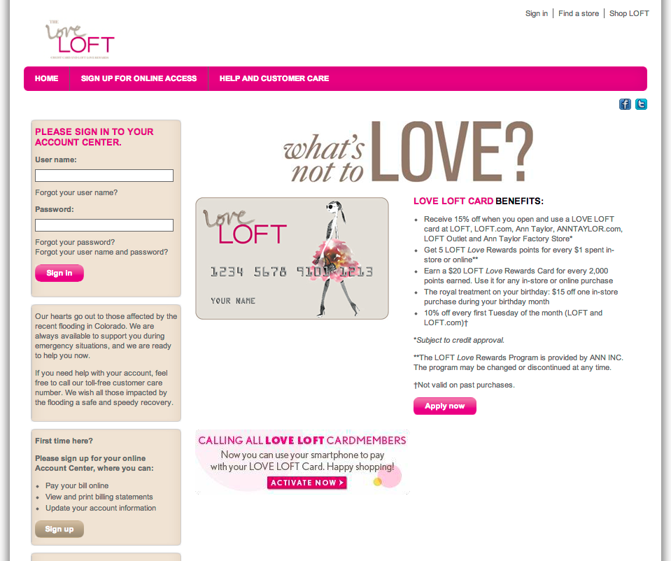
No, click the link, and this is what I encounter (see screenshot).
My first thought, “Did I just get redirected to the home page (of the site) and I’m being encourage to sign up for a Loft card?” My second thought, “Is this (Loft Card) link incorrectly linked?” I click the browser back button to return to the My Account landing page and begin clicking other links on the page. Everything I clicked on behaved accordingly; I click on the “Loft Card” link, and the same bright-colored, happy page as before.
My confusion grows because the right-side of the page says “Hello! Log in » Apply now ».” Aren’t I already logged in? When I look at the site masthead, I can tell I’m logged in because two key indicators of confirming a logged in state are displayed: “My Account” and “Sign Out.”
I proceed to click the browser back button (again), click a few more links on the account landing page (test, test, test), then click the Loft Card link again, with the same results. Definition of insanity.
Now I’m annoyed. This shouldn’t be taking as much time as it is. This is a common scenario, it shouldn’t be this mysterious. There is NOTHING OBVIOUS on this page indicating what I should do, given my expectations.
I scan the page again, more intently, looking for anything that might help me figure this out. Somewhere in the back of my mind I recall that the email reminder was sent from “Comenity Bank-LOFT”. Maybe this whole Loft card thing is managed by a separate bank? Maybe I have to log in to manage my card, separate from the shopping site?
I click on the “Log in »” button/link. And wouldn’t you know…
The indicator I’m looking for is revealed: “Log in” slides to the left displaying “Love Loft Card” and “Love Loft MasterCard.” I click on “Love Loft Card.”
(By the way, by clicking on this does it mean I love Loft, or is that the actual name of the card?)
Ermahgawd. New page opens over the one I was just on. COMPLETELY. NEW. UI. “What’s not to Love?”(I am not “Loving Loft” at this moment.) I eventually get to the page where I can pay my bill. But not before I thought about looking up a phone number to make the payment over the phone, or getting in my car and driving to the store. I came away feeling like I been in the center ring of a 3-ring circus – and no net.
My recommendations:
1) Link directly from “Loft Card” to the actual sign in page (above). Also, consider adding “Loft MasterCard” and “Apply for a card” links to the same column.
2) Make it more visually consistent with the rest of the website for continuity and to reduce potential visitor confusion. If anything, add text to the landing page that helps direct the visitor, such as, “Already a card holder, sign in by…” It seems obvious, but it’s amazing how small details are so often overlooked.


 ittybittyusability