Personal Recommendation Systems, Part 2

Sounds great in theory, but what about reality?

Part Two (P1 click here) of the discovery process is focused on looking at (auditing) real-world implementation of product recommender systems in various products and services.

Google search for any service or site for “best recommendation system website or app” and you will inevitably see the following on the list, somewhere near the top:

  • Spotify
  • Netflix
  • Hulu

The aforementioned streaming media companies ARE the most often mentioned example of a “Personalized Recommendation System” that gets “it” right (“it” being whatever the user deems it to be with regard to personalization); nearly everyone I’ve spoken to holds them up as a positive example of a correctly implemented and working system. Netflix is a slightly different use case in that they had user profiles and preferences from their red mailer days, compared to Spotify.

Since these platforms are so often mentioned for their product recommendation systems, so often listed, so talked about and discussed, algorithms dissected, I’ll not go into too much depth on their observed strategies and displays.

For the quantitative-oriented, the all up numbers for the audit are:

  • 18 comparative brands
  • 26+ tags (e.g., “Signal type”, “User status”, “Inputs”, “Platform” etc)
  • 200+ screens across app and web
  • Streaming media
  • Publishing
  • E-commerce retail & marketplace
  • Social media
  • Ride share
  • Specialty/curated

Comparative Audits

Competitive audit spreadsheet with corresponding screens and flows

What is a comparative audit and why do we do it?

User experience professionals conduct comparative audits in order to understand the problem/solution space being investigated. We often look for and capture competitive experiences (if applicable) BUT equally as important we look outside the competitive landscape to gain a more holistic view and understanding of the space

In this case, with regard to product recommendations:

  • Our customers browse and shop on other sites and apps; it is in our best interest to understand recommendations in those environments
  • Looking at different product and service models exposes us to different types of recommendation strategies and implementations
  • Auditing comparative sites gives us a more informed, broader view of product recommendation strategies that can inspire our own explorations and provide examples we can point to

Competitive audits often have the lens of the subject matter applied to them to make cogent observations. Using the content and information recorded in my research of product recommendation systems (Part 1), I created a set of specific “product recommendation” tags and created a lexicon for audit notes. It enabled me to be more aware of what I was looking for and accurately describe it. The lexicon and established vernacular proved useful for other team members because we all used the same language to identify and discuss our observations.

In this case, with regard to product recommendations, I purposefully:

  • Audited for different types of recommendation strategies (global, contextual to product, personalization, custom or hyper-personalization)
  • Reviewed product grain/tier, individual page location and context, content and mechanics
  • Captured results of both implicit and explicit inputs, such as user type, signed in/out status, likes, searches, filters, list creation, product page views, onboarding and feedback loops
  • Additionally observed changes based on frequency of visits and cross device browsing
Examples of product recommendation tags

Capturing observations and flows

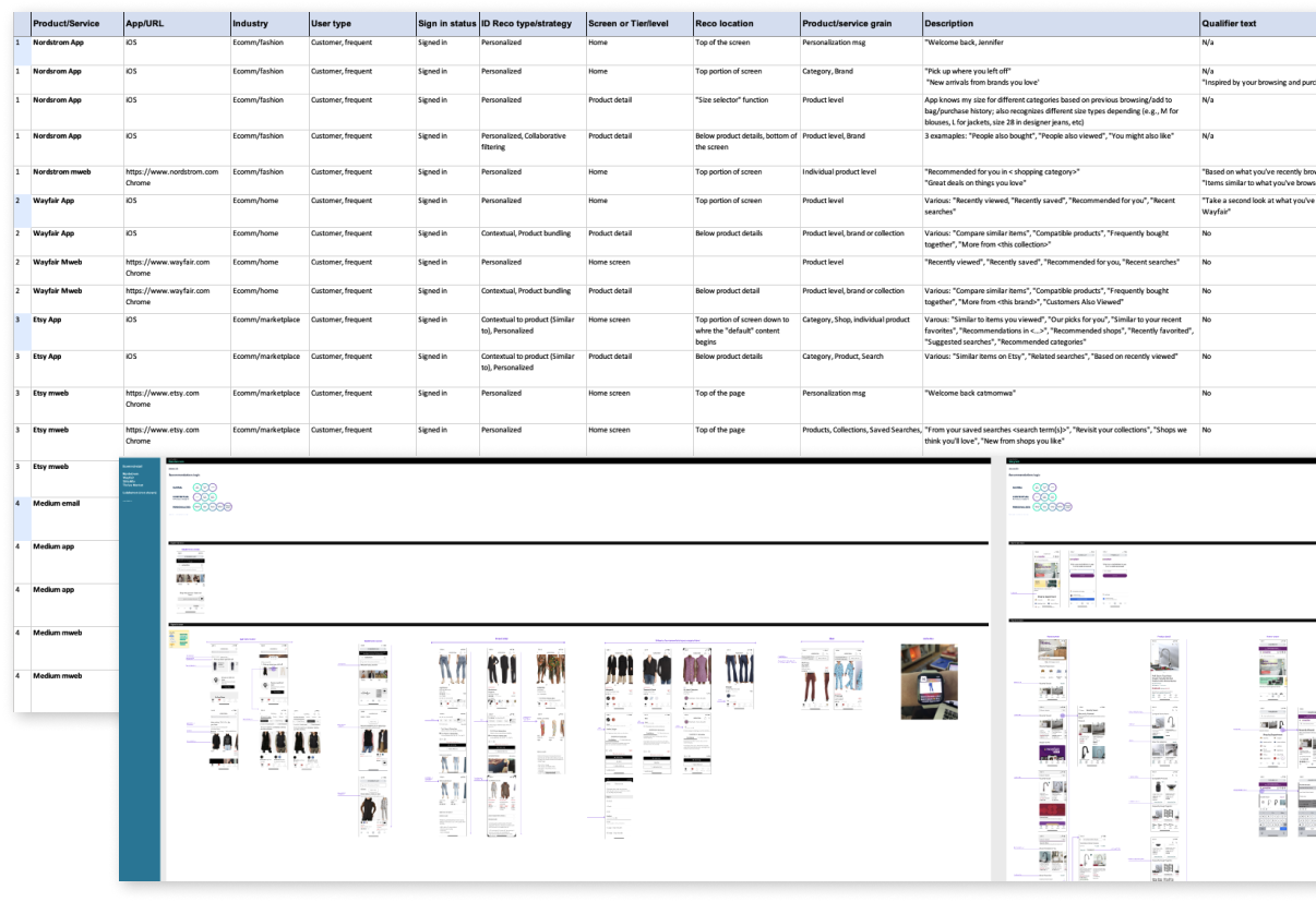
Information, flows and screen level observations were captured and recorded simultaneously in Excel and in Figma. I inserted both call outs at the flow and screen levels correlating to specific points of data in the spreadsheet. Both the mobile website and App experience were reviewed

Nordstrom App and Mweb home screen
Nordstrom App and Mweb spreadsheet entries

Key observations

Various audited sites and platforms

Of the 18 or so product and service companies I audited I’ll limit my observations and examples to the following:

  • Nordstrom (retail fashion)
  • Etsy (retail marketplace)
  • Wayfair (retail home)
  • Twitter (social media)
  • Medium (publishing platform)
  • Spotify (streaming service)

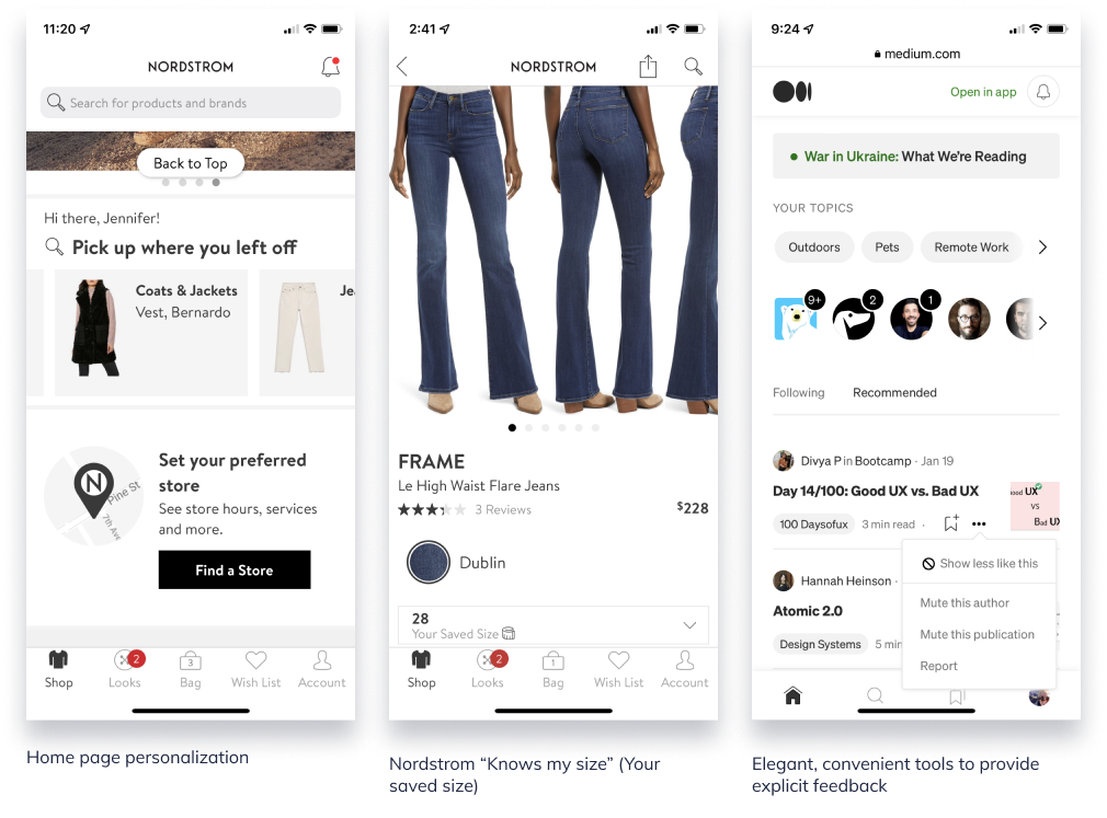
Qualifier text provides credible connection and builds confidence

Qualifying text is necessary to build trust and a logical connection between user behavior and the recommendations being provided to her. Examples of qualifying text are, per the above images “Based on your reading history”, “Selected for you”, “Based on your likes”, “Inspired by your browsing and purchase history.”

  • Medium and Twitter provide contextual qualifiers at both article and tweet level respectively when applicable and appropriate
  • Nordstrom was the only retailer who provided qualifier text with recommended products on the home screen

User feedback functions facilitate more relevant, personalized experiences

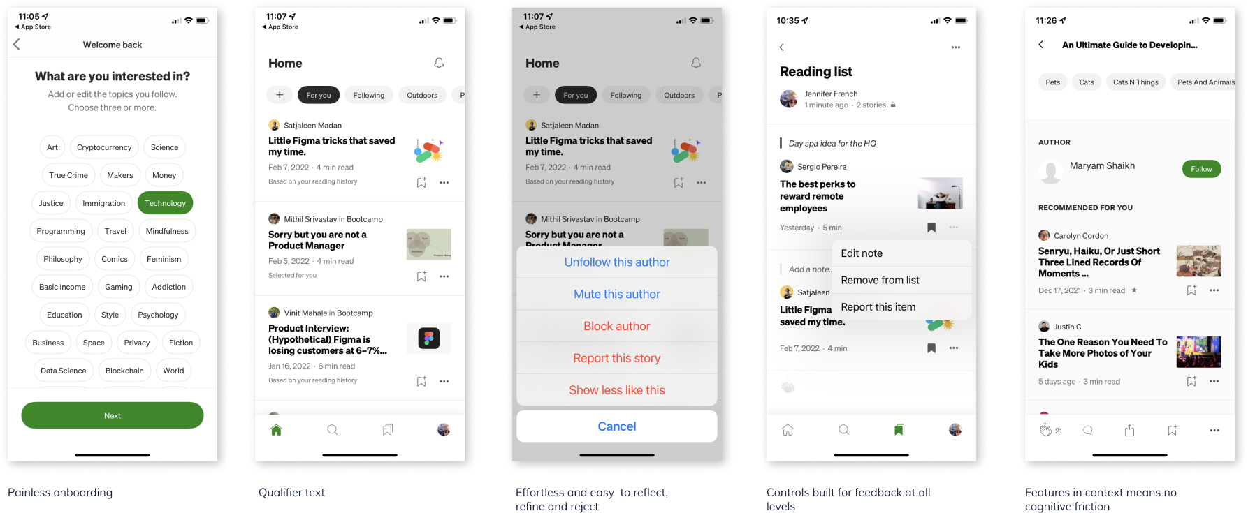
In order to refine recommendations the system needs relevant signal from the user and ideally reason as to why the suggestions are acceptable or not acceptable. Providing feedback mechanisms in appropriate context enables the user to quickly and easily provide feedback to the content or products being displayed to her. It’s worth noting that these types of feedback controls were only visible in publishing, social media and streaming services. Retail did not have explicit controls.

  • None of the retailer sites/apps provide a method for users to give direct feedback on “recommendations” or “suggestions” resulting in heavy reliance on implicit data interactions and/or less frequent explicit data sources
  • Medium and Twitter platforms provide users with ability to provide content feedback at most granular level, individual articles and tweets respectively; both platforms have an “onboarding” process initially with suggestions throughout
  • Medium and Twitter provide user controls in context of the current screen view; do not require the user navigating “away” to a profile or preferences section

Individual recognition sets a personal tone

One of the quickest ways to create a sense of personalization is to playback a user’s name or username. Additionally, layering in language with respect to recency, such as “Welcome back”, “Pick up where you left off” further enhances the perception of recognition. Additionally, acknowledging the time of day a user is visiting, such as “Good afternoon” in the case of the Spotify (above), which was accurate at the time of the observation.

  • Only Nordstrom and Etsy display customer or user name with a greeting on the home screen; Spotify displays user name next to profile pic (paid account)
  • User recognition (mentioned above) further strengthens relative context and continuity product recommendations that follow, especially, Nordstrom
  • Nordstrom is the only company that acknowledges user on both App and Web experience
  • Not including is a missed opportunity to provide small, simple user recognition feature that could be expanded to include time past since last visit, time of day when visiting etc

Customer recency leads content personalization on home screens

Personalization on the home screen tends to replay most recent user behavior and/or state. Replay helps orient and remind the customer of her previous goals or tasks when she last visited or used the service (HBO Max) which helps to jump start and facilitate re-engagement.

  • Recommended products with personalization language appear at the top of the screen and are more likely to be based on recent user behavior (however “recent” is defined)
  • Most if not all sites display one group of recommendations based on recency; most are labeled in a manner to remind the customer what she was looking at or how she was interacting, such as “Previously Viewed” “Previously Saved” “Pick up where you left off”. Products may be outwardly labeled, “Recommended for you”
  • Product groupings further down the screen may be less specific and more broad in scope, such as “Suggested searches”

Product detail screens provide comparison to products, collections, or cohorts

Product-based recommendations are more common at the product detail level than explicit “personalized” recommendations.

  • Product detail pages focus on same or similar products to the one being viewed such as “Similar products” or “More from this collection.” Suggestions may include at least one set that is more “relevant” to the individual, such as “Customers also <…> “
  • Nordstrom was the only retailer with a variety of customer/user-centric labels across different products; simultaneously personalizing and providing product suggestions
  • Nordstrom had only 1 alternative product carousel on the PDP while all other retailers had more than 1 suggestion

Small instances provide big opportunities to surprise and delight

Personalization and recommendation experiences aren’t necessarily about how many different recommendation configurations can be displayed at once. Sometimes it’s the small instances that demonstrate the business is paying attention and listening.

  • Home page personalization with welcoming message
  • Nordstrom “Size” recommendation
    Nordstrom app not only recognizes the user but also knows what size to recommend based on previous browsing and shopping. When she’s on a PDP, it will display the size she normally adds to bag/purchases. It also adjusts to category or measurement (e.g., Size M in pants, Size 28 in designer jeans)
  • Ability to control the display: Medium and Twitter
    The ability to say “more of this” or “less of this” via an easy-to-use convenient menu gives the user more control over the content that competes for her attention and provides the business with a clearer direct signal. A win win.

In all three of these examples (exception: Welcome message), the user does not need to leave the current screen to visit a profile or preference page–these are small enough that they can be managed within the context of the current page. In the Nordstrom size example, the user never filled out a profile page for Nordstrom to indicate the different size types for all the applicable women’s categories.

Who sets the bar?

We all know about Spotify and Netflix.

Nordstrom
Designer and high-end fashion ecomm

Nordstrom brand is famous for its legendary customer service and personal shoppers. It doesn’t surprise me that the online version would follow suit where it can.

  • Immediate personal recognition with display of name
  • Replays previous product, at brand and category level, customer was looking at previously and provides pathway to continue browsing
  • Utilizes qualifier text to qualify why the product/brand suggestions are appearing
  • Auto-selects customer size and displays in size selector; applies across different types of product (NOTE: this was NEVER selected in a profile–this is learned)
  • Correlates the other product suggestions with customers (“people”) like me; only one carousel of related product

Medium
Publishing platform

Medium’s experience is so well thought out it’s magical. It literally anticipates the user’s next-best-action across it’s various use cases and achieves what I consider to be a transparent UI.

  • User centric experience from top to bottom
  • From onboarding, to preferences management, to page level controls the user is able to reflect, refine and reject quickly and painlessly
  • Providing feedback is effortless and does not require user to leave context in most instances
  • Entire experience (language, display, interaction, algorithms) has the qualities of complete attention to detail at every touchpoint; there are no paper cuts in this experience

Next up on ittybittyusability: My perspective on the HCD (Human-centered design) process

Personal Recommendations Systems: Part 1

Not too hot. Not too cold. This one is just right.

I’m diving into the realm of Personal Recommendations systems, and it’s like the never ending task of peeling an onion. Fascinating, but there are lots of layers with some known knowns, as well as a few known unknowns.

As a UX professional, I’m well versed in the display best practices and interaction experience required in order to make it a purposeful, worthwhile tool and delightful experience for the user.

What’s been interesting (and a little unnerving) is how many people in my industry and those connected to it don’t understand what it means when they say, “we want to deliver a relevant personal recommendation.”

It’s becoming a phrase that makes me twitch a little when I hear it.

So, without further ado, allow me to indulge myself and share my research so that maybe some day you won’t have to.


What is a Product Recommender System or Engine?

Recommendation Systems collect user, product, and contextual data, both on- and off-site, in order to predict products or services to a specific user. It is a technology that uses machine learning and artificial intelligence (AI) to generate product suggestions and predictive offers, such as special deals and discounts, tailored to each customer. The design of such recommendation engines depends on the domain and the particular characteristics of the data available.

Suggestions for books on Amazon, or movies on Netflix, are real-world examples of the operation of industry-strength recommender systems.

What is the best strategy for a Product Recommender system to achieve personalized recommendations?

In order to be able to run, one needs to learn to crawl first, then walk. The same for “personalized” recommendations. The key word here is “personalized.” Just like a new user is “new” (you’re only a new user once), a personalized recommendation can only be achieved after establishing a well known profile of the customer via segmentation, implicit and explicit data, etc.

Product recommender systems require a “crawl, walk, run” implementation strategy to successfully build a comprehensive system and account for both product and user status. From dynamicyield.com, there are three broad tiered strategies to achieve this outcome:

• Global
• Contextual
• Personalized


Global strategies
These strategies tend to be the easiest to implement, simply serving any user – both known and unknown – the most frequently purchased, popular, or trending products in a recommendation widget.

Contextual strategies
These strategies rely on product context, assessing product attributes, such as color, style, the category it falls under, and how frequently it is purchased with other products, to recommend items to shoppers.

Personalized recommendation strategies
Personalized strategies, the most sophisticated of the tiers, don’t just simply heed context, but also the actual behavior of users themselves. They take the available user data and product context into consideration to surface relevant recommendations for each user on an individual level. This means, in order to effectively deploy them, a brand must have access to behavioral data about the user, such as purchase history, affinities, clicks, add-to-carts, and more.

Source: Dynamicyield.com

Popular filtering systems

It’s likely that some of the approaches listed in the three tiers sound familiar, so let’s quickly unpack their meaning and how they work.

Content-based filtering system
A content-based filtering system analyzes each individual customer’s preferences and purchasing behavior; it analyzes the content of each item and finds similar items.

This type of filtering system is usually behind the “Since you bought this, you’ll also like this …” recommendations.

Source: Towardsdatascience.com


Collaborative-based filtering system
A type of personalized recommendation strategy that identifies the similarities between users (based on site interactions) to serve relevant product recommendations

Source: Towardsdatascience.com


Hybrid recommendation model
A hybrid recommendation system offers a combination of filtering capabilities, most commonly collaborative and content-based. This means it uses data from groups of similar users as well as from the past preferences of an individual user.

Affinity based recommendations
Affinity-based recommendations are product or content recommendations that are made based on the individual shopper’s profile. These recommendations are usually shown to the shopper on a website or app, in an email or in a notification.

Profiles that determine recommendations are derived from the shopper’s online behavior, the transactions they make, and their demographic data. All this data is used to map the shopper’s preferences—or affinities—across a wide range of visual and non-visual attributes, all of this is captured at every point in the shopper’s journey on the website or app.

In apparel retail, visual attributes could include colors, patterns, the length of a sleeve, or neckline and hem length. Non-visual attributes could include occasion, weather, etc.

Profiles map a shopper’s affinities to these attributes based on their activity and intent on the site.

Source: Dynamicyield


Product bundling

When two products, such as a scarf and coat, were popular choices together, or diapers and disposal bags, commonly referred to as “Frequently bought together.” This is a common recommender strategy on Amazon.com.

Now you know what it’s called, if you didn’t already.

Source: Amazon.com


It’s important to note the underlying purpose of each model: utilizing types of context and data that is either available or not available to essentially look for gaps to fill at the right place, right time. In other words, recommendation systems find the space that users share, and then fill or that space with the best possible product/service “match” it can.

A Recommender System will never be able to match User A to User B with perfect results, as their tastes will diverge at some point. The truth is, recommendation engines don’t set a threshold when looking for compatibility between people .

They look for the best possible match
.

Source: Murimee

Data requirements. The more detailed and accurate, the better.

Product recommender systems run on data, constantly ingest data, and produce data to stay relevant and evolve. Data is at the heart of engine. When I first started researching and gathering insights, I decided to capture data types and collection methods to better inform and set expectations for a personalization strategy including but not limited to:

Customer data

Personally Identifiable Information, or PII. PII involves any data tied to an individual, including email, address, phone number, an ID number — or anything else that can be used to identify a person.

Demographic data describes a customer’s characteristics. Demographic information can detail gender, geography, occupation and age.

Engagement data details the interactions a user has across all brand channels. This metric enables marketers to gauge a user’s level of interest, preferences and intentions, no matter the touchpoint.

Behavioral data is all about action. Site browsing, purchasing and email sign-ups are all considered behavioral data that aims to observe and infer customer intent. This type of data is similar to engagement data, however, it only tracks customer interactions with the brand online.

Source: https://signal.co/resources/what-is-customer-data/


Implicit and Explicit data

Implicit data tells you what a customer does, but forces you to guess about the why behind it. A customer views a product but does not make a purchase. A user watches a film trailer or reads an article about something. This is a statement of intent but no clear, affirmative action.

Implicit data is easier to collect, and there’s more of it. But, implicit data is harder to interpret, often requires clarification and observation. For example, websites where people browse and view but do not always leave a rating. In such cases, there is exponentially more implicit than explicit data being created by user activity.

Explicit data is information that a consumer deliberately volunteers. It validates implicit data and provides much-needed context, uncovering things like the preferences, motivations, and desires that inform a consumer’s behavior and allowing for more nuanced audience segmentation and personalization—in short, the why behind the buy.

A customer buys a product, rates a film, or gives a thumbs up or down to a post. The customer is clearly showing how they feel about a product. The data is clean and actionable.

Explicit data is a clearer signal than implicit data, but is harder to collect because it requires purposeful action on the part of the user. Simply listening to a song is not explicit data in itself. The system does not know for sure that the user likes that song. Actual explicit data is when the user adds a specific tune to a playlist or hits the heart icon to say that they enjoy listening to it.

Explicit data can also be shallow because while it does have a clear signal, that signal maybe no deeper than a like/dislike, thumbs up/down; a binary reaction.

Source: https://blog.mirumee.com/the-difference-between-implicit-and-explicit-data-for-business-351f70ff3fbf

Once you’ve got your arms wrapped around your user and product data, it’s time to start grouping and segmenting it passed on specific parameters, such as behaviors, affinities, demographics etc in order to begin “personalizing.” Be careful not to interchange segmentation for personalization and vice versa.

Segmentation and personalization

Segmentation involves dividing customers into audiences based on broad factors like location or product interest. It usually requires a CRM or CRM-type system, normalized data and attributes tied to a targetable ID, as well as some broad-based understanding of different buyer types that coordinate to different product or offer affinities.

Segmentation: it’s about the Marketer
Segmentation is a principal marketing strategy that involves identifying similar groups of potential customers according to relevant information that can be used to deliver a mix of strategies to receive results.

Segmentation typically follows a set of descriptors, including a potential customer base’s demographic or psychographic variables.

Source: https://www.progress.com/blogs/segmentation-vs-personalization

Source: MobileMonkey

Timeout: I really love this customer segmentation graphic from Forrester Research. So I’m sharing it.

Source: Forrester Research


Personalization
Personalization takes segmentation much further by drilling down on specific behaviors and actions of an individual to provide her with the necessary information to move to the next step in her buyer’s journey.

Personalization: It’s about the Customer
Personalization involves identifying a specific customer within a segment.

Personalization is all about how the brand can solve that individual’s pain point or need. That involves understanding the customer’s intent and creating personalized experiences around that intent. Identifying a customer’s intent means that considering various data points using rules-based logic.

A customer’s intent can change each time they interact with a brand. Their intent can also change throughout one interaction.

Source: https://www.progress.com/blogs/segmentation-vs-personalization

Source: Smartinsights

Irrelevant Personalization (is bad, you don’t want to do this)

When segmentation and personalization are interchanged, we hear cases like a shopper being recommended mosquito nets after purchasing a mosquito net a week back. Or a person waking up to a dozen of promotional emails about baking trays after buying an oven.

This example doesn’t imply that they aren’t ‘personalization’. It implies ‘irrelevant personalization’, which would be regarded as a failure.

For example, out of the 100% oven buyers, there might be a percentage that needs trays. However, sending all of them a prompt to buy ‘tray’ reflects that the brand has put everyone from that group under one category, instead of mapping their individual needs. This illustrates the outcome of confusing segmentation with retail personalization.

Source: https://www.progress.com/blogs/segmentation-vs-personalization

Segmentation vs Personalization: A side-by-side comparison

Source: Moengage

Macro and Micro segmentation

I briefly want to introduce macro and micro segmentation. Macro segmentation is more or less segmentation as described earlier: larger groupings customer based on similar attributes. Micro organization takes it a step further with applying additional refinement. Not quite personalization, but getting closer. This could also be interpreted as a curated segmentation; creating smaller segment slices from larger pieces of the pie.

Macro segmentation refers to the practice of dividing online traffic into a few sub-groups of visitors who differ from one another in one or two basic attributes like location, gender, or an identified browsing pattern.

Demographics: age, gender, education, income, children, ethnicity, marital status
Geography: Country, area, population growth, population density
Psychographic: lifestyle, beliefs, social classes, personality
Behavioral: use, commitment, awareness, affection, buying habits, price sensitivity

Micro-segmentation is a marketing technique that uses knowledge to classify people’s interests and to influence their perception or behavior. We have all the data that we need to answer our client’s questions in the ideal world. However the ideal is not always our reality, so we need to find new approaches to meet the needs of the consumer.

Micro-segmentation encourages customers to be grouped into more targeted, oriented markets within the segmentation and market of the customer—enhancing specificity and, amid limited customer data, creating a micro-segmentation marketing strategy.

Examples:
Upscale Tourists & Buyers: consumers interested in elevated goods and travel amenities with high discretionary travel and shopping budgets.
Good Living: buyers interested in good and sustainable living as well as wellness and fitness (including advertisements and articles on these subjects)
Cultural Fanatics: Consumers involved in performing arts and entertainment

Source: https://vue.ai/glossary/

User types


User
 types can be described as user profiles associated with different categories of user groups. Each user type is characterized with a particular usage pattern. We identify user types in order to understand how the site or app is being used; where users are coming from, new vs repeat (return) users, how often or frequency of visits and time in-between visits, etc. Depending on the visitor and visit frequency we can better set recommendation expectations and more accurately implement them.

Plus it’s a great refresher.

New visitors or new users are defined as people visiting your site for the first time on a single device — so each first visit on your laptop, smartphone, and tablet counts as a separate new visit. You can only be a new user once.

A user makes “sessions”, therefore a first session on a website receives a ‘new’ label. Subsequent sessions receive a ‘returning’ label.

(Google Analytics defines a new visitor as anyone who has never been on your website before, according to their tracking snippet.)

Return visitors are users who have been to your site before.

Unique visitors, or new users, describe the number of unduplicated visitors to your website over the course of a specific time period.

Return visitor labeled as a new visitor
If a person is on a website in incognito or private browsing mode.
If a person visits a site initially from their laptop and then browses it later on their smartphone. If they are not logged into Chrome on both devices, then when they view the site again on their smartphone, they’ll be counted as a new visitor.
If a person visits a site once and then comes back a second time.
If a person visits a site, and then clears their browser cache before viewing it again.

Frequency and recency data


Frequency and recency data are helpful to better understand the customer journey of your users, as well as their needs and behaviors. They can help create or maintain your personas, and also discover how to better support not only your visitors, but also your business goals.

Frequency of site visits indicates the overall number of visits made by each user on your site. This metric allows you to assess the percentage of new users on the site as well as the familiarity level of all returning users

Recency measures the number of days that have passed since each user’s last visit. This measure allows you to see the average amount of time between visits for your user base.

https://www.nngroup.com/articles/frequency-recency/

I hope that you’ve found this information helpful and useful. Stay tuned for Part 2 where I delve into an audit to discover best examples of design and implementation of Product Recommender systems.

Grocery e-commerce presents unique challenges

Baymard Institute once again provides a fantastic summary and findings from their in-depth research examining online grocery shopping. Several points stood out to me as unique departure from “traditional” online shopping:

1. Frequently or regularly purchased (e.g., “buy again” )
2. Ability to provide substitutions to sold out items
3. Delivery vs in-store pickup – sometimes in the same order
4. Ease of adding to card, often higher in the funnel than the traditional product detail page

Read the entire summary details here

It’s an… Icon? A check box? Open/close mechanic? Navigation element? All of thee above? Please let this be broken.

I am a huge fan of (Ann Taylor) LOFT. The price point (everything eventually goes on sale within a week or two), quality, and style suite my budget and fashion sense just fine. I have a LOFT card to earn points towards more clothing, and I submit payments online.

The LOFT recently updated the account center where you manage your payments, balance, account activity, etc, because when I logged in today it announced the new account center “is even better.”

Yes, most of it’s cleaner and more suitable for multi-device and screen accessibility. But for whatever reason, there are square shapes showing up for almost everything, except text. And I mean everything.

The use of the square is so widespread I can’t be certain if something is broken, or whomever just got carried away. It’s a static visual, it’s part of the navigation menu, it’s part of the interactive features and selection mechanics in the UI. I’m really hoping something is wrong with their image server.

The worst part is that it just broke nearly every mental model I have when it comes to a square. Square = check box. Click/tap = select/unselect. I thought I was losing my mind. I kept tapping on my iPad expecting a check to appear.

Post Log-in Experience:
After the log-in screen I was presented with an overlay introducing the new account center. Initially, I wasn’t paying attention to the use of the square shape in this window. Not until I went to check the box “Don’t show me this again.” (See below).

LOFT_Screen3
Instead of a “check” in the box (or square), I got a square–in the box (or square). Is it broken or is this intentional? Good Lord, I hope this is broken.
LOFT_Screen4
Home Page and Menu:
LOFT_Home_1It just keeps getting worse. There are squares everywhere, and the intended use or purpose is a mystery to me. In the menu to the left of the page, the square is not used to visually demonstrate the “on state” (like filled in). Instead, a pink, vertical line is the indicator.

The three smaller gray squares in the upper right hand corner are navigation elements to the My Profile section, Message Center, and Help and Customer Care. I didn’t even know where I was going to end up until the page loaded. There is no label on hover state or otherwise.

When I click on the square next to the label “Recent Activity” it just rotates and reveals inline my recent account activity.

And at the top of the screen I don’t even know what the white squares in the pink circles are supposed to be.

Make a Payment:
The shot below is from my tablet, which is where I initially encountered this experience. Each time I tapped on the square, I kept waiting for the check mark. I must have tapped on “Other amount” half-a-dozen times before it occurred to me that the change in background color (light gray to dark gray) was the visual indicator for “selected.” Holy crap, is this intentional?

Not to mention, in the Select Checking Account and Select Payment Date columns, there are selections with TWO squares. What on earth are they meant to represent?

LOFT_TabletScreen1
The Aftermath:
I managed to make my payment. (I logged back in this morning to double check). But the scenario raises several questions.

The first question, obviously: is the use of the squares for all static and interactive UI assets intentional? I mean, was there a cognitive decision to use the shape to represent nearly everything?

Question number two: how many UI icons and assets are really necessary? A squint test on this page reminds me of a shooting gallery with lots of targets.

Final question, did this get a scrub and Q/A before it went live?

I really, really, REALLY hope something is temporarily wrong, because overall it’s an improvement to the previous experience.

The retailer customer challenge: mdot, responsive or dynamic serving?

According to a recent post by Pure Oxygen Labs, 2014 saw retailers shifting away from Mdots to Responsive and Dynamic Serving. Here’s a look at the numbers:

  • 59% used dedicated mdot sites – down (significantly) from 2013
  • 15% used dynamic serving – up slightly from 2013
  • 9% used responsive design – up (significantly) from 2013
  • 14% had no mobile web presence at the time (OMG)

Pure Oxygen Labs points out that while mdot usage is sliding, the biggest obstacle and conundrum for retailers adopting responsive design is page speed and it’s potential effect on conversion. Despite this “Achilles’ Heel”, POL expects responsive to surpass 15% retail adoption in 2015.

Read on for Pure Oxygen Labs interpretations, predictions and technical insights.

A Sober Look at Why Responsive Rebuilds Fail for E-Commerce Websites

3 Reasons Why Responsive Rebuilds Can Reduce E-Commerce Revenue

From our experience working with enterprise e-commerce companies in a wide range of product categories, it all comes down to one (or a combination) of the following three reasons:

  1. A retailer treats Responsive Design as a conversion-centered solution, which it inherently isn’t.
  2. A team makes improvements to the under-performing mobile layouts but ends up affecting desktop layouts as well, negatively impacting conversion rates.
  3. Lack of internal expertise with this relatively new design methodology leads to site speed issues that go undetected during the rebuild project but then shatter conversion rates and organic search traffic after the new site is released.

Read on at Mobify.com to learn how to avoid these potential pitfalls.

Not Charming

I love it when coworkers share websites or apps with me because of either great or horrible experiences. I love it when they proclaim, out loud, “WTF?” It’s the siren song for a UX person in an interactive agency. It’s also an affirmation because their reactions tell me I’m not the only one that notices kooky or poorly designed experiences that make a website difficult to use.

Case in point, Microsoft Surface website. Specifically, the product pages. At first glance, there is a fairly innocuous navigation panel on the right-side of the screen. A common website navigation element, the menu is a list of links that anchor or “jump” the visitor to a corresponding section of the page.

Location, location, location
The first thing that caught my attention was the location of the navigation panel itself in relation to the page. I generally encounter this type of navigation on the left side of a web page. My working assumption is that the navigation panel was placed on the right side in order to replicate, to some extent, the Charms bar in Windows 8 in order to familiarize potential customers with Windows 8/8.1 OS features. (For those unfamiliar with the Charms bar, it contains search, access to settings and contextual app menus. And it appears from the right side of the OS when activated by a swipe or click on the right.)

Image
Default state of the Surface Pro 2 page.

Granted, I don’t have to use the navigation panel menu items to access the information on the page. I can scroll up and down. But like any good navigation labeling, the labels give me clues into the section contents and the information. Not too mention, it’s faster to use the menu if I want to skip around. Also, the panel location in relation to content (and vice versa) changes depending on the width of my browser window because it’s a responsive site. Which means that my mom is not going to know she can expand the width of her browser window to see the information or access the calls to action, and will call me to complain.

Image
Navigation panel open

Label System
The first item at the top of the navigation is a single house icon with no descriptive label. I’m assuming that since it’s a house, it means “Home.” But which “Home?” Surface.com? Microsoft.com? Additionally, both the “House” icon and the first link in the navigation, “Surface Pro 2” go to the same anchor at the top of the page. So,  the Home icon is unnecessary if there’s a better link to do the job and the use of the Home icon is misleading. The visitor isn’t going Home, they’re going to the top of the page.

Image

Not to get too nit-picky, but whatever.

The label system is inconsistent. I prefer navigation labels on any site or app be similar, such as all descriptive or all actionable. The navigation across all three product pages is a combination of descriptive labels and actions.

Additionally there are two different navigation labels for buying the product, “Buy Now” and “Get it now,” even though all the buy buttons on the page are labeled “Buy Now.” Sure, it’s a minor discrepancy, but like paper cuts, they add up to one big painful experience.

Obscuring Content and Calls to Action
Moving into the page itself, using the nav menu, it becomes clear that the placement is not ideal. In fact, it’s questionable. The panel partially covers written content, details and primary imagery placed on the right side of the page, as well as the almighty “Buy now” buttons. Responsive or not, information on the screen is there for a reason and if it’s not accessible, then what’s the point?

I can’t believe that someone didn’t say, “woah, hang on” before the site went live. This is after all, the flagship website for Surface products. Every word and image of the product on the page is critical to influencing potential customers and selling the product.

Image
Product feature information obscured by the navigation panel.

And it isn’t just one instance of the navigation covering critical information and CTAs (calls-to-action) on the Surface Pro 2 product page, all three of the product pages suffer from this debilitation.

For example, “New Kickstand” is hidden by the navigation panel. In order for the visitor to see it, she has to move her mouse out of the panel in order to close the panel (or expand the browser, if she’s savvy enough). If she wants to continue using the panel to navigate the page, she has to position her mouse back over the closed panel to open it, then click on the next menu item she wants to see. A lot of unnecessary actions and movements.

Image
Kickstand imagery is obscured by the navigation panel.

Additional Content
Each product page has a content section not included and therefore not accessible via the navigation panel. For example, in the screenshot below for Surface 2, the section about the new touch and type covers is not in the navigation menu. In the screenshot for Surface 2 Pro, the section for the docking station is not evident in the menu either.

This “approach” is implemented across all three product sites. As mentioned previously, since visitors will often look for keywords or phrases in navigation to determine if what they’re looking is on the page or in a section (aka “information scent“), why are these sections not included? Yet, there are two different ways to get to the top of the page and two different versions of Buy Now? I’m at a loss.

surface2_1
Information section about the new and improved Touch and Type covers is not in the navigation menu.

surface5
Information section about docking stations is not in the navigation menu.

E-commerce
From a make-it-super-easy-to-purchase-the-product-and-feel-confident-about-it perspective, two  no-no’s that would bring Amazon.com’s KPI’s to their knees: Obscuring price and ability to purchase. In the screenshot below the price for the Surface Pro 2 is obscured by the navigation panel in the “Buy Now” section of the page, and in the second screenshot “Get It Now” is also hidden by the panel. These, in addition to the differently labeled Buy Now CTA’s mentioned in the above Navigation section.

Image
Price point is hidden, next to the Buy Now button. Also, the nav panel cover and the background color are identical, creating a bizarre affect.

surface5
“Get it Now” in the navigation panel vs “Buy Now” label on the button, which is obscured by the panel. Brilliant. Also, the Docking section isn’t even in the menu.

So what does it say about Surface when information is obstructed by navigation and by a potentially poor implementation of responsive design intended to help the customer learn about their product offering?

Putting on my black hat here, this is not how you design an e-commerce experience and expect to sell product. Nor is this the best example of an responsive, information-based website intended to generate interest, shift perception, and be accessible.

Benchmark study on e-commerce checkout experiences

I’m currently working on a purchase flow for a service-based product. In other words, there’s no shipping involved. In doing some research and reviews on an acceptable way to set expectations for how taxes are calculated, I stumbled across a great resource produced by Baymard Institute. They’ve created several usability reports, one of which is dedicated to the Checkout Usability in which Baymard has evaluated 100 retail websites on a set of usability guidelines. Ultimately each site is scored across 6 individual components: Flow, Focus, Data Input, Copywriting, Layout, and Navigation, and then ranked from 1-100. While you need to purchase the report in order to see the positive and negative critiques, the site does allow you to view the benchmark results, as well as filter the sites in several categories. It’s awesome if you need to view multiple examples of shopping carts and checkout flows quickly and without having to go through the flows on 100 retail sites.