
15 members of Forbes Technology Council share their predictions for what will be considered essential features of “good” UX design in the near future.
Raise your hand if you’ve been advocating for some of these features for a LONG TIME. Personally, I’ve been (screaming) asking/begging/demanding:
A focus on the customer journey
Honest to God, the journey does not begin nor end on just the screens a specific team is “responsible for.”
Thorough customer research at the ideation stage
Testing the final product is just too late. Sure, it’s testing, but I think we all know how this will end.
Simplicity
Simplicity doesn’t mean a dumbed down design. It represents a solid focus on the customer, her needs/goals, and a direct route from A to B.
Well tested user flows
OMG yes this. See “focus on the customer journey” x “number of screens a customer interacts with.”
I was a little surprised to see the Accessibility and Inclusion not specifically called out, but I think we can all agree that those should be a part of each feature.
Read the entire article here.
Slow down. Take a moment. Journal.
How many of us have found ourselves struggling with a challenge and seemingly can’t break through to the solution? And at some point we decide to get up and grab a snack or coffee, maybe a bio break, and as we’re walking to our desk the solution just comes to us?
(Doesn’t happen to you? Maybe it’s just me then.)
Regardless, my point is sometimes you just need to walk away. Literally, go think about something completely unrelated. (Like, what kind of snack do I want? Fruit? The clouds are so pretty today. I wonder what happens in the next episode of the TV show I’m watching.) Not only does it provide a mental break, but also gives the body an opportunity to move a bit.
(A engineering friend of mine told me once that his aha moment is when he’s getting ready in the morning before work; called them “shower thoughts.” )
Which leads me to share a semi-related article I came across in the Harvard Business Review, “The More Senior Your Job Title, the More You Need to Keep a Journal.” The author describes the act of journaling as a purposeful exercise of pause and reflect, with strategies for creating meaningful entries. Similar to taking a mental break for a few minutes, the act of reflecting and event playback helps us mentally unpack and revisit scenarios, as well as take learnings from them for later. With information coming at us on all sides 24/7, we aren’t giving our brain the break it may need, making it harder to solve those challenges. And whether we realize it or not, during that walk to the kitchen is we’re giving our gray matter the space it needs
So, do your brain a favor. Take a time out and just give your brain a break. While watching the clouds.
Ignore your customers at your own peril
I’ve been in the UX/design/product biz long enough to know it’s your ass if you don’t listen to your customers.
I’ve also been in the biz long enough to know that sometimes you think you’re going to lose your mind because: your customers tell you they know exactly what they want, or they don’t know what they want until they see/use it (stakeholders too), or they tell you what they think they want and then decide no, that’s not what they wanted. Regardless, no matter how stir crazy you may feel, it’s important to continue Listening. Not hearing, but listening. Taking an active, empathetic mindset.
The benefits of this are a thousand fold and are tried-and-true tested. You take care of your customers, and they will, in turn, take care of you. It’s a reciprocal trust that generates brand loyalty to the nth degree. But once you stop listening, and maybe instead pretend you know what’s best, you’ve broken trust, and it’s open season on your brand/product/experience. Your customers will no longer take care of you as much as they once did. You might even lose a few. And we all know it costs more to get new customers than it does to retain the ones you have.
And here’s the thing. I’ve seen this happen So Many Times you’d think that someone would have figured it out. Maybe someone has and I missed that story. But honestly, businesses do a great job of not reading the room.
Your customers are your tribe; a family of fiercely loyal and protective users, but so long as you continue to bring them joy. Failure to admit you got it wrong, while insisting that you got it right, is a one-way ticket to shit-island.
Failure to bring joy comes in many forms, such as a poor update or feature release or less than satisfactory components used in an upgrade. You name it, you’ve likely experienced it yourself. One of the most common howl-worthy scenarios in the digitalsphere is the “brand refresh” or a “system upgrade.” In an attempt to make things “better” e.g., more transparent, stylish, findable, easier to use, less quirky etc something crucial to the experience inevitably gets touched, modified, moved, or tweaked and your tribe loses its mind. Why? We are creatures of habit, and we don’t like being forced to spend time relearning something that to us worked “perfectly fine” and now it’s changed and crap, now I have to think, and not only that I’m really disappointed, and worse part is the company doesn’t seem to care. WTH?
Case in point:
Tesla recently updated its dashboard UI (badly) and it REALLY pissed off the Teslaholics.
(Updates are a Big Thing in the Tesla community. Kind of like when Apple used to release a completely new product once in awhile–iPhone, iPad anyone? It’s pretty damn exciting.)
Anyway, in the case of Tesla, it didn’t help that Elon Musk poo-poohed the whole thing. Especially when UI/UX designer Hans van de Bruggen designed and built a working prototype that solved the pain points, published it for feedback, and the Tesla owners who used it clamored forTesla to use it. Elon Musk in this case not only didn’t listen to his customers, he insisted he knew what they wanted. (Which proves that just because you have more money than 3/4 of America doesn’t mean shit if you treat your tribe like the human equivalent of toilet paper. )
Considering how much a Tesla costs and the investment it requires, I’d be seriously rapid too. I might even be thinking about the other EV that are coming on the market. Remember the tribe has a long memory.
Read on about Hans van de Bruggen in two posts where he dissects the Tesla update, and recounts his Elon vs. Hans and the internet. Can’t wait to hear more about this saga.
Empathy vs Sympathy

User experience peeps use the word “empathy” frequently. We are “empathetic.” We “empathize” with the users of our product/service. Do not disturb me, I am “empathizing.”
But if asked, what is the difference between empathy and sympathy, would you know how to answer? I might, barely, only because someone once shared this animated video short with me, featuring a portion of a talk by Brené Brown . Thank goodness for Ms. Brown, who can, through beautiful storytelling examples make us better professionals as well as human beings.
Sorry dude, I’m kinda dead
The internet continues to provide.

Great case study of a case study
Whether you’re designing a product for planning travel, shopping for groceries, or the next music platform, knowing your audience and their pain points is THE most critical aspect of any approach.
This is a total DUH, but you’d be surprised (and maybe you’ve experienced this) how frequently a user and said pain point recedes as other priorities surge (e.g., business goals, technical limitations, internal processes.) And then it’s left to the UXer to be the squeaky wheel. Squeak, squeak, squeak….squeaky squeak. Yes, that’s what we’re supposed to do/paid to do, but having the same conversation over and over again is really deflating and a bad version of Ground Hog Day.
So where am I going with this? Being able to experience what your user experiences, or empathize, is essential. Capturing and executing brilliantly amidst the twists and turns of product design is a super power. Then, being able to write about the experience and share – even more cause for celebration. It’s easy to forget things, the wins, the learns, and the challenges as time passes, and you’ve moved on to the next thing. (Like when you go to interview and have there’s a portfolio review and the details are a little fuzzy – frustrating, right?)
Which brings me to my point. A WONDERFUL example case study (in my humble, subjective opinion); lots of (good) visuals and a well crafted writing style. The author,
Roja Patnaik, clearly knows what she is talking about, and does an excellent job of explaining it (always a challenge) without walls of copy. I won’t give anymore away, you’ll just have to read it yourself and judge.
Enjoy.
Design Systems, Pattern Libraries & Style Guides… Oh My! (Oh Hell)
I’ve heard these terms used in both general and specific professional discussions for years now, and don’t really remember ever actively pausing to consider the differences. I’ve referred to them, researched them, even helped contribute to and design them. (I’m assuming I’m not the only one…) So imagine how genuinely thrilled I was to come across this teaching video by Jesse Showalter.
Low-and-behold. It goes to show that it’s worthwhile to take a moment.
Warmup in progress?
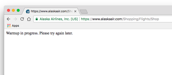
So. Many. Questions.
How not to accidentally start a war
A very interesting article from the online magazine the Verge regarding the company that created and supplies the software alert system that was responsible for the near disastrous incoming BM warning issued to residents and visitors in Hawaii earlier this week.
When considering how our brains function, or don’t, during extreme conditions (an incoming missile being one of them), it’s rather unfathomable that there is no visual differentiation or confirmation between a “test” message and a “real” message.
The company has confirmed that, if creating a message from scratch, there are eight steps involved; if creating from a template: three steps. So users technically can’t just click a button and issue an alert – there are at least three steps. (I personally can’t imagine being able to keep my sh*t together to get through three steps, but then again, what we imagine we’ll do in an emergency situation is often not the case.)
What surprises me is that there is NO FINAL CONFIRMATION messaging when sending out a “live” message. As in, “Are you really sure you want to send an entire state into panic?” Or, “Are you really sure you want to start a war?” Maybe even a second one (a final final confirmation message) just in case cognitively the person isn’t thinking clearly, possibly adding bells, whistles and starbursts. (Studies show the same thing happens to pilots in crash scenarios. The brain can only handle so much at once.)
Word of the day: Confirmation.
Are you sure you want to start a war? Really sure? This action cannot be undone.
One of these things is not like the other
Ah, indicators, notifications, validations. A virtual soup of icons, color, and text that either lead to minor panic attacks or promote procrastination. Those visual nuances that tell us through color, icon, text, motion or a combination thereof, that something needs attention: immediately or later or FYI. Sometimes accompanied with fear-of-God messaging, sometimes not; “(!) Please provide a first name” or “(!) Required.”
However, not all notifications are necessarily equal. Notifications may and will have varying levels of importance to the user or to the system. Failure to see and take action may have serious consequences, while others can be put off – i.e., remind me later.
Nielsen Norman Group (NNG) has, as usual, an informative article on indicator types, “Indicators, Validations, and Notifications: Pick the Correct Communication Option.”
I’m in the midst of a project where there are four to five potential levels of notifications with possibly more to appear. Yes, it’s a cringe-worthy, but sometimes you show up and the only thing you get is lemons. So you do your best to manage the experience for the end user. In this case: not confuse the hell out of her (the user) by having to decipher different color notifications w/ or wo/ indicators (e.g., icons) and messages (at the same time), try to prioritize them (correctly), and then act on them (or not).
You know, “Do no harm.”
The project is the display of a specific set of categories (approximately seven) with corresponding attributes and data. Oh so much data. The UI is a grid display (think Excel), and therefore imperative that the user be able to quickly orient herself, interpret what she reads/sees, and locate things she needs to attend to: immediately, soon, or whenever. (Literal definitions.)
In order of priority:
- Blocker – critical information is required or the user can’t participate in sales
- Nice to have – information the user should supply, but not a blocker
- Optional – information can be supplied, but it’s not critical or nice to have
- Search results – here’s what you searched for, here is/are the result(s) – or not
The key to managing this potential carnival will come down to business rules.
Such as:
- When do certain notifications appear, or not appear?
- What notification overrides all others?
- What notifications can appear together?
- What notifications are considerate reminders while others are more in your face?
- And etc.
Without business rules in place the user will undoubtedly be hit over the head numerous times with numerous messages, and most likely experience inaction (freeze) because it will be difficult to know where to start.
Biz rule #1: Critical information is king – bow down
Obviously, the most critical information needs to be top dog; if it’s missing, the user needs to supply it ASAP. This is notification should, when applicable, be highlighted above all other notifications to allow the user quickly focus and take action. In other words: red.
While other notifications may have messaging, color and icon elements, if there is a “blocker” on the page, the other notifications are downplayed to let the blocker notification stand out.
Biz rule #2: Nice to have, plays nice with others
Though not critical, “nice to have” information is still necessary. In this case, I’m following the NNG recommendations for a passive action notification and indicator. Meaning, in absence missing critical information, cells may be highlighted per section
However, if a blocker is identified on the same screen as “nice to have” then the prompt will be suppressed to allow the user to focus on the most critical missing information, but a secondary configuration for “nice to have” may remain.
Biz rule #3: Optional is neutral territory
Optional is exactly that, optional. A user doesn’t have to supply it, and if they do, good for them. I’ve chosen to leave these cells status quo, meaning no notification or indicator. The only thing the user will see is an edit icon if she taps or clicks into the cell. This is a pattern used on previous internal UIs accessed by the vendor, as well as a common image for edibility. Having it appear on click or tap is to reduce visual noise, because there is A LOT of data on these screens.
Biz rule #4 Search – make results obvious amongst other indicators
Obviously, with a lot of data, having the search highlight the data that matches the search query assists the user, as there’s not traditional “search results” screen. However, there may be times when cells may be highlighted as “nice to have” prior to and after the search query. Since the search function is a temporal situation, the cells may be highlighted while “nice to have” may be suppressed in order to reduce visual noise and maintain focus.
What’s the old saying, “looks good in theory but how does it look in practice?” Hopefully there will be an opportunity to test the rules soon with real users of the system, and see if I can direct them to react and act appropriately. Time and use will tell if I’ve dialed in the appropriate levels of color, messaging and iconography at the proper times and in the right context.
 ittybittyusability