Recently, when exiting the parking garage, I noticed some signage updates to the new payment system installed by the garage. Since I’m a monthly card holder, I just have to flash my card and the gate automatically opens. Based on the labels and dialog windows, my guess is that the process for paying to get out of the garage is not intuitive.
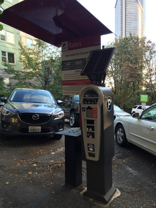
Take a good look at the photo below and tell me how absolutely genius this set up is.
Genius
For starters, the smaller item on the far right with the slick rounded top is an electronic parking meter. You put in money or a credit card, select how much time you want to pay for, and it spits out a little piece of paper you stick on your dashboard.
Note that the parking meter has a solar panel on top of it, presumably to keep it powered or partially powered.
Now take notice of the larger “thing” to the left of the electronic parking meter. This is signage informing the would-be parker about parking rates, instructions on how to pay for parking, and undoubtedly some language that says something about the parking company takes no responsibility for lost, damaged or stolen stuff. Aka, fine print.
The designers of said signage thoughtfully included an awning over the signage, presumably to shelter is reading the instructions from the rain (this is Seattle, after all.) The awning manages to stretch over the a portion if not all of the solar panel on top of the parking meter. Again, I’m sure, to keep the Seattle downpour off of whomever while the parking people get their money.
Both of the signage and electronic parking meter are situated somewhat under a very large tree, the branches of which create a leafy canopy.
Now, I get that solar power has come a LONG way, but this is genius.
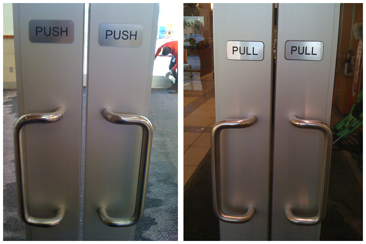
I have no IDEA why I’ve been thinking about “Norman Doors” lately; it may have been while watching an older episode from Modern Family where Claire gives herself a shiner while being boss for the day at her dad’s closet company.
Most in the UX community are familiar with the phenomenon, but for those unaware it’s relative simple. A “Norman Door” is simply a door that one simply cannot determine exactly if it is meant to be pushed open or pulled open. (The title is named after the well-known Donald Norman.) Conflicting handle design (vertical or horizontal) and signage (“Push” or “Pull”) may often be at odds with one another.
I found a nifty little blog post with great examples of Norman Doors at 703 Creative.
Photo credit: 703 Creative
The post has some great examples that will generally leave you head scratching, but hopefully wary next time you approach the entrance to your local shopping mall.
Aaron Tenbuuren, a color blind designer, offers perspective on how we can consider color blindness when designing, as he writes in his recent post, “Designing For (And With) Color Blindness.”
I didn’t realize (or maybe I forgot the number) that one in ten individuals are color blind. While a relatively small portion of the population, they are still users of apps, sites, experiences. Multiply that number and it leads to a large percentage of potential users/visitors/customers who find using your site or app difficult and/or not worth the effort.
I’ll find nice photographs that have great color palettes, pieces of furniture, paintings, anything. These already established and proven pieces are a great source of color influence.
I appreciate Aaron’s inspiration for color palettes – particularly since it exists in the physical world, outside the online one. Even more so when you consider how he experiences color. Not an absence of (which I previously associated color blindness with), but difficulty in labeling or telling one color from another.
I once had a color blind, color photography instructor in school. We would constantly ask him (to the point of annoyance, I’m certain), to identify colors in our photos, or in the subject matter we were photographing. He’d get it right 100% of the time, which just blew me away. And his photographs were equally as stunning.
There is something to learn from a different approach seeing and experiencing color. Perhaps Aaron and my instructor understand color better then individuals with normal sight do.
I stumbled across a great peer website today and wanted to pass it along. If you already know about Michael Locke (UI/UX Design, Training & Education), then feel free to leave “Old” in the comment section for this post.
Michael Locke is a Lead UX Designer with ADP with over 15 years web design experience, front end web development proficiency, marketing, photography, and a ton of groovy, savvy knowledge in related fields. From his “About” section, “I have a huge passion for helping people succeed.” Boom. There it is.
I highly recommend bookmarking his website and checking in now and then.
A recent NY Times article, Are Tiaras the New Power Scrunchies?, and a second article on Jezebel.com,How to Choose the Perfect Business Tiara, highlight the tiara as the latest power accessory; completely acceptable as part of a woman’s business-wear ensemble, and not to be taken lightly when selecting and wearing. Yes, there are rules about wearing tiaras; whatever it takes, embrace your personal glitter power.
In the spirit of the Holiday Season and the 3%, I give you my possible tiara choices. Enjoy.
Bespoke 1920’s Style Headband by StanAndMay on Etsy.com
Simple Crystal Bridal Headband by EdenLuxeBridal on Etsy.com
Greek Goddess Laurel Leaf Tiara by AnneMarguerite on Esty.com
Microsoft CEO Satya Nadella, when asked what advice he would give young women in the tech industry regarding asking for a pay raise, offered this:
Which is, it’s not really about asking for the raise, but knowing and having faith that the system will actually give you the right raises as you go along.
And that, I think, might be one of the additional superpowers that, quite frankly, women who don’t ask for a raise have. Because that’s good karma. It’ll come back because somebody’s going to know that’s the kind of person that I want to trust. That’s the kind of person that I want to really give more responsibility to. And in the long-term efficiency, things catch up,
Essentially ladies, even if you don’t ask for a raise, you’ll eventually get fair pay. If this were true, I’d be making six figures annually.
The comments he made were a ramble, and hopefully do not really express his actual feelings on the matter. If not, it reflects abysmally on Microsoft, and its culture/attitudes.
Perhaps Mr. Nadella should speak at The 3% Conference, championing creative female talent and leadership.
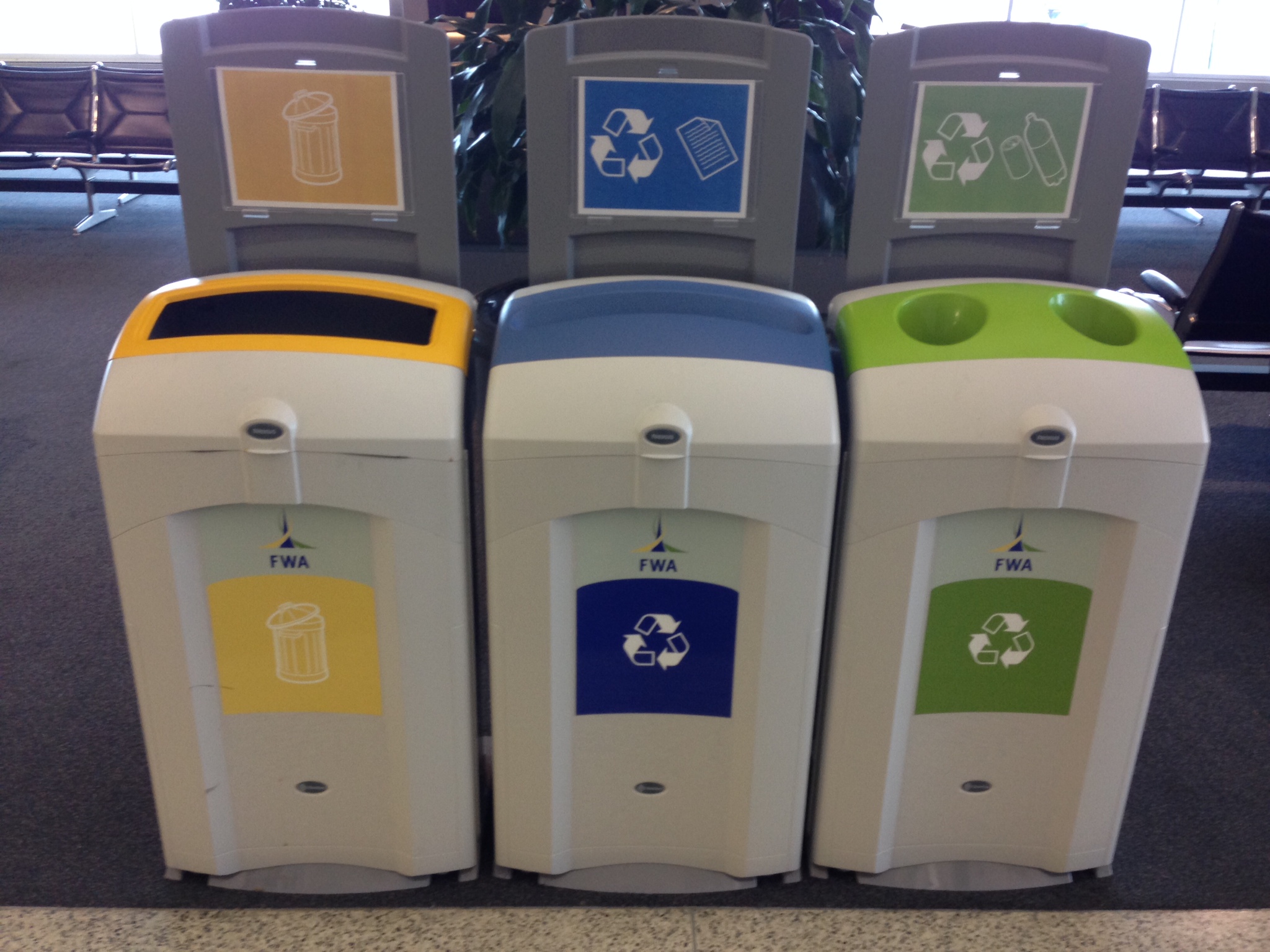
Recent travels made me aware of how airports are really into accommodating Trash, Recycle, and Compost and all the inherent iterations and separation requirements. Snapped this example at the Fort Wayne International Airport (Indiana). I thought the use of different shaped openings, color, and iconography was really interesting, particularly the use of yellow for garbage. At least, I’m assuming it’s for garbage even though the icon reminds me of the design-y countertop food waste containers.
It only recently occurred to me that there are two, well-known, UX professionals with nearly identical names. They both contribute frequently to A List Apart and UIE. (For those of you in the industry, you know who I’m talking about.)
Stephen Hay: is a front-end design and development consultant based in the Netherlands. He is the author of Responsive Design Workflow (Peachpit/New Riders 2013), a contributor to Smashing Book #3, and a frequent speaker.
Stephanie “Steph” Hay: is a content and UX consultant whose clients include Happy Cog and UIE.