UX Mobile Immersion Conference 2014 – Day 1

I begged the powers-that-be to send me to the UX Mobile Immersion Conference (#UXIM) in Denver, Colorado this year. I started submitting requests and rationale in November 2013. Since I got a passive aggressive “nope,” I’m living vicariously through Twitter right now, following #UXIM. There are some amazingly fun and informative tweets coming from the conference right now, my favorites listed below.

  • People swap devices 21 times an hour… continuity matters.
  • #1 goal is to achieve content parity.
  • Start with a small screen first, then expand until it looks like shit. Time to insert a breakpoint. (Stephen Hay via Brad Frost)
  • Navigation (especially complex), should be scannable. There are lots of design patterns that are becoming de-facto standards.

From Brad Frost: Using Atomic Design to Create Responsive Interfaces

  • 5 Principles of Adaptive Design: Ubiquity, Content Parity, Performance, Enhancement, and Future Friendly
  • “Vocab word of the day: Interdigitate
  • “If you need to convince someone to care about the mobile web, all you need to say is ‘social.'”
  • “We’re not designing pages anymore; we’re designing systems of components.”
  • “Respect their users and their time. Road blocks and interstitials are bullshit.”
  • “Phablets – dirtiest word in technology.”
  • “More iPhones are sold every day than babies are born.”
  • “Responsive design is not expensive. The dynamic web is expensive, responsive design is not to blame.”
  • “Mobile First Design forces you to take a hard, cold, look at the priorities of your site’s navigation.”
  • ‘Don’t just do a content inventory… it’s just as important to do an interface inventory.”
  • “Carousels on home pages exist to keep people from beating the shit out of each other in meetings” #shouldiuseacarousel
  • “If you are hiding something for mobile, you are doing it wrong.”
  • If your content doesn’t make sense on mobile, you need to ask yourself if it makes sense at all.”
  • “We sell websites like paintings. Instead, we should be selling beautiful and easy access to content.”
  • “Atoms (HTML Tags) -> Molecules (functionality) -> Organisms (modules) -> Templates (content structure) -> Pages (content presentation)”

BkoT0NCCYAACs5D


From Ben Callahan: Workflow on Responsive Design (RWD) Projects

  • “You best solve problems using tools you are fluent with.”
  • “Do the dishes and people will follow.”
  • “The amount of process required is inversely proportional to the skill, humility, and empathy of your team.”
  • “If you don’t have the authority to say “no”, it’s not a collaborative process.”
  • “Constraints–you need them to create.”
  • “Our specializations of expertise are fragmenting the experiences we build.”
  • “Create guidelines instead of rigid process. “
Bko2bG2CMAAkHU8
Meeting Notes by James Matchett, Careerbuilder


The UI of airplane cockpit design

[Fair warning. I’m writing about the UI design of airplane cockpits in the midst of a mystifying airplane disaster that has consumed the planet for nearly 4 weeks, Malaysia Flight 370. Which made me start reading about previous air disasters, which led me to Air France 447.]

Prior to the MF370 incident I read (on vacation), “The Unthinkable: Who Survives When Disaster Strikes – And Why” by Amanda Ripley. It’s a fascinating look at how our brains are wired (or not wired) to react when disaster strikes, be it natural or man-made. Basically, most people think they’re going to act and behave a certain way, but don’t, which results in living or dying. Ripley examines, via survivor stories and research, that for every super power our brain gives us during a stressful situation (example: super human strength), the brain also takes something away, such as our vision or hearing. Also, seemingly simple motor tasks may become too complex to achieve, like putting on a life jacket, unbuckling a seat belt, opening a door, revealing why muscle memory can be the key to survival. In a nutshell, areas that control certain aspects of our brain under normal situations are minimized while other aspects become more dominant.

In her book Ripley describes an aviation accident in which, during routine landing approach, the landing gear indicator light failed to illuminate. The crew remained airborne while they worked to trouble shoot the incident, unaware that they were still descending, despite the fact that the audio warnings were going off in the cockpit. Ultimately the flight crashed, and it was determined that the crew was so fixated on the indicator light (which turned out to be a burned out bulb), that they didn’t hear the warnings. This is just one example of how our cognitive systems react to extreme situations. Under a normal scenario, the crew would have heard and reacted appropriately to the alarms, but the increased stress and narrowed focus obviously affected what the crew heard and saw.

Air France 447
On May 31, 2009, Air France 447 (an Airbus A330), en route to Paris, France, crashed into the Atlantic Ocean. The BEA’s (Bureau d’Enquetes et d’Analyses – French air accident investigation agency) final report concluded the aircraft crashed after temporary inconsistencies in the airspeed sensors caused the crew to react incorrectly, leading to an aerodynamic stall from which they could not recover in time.

Whether it was pilot inexperience and/or lack of familiarity with the controls and inputs, the PF (pilot flying – total flight crew of 3) kept pulling the stick back, which ultimately caused the Airbus A330 climb to unrecoverable stall.  Without overwhelming you with details regarding angle of attack, lift coefficient, pitch inputs, and etc., the plane entered an electromagnetic thunderstorm which disengaged the autopilot, to which the pilot flying (PF) reacted by pulling the stick back. Despite 75+ repeated audio stall alerts, the flight crew was unable to comprehend what was happening to the aircraft. Even if one pilot was unable to understand what was going wrong, how is it that his two colleagues failed to notice the issue (PF pulling back on the stick)? Possibly contributing to the crew’s confusion and panic were several major factors:

  • Some of the primary cockpit display panels were dark (went black, no longer displayed data) because the computer that receives the data was no longer able to make sense of what was coming in (due to lack of minimum airspeed, temperature), and subsequently turned the cockpit displays off
  • The other pilot in the cockpit did not likely see the PF pulling his stick back, due to the location of the side stick and the fact that the side sticks to not move in tandem like traditional yoke controls.
  • Airbus auto-thrust bypasses the manual levers entirely, they don’t move. Instead, pilots have to check their cockpit display panels.

Side sticks
The A330 is controlled by side sticks that, as the label implies, are located beside the pilots’ seats. They resemble joysticks from video game consoles. The side sticks aren’t connected to the control surfaces by levers and pulleys as in older aircraft, but instead side stick commands are fed to computers that send signals to the engines and hydraulics. Often called “fly-by-wire” technology, it has advantages in reduced weight, therefore saving fuel, they have fewer moving parts, have backup systems, and are programmed to compensate for human error. The sticks also enable pilots to concentrate on other aspects of flying because once a command is given, the pilot can release the stick after a few seconds.

However, because the stick is at the side of the pilots seats and not in front of the pilots like the traditional control yoke, one pilot may not be able to see what the other pilot is doing, unless that pilot makes a big effort to look across the other side of the flight deck, which is not easy or convenient, especially in a tense situation when other inputs require attention. Additionally, side sticks do not reflect what command one stick might be receiving. Recall how a traditional control yoke situated in front of the pilot: when one yoke is pulled forward or backward, the other yoke will move in tandem, indicating what the PF is doing. Another aspect of the side stick is  that if both pilots move their respective control sticks, the inputs are averaged.

Glass Cockpit
The A330 also features a “glass cockpit” (as does current Boeing designs).  A glass cockpit features digital instrument displays, typically large LCD screens instead of traditional analog dials and gauges. While the traditional cockpit (aka “steam cockpit”) relies on mechanical gauges to display information, the glass cockpit displays are driven by flight management systems which can be adjusted to display flight information as necessary. Ultimately this simplifies aircraft navigation and operation. Glass cockpits are popular with airline companies because they tend to eliminate the need for a flight engineer ($$$$ saver).

However, with the dependency on the glass cockpit systems, comes the need to train crews to deal with glass cockpit blackouts and failures. On 25 January 2008 United Airlines Flight 731 experienced a serious glass-cockpit blackout, losing half of the ECAM displays as well as all radios, transponders, TCAS, and attitude indicators. Partially due to good weather and daylight conditions, the pilots were able to land successfully at Newark Airport without radio contact.

In 2010, the NTSB published a study done on 8,000 general aviation light aircraft. The study found that, although aircraft equipped with glass cockpits had a lower overall accident rate, they also had a larger chance of being involved in a fatal accident.  The NTSB Chairman said in response to the study:

Training is clearly one of the key components to reducing the accident rate of light planes equipped with glass cockpits, and this study clearly demonstrates the life and death importance of appropriate training on these complex systems… While the technological innovations and flight management tools that glass cockpit equipped airplanes bring to the general aviation community should reduce the number of fatal accidents, we have not—unfortunately—seen that happen.

Auto-thrust
Airbus computers can automatically adjust the engine thrust to maintain whatever speed is selected by the crew. This means pilots do not need to keep fine-tuning the throttles on the cockpit’s centre console to control the power. But a curious feature of Airbus “auto-thrust” is that it bypasses the manual levers entirely – they simply do not move. This means pilots cannot sense the power setting by touching or glancing at the throttle levers. Instead, they have to check their computer screens. According to Boeing, some airline pilots do not like the absence of motion in the flight deck, which is why Boeing’s system the manual handles move even when the system is in automatic mode.

It has been debated that if AF 447 had been a Boeing aircraft the pilot would have realized  the PF had the stick pulled back, as Boeing cockpits are still designed with center column steering. Boeing has also persisted with some conventional controls in it’s fly-by-wire aircraft, even the 787. Boeing cockpits still require levers that have to be pushed and turned like older mechanical versions, despite the fact that the levers send impulses to computers. The controls still have to be held in place or a maneuver to be accomplished. Some pilots think the Boeing approach overly conservative, and it makes it difficult to transition from one type of flying to another. Despite the fact that hand-flying is not as common because of automation for fatigue reduction and reliability, there is something to be said for visual and haptic feedback, particularly in a scenario when not all senses are functioning normally and inputs are under duress. Not to mention having critical displays visible at all time.

In regards to flight AF447, BEA director Jean-Paul Troadec and his team pointed at human-machine interface issues that made the situation extremely confusing for the crew at the controls of the plane. Ultimately, safety comes from both the pilots’ cognitive abilities and the signals they receive, Troadec concluded. He also stated, in response to the audio stall warnings being ignored, “it could have been a matter of sheer perception…Audio alarms are no longer heard in some situations.”  This has prompted the BEA to recommend the addition of a visual stall warning. The BEA report recommended more training for dealing with unexpected situations as well. 

Article sources/inspiration:
A Startingly Simple Theory About the Missing Malaysia Airlines Jet
Wikipedia: Air France Flight 447
Final AF447 Report Suggests Pilot Slavishly Followed Flight Director Pitch-Up Commands
Air France Flight 447: ‘Damn it, we’re going to crash’


Not Charming

I love it when coworkers share websites or apps with me because of either great or horrible experiences. I love it when they proclaim, out loud, “WTF?” It’s the siren song for a UX person in an interactive agency. It’s also an affirmation because their reactions tell me I’m not the only one that notices kooky or poorly designed experiences that make a website difficult to use.

Case in point, Microsoft Surface website. Specifically, the product pages. At first glance, there is a fairly innocuous navigation panel on the right-side of the screen. A common website navigation element, the menu is a list of links that anchor or “jump” the visitor to a corresponding section of the page.

Location, location, location
The first thing that caught my attention was the location of the navigation panel itself in relation to the page. I generally encounter this type of navigation on the left side of a web page. My working assumption is that the navigation panel was placed on the right side in order to replicate, to some extent, the Charms bar in Windows 8 in order to familiarize potential customers with Windows 8/8.1 OS features. (For those unfamiliar with the Charms bar, it contains search, access to settings and contextual app menus. And it appears from the right side of the OS when activated by a swipe or click on the right.)

Image
Default state of the Surface Pro 2 page.

Granted, I don’t have to use the navigation panel menu items to access the information on the page. I can scroll up and down. But like any good navigation labeling, the labels give me clues into the section contents and the information. Not too mention, it’s faster to use the menu if I want to skip around. Also, the panel location in relation to content (and vice versa) changes depending on the width of my browser window because it’s a responsive site. Which means that my mom is not going to know she can expand the width of her browser window to see the information or access the calls to action, and will call me to complain.

Image
Navigation panel open

Label System
The first item at the top of the navigation is a single house icon with no descriptive label. I’m assuming that since it’s a house, it means “Home.” But which “Home?” Surface.com? Microsoft.com? Additionally, both the “House” icon and the first link in the navigation, “Surface Pro 2” go to the same anchor at the top of the page. So,  the Home icon is unnecessary if there’s a better link to do the job and the use of the Home icon is misleading. The visitor isn’t going Home, they’re going to the top of the page.

Image

Not to get too nit-picky, but whatever.

The label system is inconsistent. I prefer navigation labels on any site or app be similar, such as all descriptive or all actionable. The navigation across all three product pages is a combination of descriptive labels and actions.

Additionally there are two different navigation labels for buying the product, “Buy Now” and “Get it now,” even though all the buy buttons on the page are labeled “Buy Now.” Sure, it’s a minor discrepancy, but like paper cuts, they add up to one big painful experience.

Obscuring Content and Calls to Action
Moving into the page itself, using the nav menu, it becomes clear that the placement is not ideal. In fact, it’s questionable. The panel partially covers written content, details and primary imagery placed on the right side of the page, as well as the almighty “Buy now” buttons. Responsive or not, information on the screen is there for a reason and if it’s not accessible, then what’s the point?

I can’t believe that someone didn’t say, “woah, hang on” before the site went live. This is after all, the flagship website for Surface products. Every word and image of the product on the page is critical to influencing potential customers and selling the product.

Image
Product feature information obscured by the navigation panel.

And it isn’t just one instance of the navigation covering critical information and CTAs (calls-to-action) on the Surface Pro 2 product page, all three of the product pages suffer from this debilitation.

For example, “New Kickstand” is hidden by the navigation panel. In order for the visitor to see it, she has to move her mouse out of the panel in order to close the panel (or expand the browser, if she’s savvy enough). If she wants to continue using the panel to navigate the page, she has to position her mouse back over the closed panel to open it, then click on the next menu item she wants to see. A lot of unnecessary actions and movements.

Image
Kickstand imagery is obscured by the navigation panel.

Additional Content
Each product page has a content section not included and therefore not accessible via the navigation panel. For example, in the screenshot below for Surface 2, the section about the new touch and type covers is not in the navigation menu. In the screenshot for Surface 2 Pro, the section for the docking station is not evident in the menu either.

This “approach” is implemented across all three product sites. As mentioned previously, since visitors will often look for keywords or phrases in navigation to determine if what they’re looking is on the page or in a section (aka “information scent“), why are these sections not included? Yet, there are two different ways to get to the top of the page and two different versions of Buy Now? I’m at a loss.

surface2_1
Information section about the new and improved Touch and Type covers is not in the navigation menu.
surface5
Information section about docking stations is not in the navigation menu.

E-commerce
From a make-it-super-easy-to-purchase-the-product-and-feel-confident-about-it perspective, two  no-no’s that would bring Amazon.com’s KPI’s to their knees: Obscuring price and ability to purchase. In the screenshot below the price for the Surface Pro 2 is obscured by the navigation panel in the “Buy Now” section of the page, and in the second screenshot “Get It Now” is also hidden by the panel. These, in addition to the differently labeled Buy Now CTA’s mentioned in the above Navigation section.

Image
Price point is hidden, next to the Buy Now button. Also, the nav panel cover and the background color are identical, creating a bizarre affect.
surface5
“Get it Now” in the navigation panel vs “Buy Now” label on the button, which is obscured by the panel. Brilliant. Also, the Docking section isn’t even in the menu.

So what does it say about Surface when information is obstructed by navigation and by a potentially poor implementation of responsive design intended to help the customer learn about their product offering?

Putting on my black hat here, this is not how you design an e-commerce experience and expect to sell product. Nor is this the best example of an responsive, information-based website intended to generate interest, shift perception, and be accessible.

Can you find the scroll bar?

The coworker that sits next to me turned to me the other day and said, “Where’s the scroll bar?”

Image

When I looked over at her screen, it was in fact apparent that scroll bar was not visible. She was uncertain how to scroll down the page without being able to click and hold the scroll bar. When we reduced the width of the page, the scroll bar did appear. To her dismay, it was white with a small outline. Not exactly an easy target. Image

I’ve noticed the absence of the scroll bar when I work exclusively on my laptop (as opposed to connecting to a larger monitor), and find it particularly annoying to navigate any application or website if I don’t have my Magic Mouse with me. I don’t know if it’s a trend or the nature of applications on a newer OS, but in my  (humble UX) opinion, it’s an irritating feature. And for those people like my coworker, it creates confusion and interrupts their ability to accomplish their tasks and goals.

One of the most common myths about website usability is that people don’t scroll. This often leads to the dreaded “fold” debate. Duh, people scroll. It’s natural. We’ve been scrolling for decades. Even more so with tablets and smartphones these days (aka “swiping”). But hiding the scroll bar doesn’t mean that people will know it’s still possible to do so.

Benchmark study on e-commerce checkout experiences

I’m currently working on a purchase flow for a service-based product. In other words, there’s no shipping involved. In doing some research and reviews on an acceptable way to set expectations for how taxes are calculated, I stumbled across a great resource produced by Baymard Institute. They’ve created several usability reports, one of which is dedicated to the Checkout Usability in which Baymard has evaluated 100 retail websites on a set of usability guidelines. Ultimately each site is scored across 6 individual components: Flow, Focus, Data Input, Copywriting, Layout, and Navigation, and then ranked from 1-100. While you need to purchase the report in order to see the positive and negative critiques, the site does allow you to view the benchmark results, as well as filter the sites in several categories. It’s awesome if you need to view multiple examples of shopping carts and checkout flows quickly and without having to go through the flows on 100 retail sites.

The Fold. OMG, why are we still talking about this?

I was asked the other day for a brief POV on “the fold.” I know, cringeworthy.

The Fold 
The concept of content being placed “above the fold” is a carry over from long-established newspaper principles. Traditionally, anything on the front page and above the fold would be seen by a prospective customer. So, in order to sell more papers, newspapers put their top stories on the front page and “above the fold.”

Early Internet Use
Fast forward to the dawn of the masses starting to use Internet. At that time, the only mental model for presenting and consuming information was based on print: newspapers, magazines, brochures. Most monitors were a standard size and resolution, 800×600, and scrolling a page was unfamiliar to approximately 80% of people. It seemed logical at the time to place the most important content above 600 pixels; anything above that line, aka “the fold” would show up without scrolling.

The Internet is Everywhere
Today we have more resolution and screen sizes than we can count, much less target effectively. The fold exists differently on every device, monitor, setting, essentially nullifying the concept. It is more effective to disregard the fold and focus on clearly stating the value prop of the product or service. Compelling content drives attention. People scroll and read (or scan) based on interest, not based on pixels or placement. One user may skip over your top story because it’s not interesting to them, not because they didn’t see it. There is an ever-growing need to make words and pictures consumable across an ever-widening sea of options.

Users know how to scroll. So long as the site brings the user closer to their goals, their tasks, satisfices their needs, they will scroll and click. Know thy user, but also know how they’re viewing and interacting with your site and on what type of device(s).

Cramming tons of stuff above the fold may potentially inhibit users from being able to complete their tasks and goals, and create the perception that the brand doesn’t know it’s customers, nor care about them by making them work harder and spend more time to find what they need.

Sources:
Did somebody say: Above the fold, Erin Lentz,  August 23, 2013
Adapt or Die, and the Fold is Dead, Tracey Halvorsen, April 20, 2012
Above and Below the Fold: Stop Talking about the Stinkin Fold, Chris Lema, January 14, 2013
http://thereisnopagefold.com/

What we can learn from Healthcare.gov

hcg_screenshot

The Healthcare.gov launch fiasco, subsequent Congressional hearings, daily bug updates, and Google engineer assistance has revealed just how poorly the United States government builds technology.

Two recent articles, one from Theverge.com and the second a NYTimes Op Ed, outline in beautiful simplicity, just how messed up the government’s approach to building technology is, from the presiding mentality to the archaic procurement process and beyond.

Death by a thousand cuts – a recent product registration experience

The old saying, “Death by a Thousand Cuts,” is defined in Wikipedia as a form of torture and execution once practiced in Imperial China, as well as “Creeping normality” – the way a major negative change, which happens slowly in many unnoticed increments, is not perceived as objectionable.

Quite often, small, seemingly insignificant overlooked details reveal themselves during a user flow or process (in this case, product registration) to the point that when viewed in summation, the overall experience feels anything but delightful and ultimately negative. I get irritated because this kind of stuff isn’t rocket surgery. It’s not even rocket science. Registering a product with the manufacturer or service provider online should be easy. We know all the information, it’s generally right in front of us, and all we need to provide is our address for crying out loud. No longer are we required to cut the bar code out of the packaging and mail it in, or fill out a product registration postcard that comes with instructions and warranty.

Recently during a product registration comparative analysis, I felt like I was tortured trying to register my Samsung Galaxy Note 3. Right out of the gate, small things started adding up.

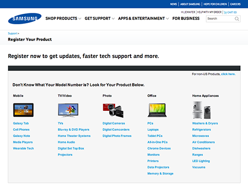
To begin with, I had to find where to register my product. Luckily I’d been auditing other websites and it seems that most companies tuck the action in the Support section of their websites. At the Samsung Register Your Product page, since I didn’t know what my model number was, I started scanning the list of links under the Mobile column. Immediately I had to determine whether or not I was supposed to select “Cell Phones” or “Galaxy Note.” It’s a Galaxy Note 3, so isn’t it a cell phone and a Galaxy Note?

samsungReg_1

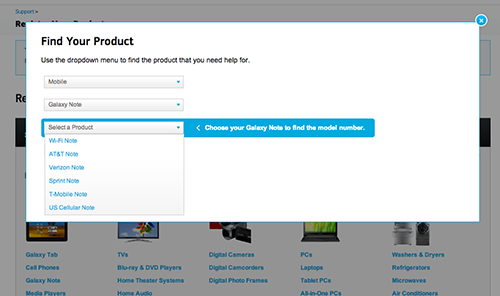
I tempt fate and click on the link labeled, “Galaxy Note.” In a overlay with a series of pull down menus, my next step is to “Select a Product” from a list of cell phone provider “Notes.” The helpful prompt reads, “Choose Your Galaxy Note to find the model number.” Wah? My product is a Galaxy Note 3 (not in the list) and my carrier is T-Mobile. What is a T-Mobile Note?

samsungReg_2

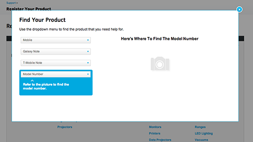
After selecting “T-Mobile Note” (living dangerously, I know), one last drop down menu to go, until the next flaming hoop. Fortunately for me the final drop down menu labeled “Model Number” displays yet another helpful prompt, “Refer to the picture to find the model number.” The picture, I guess, displayed to the right of the drop down menu under the heading, “Here’s Where To Find The Model Number.” One small problem. What’s missing from this picture?

samsungReg_3

Answer: The Picture.

Alrighty, so that’s lame and not very helpful. Maybe I can guess the Model Number. I click on the menu to reveal my options:

samsungReg_4

Nope. Not gonna try. I flip the device over and examine the back, thinking perhaps there’s something similar to my iPhone. Nothing on the back. Just the black, fake-leather back with T-Mobile/Galaxy Note 3 emblazoned on it. I remove the black, fake-leather back. Now I’m looking at the battery. Still nothing.

Off to Google I go. I start by searching for how to find my model number for my Galaxy Note 3. Fortunately for me, someone put a tutorial on YouTube.

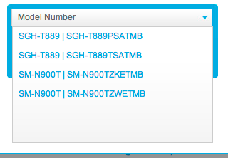
I remove the black, fake-leather back. I pull the battery out. There it is. Oh but wait, it only shows the first 6 characters, “SM-900T.” Where’s the other number in either ZWETMB or ZKETMB? I got nothing.

Once again, I decide to guess. This time, however, I assume that the “W” stands for “White.” Since my Galaxy Note 3 is black, I select the “ZKETMB” option. Fingers crossed.

Success! According to the rather small product photo, I guessed correctly. The confirmation language however, is anything but close to what I registered. “We have saved the Samsung (correct) T-Mobile (also correct) Cell Phones (I registered a Galaxy Note 3, and only one of them, as in, not plural) to your account.” Oh well, close enough.

samsungReg_6

Now all I have to do is add some additional information and I’m done.

The instructions tell me, “Fill in as much as you can now. Keep in mind, you can always return and finish at a later time.” Sounds optional to me.

However, in bolder, bigger text, the screen gives me a dire heads-up, “In order to get support, you must enter the HEX/MEI Number and purchase date of your product.” (In my head I hear Gandolf the Grey saying, “You must enter!”)

And, also per the instructions, “Please use the HEX/MEI Number found on the actual product, not the box.” Okay, fine. But it makes me think, why wouldn’t they be identical? What makes the HEX/MEI on the box (actually labeled “Handset IMEI”) not usable? Naturally, I had to check the box against the device. Just as I suspected. They’re identical.

I proceed to enter the HEX/MEI number (from the device) and the purchase date. I decide to skip the rest of the information fields because this whole process is taking longer than I intended and since the remainder of the information is optional…

samsungReg_8

Okay, to be fair, I had information in the zip code field. But the instructions said to fill in as much as I could now. Doesn’t that infer partial completion? And how come the “State” pull down menu isn’t outlined in red with instructions to select a state like the other blank form fields?

Fine. Whatever. I fill in the rest of the contact information to make the website happy. And click the “Submit” button at the bottom of the form. I just want this to be over.

samsungReg_9

SERIOUSLY!? A blank screen with a Chrome dialog box? Is this an alert? A Warning? The product is already registered to my account!? How is this possible? Hello? I’m trying to complete my registration. I click on the “OK” button, expecting to be automatically returned to my partially complete product registration page.

samsungReg_10

Instead, I get a blank, “Register your Product” page.

You’ve got to be kidding me.

I think at this point the average consumer would have tried to contact Samsung, or call their 13-year old nephew to figure this out. However, being a UX person, I feel my sense of obligation to keep pushing through.

In short order:
I hit refresh a couple of times until I get back to the product registration page I was on originally.

I decide to remove the product by clicking the “Didn’t mean to add this product, click here to remove” link to start all over again. (And by the way, it would be impossible to accidentally add “this” product, as the copy infers.)

Instead of removing the product and starting me back at step 1, the site just keeps refreshing the partially complete product registration page. Only it’s removed the date of purchase.

Obviously, I’m tempted to see how this is affecting “My Account”. Do I have zero products? Or more than one Samsung Galaxy Note 3? I get a blank page for my answer.

After a good 6 minutes of troubleshooting, I get into My Account. I have one Samsung Galaxy Note 3, (carrier: T-Mobile) registered. It took me nearly 25 minutes.

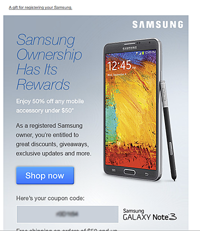
I get an email congratulating me on my successful registration (“A gift for registering your Samsung”). Apparently, ownership has it’s rewards. My reward is 50% off any mobile accessory under $50. Awesome, I’ll buy a case for this puppy.

samsungReg_11

I click on the big, juicy “Shop now” button and am presented with a page of accessories for under $50. Yet none of the accessories shown are for a Galaxy Note 3. At first I’m confused. Why are they showing me accessories for a product I don’t own?

samsungReg_12

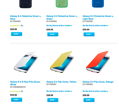
And then it hits me. All of these products are under $50.  But cases for the Samsung Galaxy Note 3 start at $59.99. Not only are they linking me to accessories I can’t use because they’re for the wrong product, the product I actually want doesn’t appear to qualify for the 50% coupon code.

While I wish I had a witty, stellar summation to wrap this up, but I don’t. It’s worth pointing out how this experience is a great example of what happens when small, seemingly insignificant details add up to inflict damage on the end-user:

  • Damage in the sense of loss of trust and consumer confidence.
  • Damage as in negative feelings towards the brand.
  • Damage as in the erosion of the user perception that the brand cares about its customers and their ongoing product experience.

Consumers’ Mobile Path to Purchase: 5 key findings

In this constantly connected world, people use their smartphones throughout the day to find information, shop, and stay connected. Google commissioned Nielsen to conduct a study of smartphone users who recently made a purchase to better understand the role of mobile in the research and shopping process. Through a combination of surveys and metered data of actual mobile consumer behavior, Google uncovered five key findings:

  1. Consumers spend time researching on mobile: Consumers spend 15+ hours per week researching on mobile sites and apps. They visit websites 6 times on average in the purchase process.
  2. Mobile research begins with search: 48% of consumers start mobile shopping-related research using search engines, more than they start on branded apps or websites.
  3. Location proximity matters: 69% of consumers expect a business to be within 5 miles of where they’re located.
  4. Purchase immediacy is key: 55% of consumers want to purchase within an hour, 83% within a day.
  5. Mobile influences purchases across channels: Of those who made a purchase and researched on their phones, 82% purchased in-store, 45% bought online (desktop/tablet) and 17% purchased on mobile.

With smartphone penetration in the US nearly doubling year-over-year from 31% to 56%1, it’s clear that the mobile savvy shopper is here to stay.

Key Implications
Below are ways that advertisers can use these insights to better reach the mobile consumer and drive more business:

Ensure you have a mobile-optimized site
Consumers expect a business to have a mobile-friendly website. To create a mobile-optimized experience, you’ll want to start by analyzing how your consumers currently interact with your website, what they’re looking for, where they’re visiting from, etc. These insights will provide hints for creating a mobile website that meets your consumers’ needs. For more information on building sites that are optimized for mobile and other devices, check out these resources.

Tailor your search ads for the mobile shopper
As search is the most common starting point for mobile shopping research, it’s important to have mobile ads running so you’ll be there when consumers are looking for you. You can help consumers get the information they need by designing your search ads with mobile-preferred creatives, such as “Call now” or “Visit our mobile site.”

Use location extensions so consumers can find you
Location extensions allow you to attach your business address to your ads, which lets consumers know how close they are to your business and provides directions for consumers to get to your store.

Facilitate faster checkouts
Showing local in-stock inventory with local PLAs, enabling click to call and building fast, seamless mobile checkout experiences with tools like Google Wallet Instant Buy are several ways advertisers can help consumers complete their purchases quickly.

Measure conversions across channels with cross-device conversion tracking
Consumers purchase across channels, often times starting their research on mobile, then buying in-store or on their computers. Advertisers can better understand how mobile ads drive purchases by using estimated cross-device conversion to measure conversions that start from mobile research.

To explore more of the findings from the Mobile Path to Purchase research, view the full presentation at the Think with Google site.

From Inside Adwords, posted by Bao Lam, Performance Ads Product Marketing Manager. 

1 Google & Ipsos Our Mobile Planet, 2011-2013