
Looks like the former executive for Microsoft Office, Kurt DelBene, will be the new leader of the Healthcare.gov. He’ll start work as a senior advisor to Kathleen Sebelius, managing the website and working toward improving its stability, interface, and security.
What we can learn from Healthcare.gov

The Healthcare.gov launch fiasco, subsequent Congressional hearings, daily bug updates, and Google engineer assistance has revealed just how poorly the United States government builds technology.
Two recent articles, one from Theverge.com and the second a NYTimes Op Ed, outline in beautiful simplicity, just how messed up the government’s approach to building technology is, from the presiding mentality to the archaic procurement process and beyond.
Death by a thousand cuts – a recent product registration experience
The old saying, “Death by a Thousand Cuts,” is defined in Wikipedia as a form of torture and execution once practiced in Imperial China, as well as “Creeping normality” – the way a major negative change, which happens slowly in many unnoticed increments, is not perceived as objectionable.
Quite often, small, seemingly insignificant overlooked details reveal themselves during a user flow or process (in this case, product registration) to the point that when viewed in summation, the overall experience feels anything but delightful and ultimately negative. I get irritated because this kind of stuff isn’t rocket surgery. It’s not even rocket science. Registering a product with the manufacturer or service provider online should be easy. We know all the information, it’s generally right in front of us, and all we need to provide is our address for crying out loud. No longer are we required to cut the bar code out of the packaging and mail it in, or fill out a product registration postcard that comes with instructions and warranty.
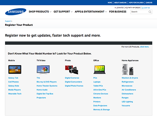
Recently during a product registration comparative analysis, I felt like I was tortured trying to register my Samsung Galaxy Note 3. Right out of the gate, small things started adding up.
To begin with, I had to find where to register my product. Luckily I’d been auditing other websites and it seems that most companies tuck the action in the Support section of their websites. At the Samsung Register Your Product page, since I didn’t know what my model number was, I started scanning the list of links under the Mobile column. Immediately I had to determine whether or not I was supposed to select “Cell Phones” or “Galaxy Note.” It’s a Galaxy Note 3, so isn’t it a cell phone and a Galaxy Note?
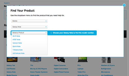
I tempt fate and click on the link labeled, “Galaxy Note.” In a overlay with a series of pull down menus, my next step is to “Select a Product” from a list of cell phone provider “Notes.” The helpful prompt reads, “Choose Your Galaxy Note to find the model number.” Wah? My product is a Galaxy Note 3 (not in the list) and my carrier is T-Mobile. What is a T-Mobile Note?
After selecting “T-Mobile Note” (living dangerously, I know), one last drop down menu to go, until the next flaming hoop. Fortunately for me the final drop down menu labeled “Model Number” displays yet another helpful prompt, “Refer to the picture to find the model number.” The picture, I guess, displayed to the right of the drop down menu under the heading, “Here’s Where To Find The Model Number.” One small problem. What’s missing from this picture?
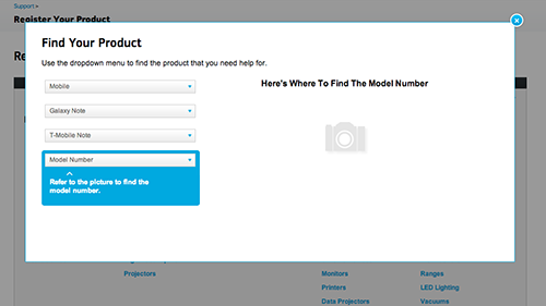
Answer: The Picture.
Alrighty, so that’s lame and not very helpful. Maybe I can guess the Model Number. I click on the menu to reveal my options:

Nope. Not gonna try. I flip the device over and examine the back, thinking perhaps there’s something similar to my iPhone. Nothing on the back. Just the black, fake-leather back with T-Mobile/Galaxy Note 3 emblazoned on it. I remove the black, fake-leather back. Now I’m looking at the battery. Still nothing.
Off to Google I go. I start by searching for how to find my model number for my Galaxy Note 3. Fortunately for me, someone put a tutorial on YouTube.
I remove the black, fake-leather back. I pull the battery out. There it is. Oh but wait, it only shows the first 6 characters, “SM-900T.” Where’s the other number in either ZWETMB or ZKETMB? I got nothing.
Once again, I decide to guess. This time, however, I assume that the “W” stands for “White.” Since my Galaxy Note 3 is black, I select the “ZKETMB” option. Fingers crossed.
Success! According to the rather small product photo, I guessed correctly. The confirmation language however, is anything but close to what I registered. “We have saved the Samsung (correct) T-Mobile (also correct) Cell Phones (I registered a Galaxy Note 3, and only one of them, as in, not plural) to your account.” Oh well, close enough.

Now all I have to do is add some additional information and I’m done.
The instructions tell me, “Fill in as much as you can now. Keep in mind, you can always return and finish at a later time.” Sounds optional to me.
However, in bolder, bigger text, the screen gives me a dire heads-up, “In order to get support, you must enter the HEX/MEI Number and purchase date of your product.” (In my head I hear Gandolf the Grey saying, “You must enter!”)
And, also per the instructions, “Please use the HEX/MEI Number found on the actual product, not the box.” Okay, fine. But it makes me think, why wouldn’t they be identical? What makes the HEX/MEI on the box (actually labeled “Handset IMEI”) not usable? Naturally, I had to check the box against the device. Just as I suspected. They’re identical.
I proceed to enter the HEX/MEI number (from the device) and the purchase date. I decide to skip the rest of the information fields because this whole process is taking longer than I intended and since the remainder of the information is optional…

Okay, to be fair, I had information in the zip code field. But the instructions said to fill in as much as I could now. Doesn’t that infer partial completion? And how come the “State” pull down menu isn’t outlined in red with instructions to select a state like the other blank form fields?
Fine. Whatever. I fill in the rest of the contact information to make the website happy. And click the “Submit” button at the bottom of the form. I just want this to be over.

SERIOUSLY!? A blank screen with a Chrome dialog box? Is this an alert? A Warning? The product is already registered to my account!? How is this possible? Hello? I’m trying to complete my registration. I click on the “OK” button, expecting to be automatically returned to my partially complete product registration page.

Instead, I get a blank, “Register your Product” page.
You’ve got to be kidding me.
I think at this point the average consumer would have tried to contact Samsung, or call their 13-year old nephew to figure this out. However, being a UX person, I feel my sense of obligation to keep pushing through.
In short order:
I hit refresh a couple of times until I get back to the product registration page I was on originally.
I decide to remove the product by clicking the “Didn’t mean to add this product, click here to remove” link to start all over again. (And by the way, it would be impossible to accidentally add “this” product, as the copy infers.)
Instead of removing the product and starting me back at step 1, the site just keeps refreshing the partially complete product registration page. Only it’s removed the date of purchase.
Obviously, I’m tempted to see how this is affecting “My Account”. Do I have zero products? Or more than one Samsung Galaxy Note 3? I get a blank page for my answer.
After a good 6 minutes of troubleshooting, I get into My Account. I have one Samsung Galaxy Note 3, (carrier: T-Mobile) registered. It took me nearly 25 minutes.
I get an email congratulating me on my successful registration (“A gift for registering your Samsung”). Apparently, ownership has it’s rewards. My reward is 50% off any mobile accessory under $50. Awesome, I’ll buy a case for this puppy.
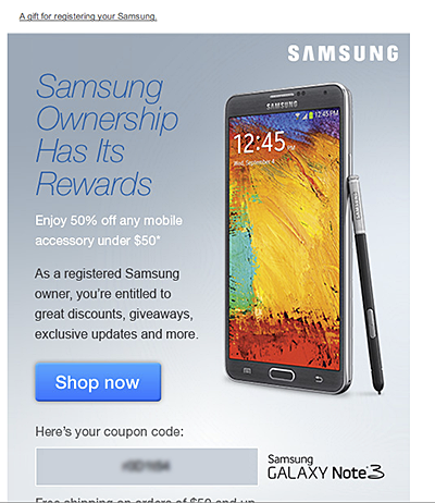
I click on the big, juicy “Shop now” button and am presented with a page of accessories for under $50. Yet none of the accessories shown are for a Galaxy Note 3. At first I’m confused. Why are they showing me accessories for a product I don’t own?

And then it hits me. All of these products are under $50. But cases for the Samsung Galaxy Note 3 start at $59.99. Not only are they linking me to accessories I can’t use because they’re for the wrong product, the product I actually want doesn’t appear to qualify for the 50% coupon code.
While I wish I had a witty, stellar summation to wrap this up, but I don’t. It’s worth pointing out how this experience is a great example of what happens when small, seemingly insignificant details add up to inflict damage on the end-user:
- Damage in the sense of loss of trust and consumer confidence.
- Damage as in negative feelings towards the brand.
- Damage as in the erosion of the user perception that the brand cares about its customers and their ongoing product experience.
Designing for Fingers and Thumbs Instead of Touch
Steven Hoober, by way of UXMatters.com, writes about how we may need to change our approach when it comes to designing interactions on mobile/small viewports. Check it out: Design for Fingers and Thumbs Instead of Touch.
Consumers’ Mobile Path to Purchase: 5 key findings
In this constantly connected world, people use their smartphones throughout the day to find information, shop, and stay connected. Google commissioned Nielsen to conduct a study of smartphone users who recently made a purchase to better understand the role of mobile in the research and shopping process. Through a combination of surveys and metered data of actual mobile consumer behavior, Google uncovered five key findings:
- Consumers spend time researching on mobile: Consumers spend 15+ hours per week researching on mobile sites and apps. They visit websites 6 times on average in the purchase process.
- Mobile research begins with search: 48% of consumers start mobile shopping-related research using search engines, more than they start on branded apps or websites.
- Location proximity matters: 69% of consumers expect a business to be within 5 miles of where they’re located.
- Purchase immediacy is key: 55% of consumers want to purchase within an hour, 83% within a day.
- Mobile influences purchases across channels: Of those who made a purchase and researched on their phones, 82% purchased in-store, 45% bought online (desktop/tablet) and 17% purchased on mobile.
With smartphone penetration in the US nearly doubling year-over-year from 31% to 56%1, it’s clear that the mobile savvy shopper is here to stay.
Key Implications
Below are ways that advertisers can use these insights to better reach the mobile consumer and drive more business:
Ensure you have a mobile-optimized site
Consumers expect a business to have a mobile-friendly website. To create a mobile-optimized experience, you’ll want to start by analyzing how your consumers currently interact with your website, what they’re looking for, where they’re visiting from, etc. These insights will provide hints for creating a mobile website that meets your consumers’ needs. For more information on building sites that are optimized for mobile and other devices, check out these resources.
Tailor your search ads for the mobile shopper
As search is the most common starting point for mobile shopping research, it’s important to have mobile ads running so you’ll be there when consumers are looking for you. You can help consumers get the information they need by designing your search ads with mobile-preferred creatives, such as “Call now” or “Visit our mobile site.”
Use location extensions so consumers can find you
Location extensions allow you to attach your business address to your ads, which lets consumers know how close they are to your business and provides directions for consumers to get to your store.
Facilitate faster checkouts
Showing local in-stock inventory with local PLAs, enabling click to call and building fast, seamless mobile checkout experiences with tools like Google Wallet Instant Buy are several ways advertisers can help consumers complete their purchases quickly.
Measure conversions across channels with cross-device conversion tracking
Consumers purchase across channels, often times starting their research on mobile, then buying in-store or on their computers. Advertisers can better understand how mobile ads drive purchases by using estimated cross-device conversion to measure conversions that start from mobile research.
To explore more of the findings from the Mobile Path to Purchase research, view the full presentation at the Think with Google site.
From Inside Adwords, posted by Bao Lam, Performance Ads Product Marketing Manager.
1 Google & Ipsos Our Mobile Planet, 2011-2013↩
Customer Journey Nightmare: Best Buy
Customer service experiences have been really top of mind lately, for me anyway. Doing some digging for a project, I found this FANTASTIC article, “Customer Journey Nightmare: Best Buy” from The Usability Blog. Core to nightmare the writer experiences is the inability of Best Buy to get its cross-channel crap together.
Using Good Design to Eliminate Medical Errors

Recently, a British research team studied life-threatening hospital errors and then designed devices to help reduce them. One of them, called the CareCentre, is a single, free-standing station that can be situated at the foot of any patient’s bed, complete with hand gel, gloves and aprons, drug locker, waste and needle bins, chart surface and storage slot. It brings together all these items where they can be easily managed and located, instead of across the room or in multiple bins carried around by medical personnel. Medical manufacture Bristol Maid is now producing the CareCentre for commercial distribution and newer hospitals are signing on to use it.
What makes a live chat experience successful?
By now, those of us who use the internet regularly are familiar with a live chat experience. You can initiate a live chat on practically any website that sells or supports something. The live chat UI is pretty standardized with conventional elements: a field for the user to type in her query or information and a “Send” or “Enter” button to send/submit what was typed to the agent or customer service representative on “the other side.” As the chat or conversation continues, the user and the agent responses are visually distinguishable with time stamps, customer name and agent name or roles represented, and additional graphic elements to further separate the two, such as colored backgrounds and horizontal rules, are often implemented. Like I stated, pretty standard stuff.
Recently during a live chat “optimization” project, I was asked if any of the recommendations I made were based on a “heuristic analysis” of other chat experiences across the site (it’s a large site with lots of different product groups). The answer was No, partially because that was beyond the original scope of the project, but also because the other chat experiences were standardized. It did, however, get me thinking about what makes a live chat experience successful for both the user and the customer service representative? Is it the UI? Is it the context and placement of all the chat elements, starting with the chat button? Or is it the human element – the personality, empathy of the agent?
The answer is, all of them.
Starting with the live chat UI, it should meet the expectation of the site’s visitors. While the UI design should align to standards and conventions (discussed above), audience familiarity also needs to be taken into consideration. For visitors unfamiliar with the concept of live chat, it may mean more emphasis on directions/information to set proper expectations, whereas a site with more savvy users wouldn’t require such emphasis, and minimal direction is likely appropriate.
If the site has more than a single live chat experience (they do exist), unifying the look and feel of all the UIs under a single brand standard with a secondary nod to the product look and feel shouldn’t hurt the consumer experience. It would most likely enhance the perceived brand value. But implementing and maintaining a standard UI is also imperative as well.
In my search for what’s out there on live chat user experience, I came across an article on Usability.com that discusses a best practice, holistic approach to chat, starting with the look and feel of the chat icon button, the availability and placement of the live chat option, and content and interface design of the live chat screen.
Look and feel of Live Chat icon
Live chat buttons/graphics/tiles vary across sites, and deciding what type of visual representation to adopt should depend on the demographic segment of the site’s target visitors. However, if the site has a broad swath of gender, culture and geography, than a gender- and culture-neutral icon or text link may be more appropriate.
Availability and placement of the Live Chat icon
Some sites attempt to aggressively establish live interaction with their site visitors by presenting visitors with a chat window within a few minutes of visitors arriving at the site. This could become a distraction which may cause visitors to leave the site altogether. To that end, discretion should be used when considering whether to push unsolicited live chat onto visitors.
Many retail sites choose to place the chat option link in the text links area at the bottom of site pages and the homepage (often within a Customer Service category of links). Placing the chat link at the bottom of the page still gives access to the option, it may be easily overlooked or unnoticed. Users may think the live chat option doesn’t exist.
However, there is an emerging trend of placing the chat feature in the general area of the top navigation bar could serve visitors better by making the chat icon fairly inconspicuous, but at the same time giving it more visibility than a text link located within the page footer.
Many retail sites are placing the chat option in the vicinity of “Add to Cart” buttons on product pages, as well as possible points within the site where customers may need to seek answers to questions, such as the Check out process, as well as Help, Customer Service and Contact us. Placing the icon next to the search field may also increase the visibility of the chat option, as search typically generates a significant amount of use.
Content and User Interface design of the live chat screen
Once visitors access the chat functionality, the site needs to provide them with a user-friendly and seamless user experience. Usability.com gives us the following guidelines to be mindful of:
- Avoid requiring users to enter personal information such as their telephone number and email address, as this may discourage users from initiating the chat.
- When a visitor initiates a chat, ideally, a representative should be available to respond immediately. If that is not possible, the visitor should be shown a message displaying the estimated wait time.
- In situations where representatives have to leave the chat momentarily to check records or obtain additional information, ensure the representative informs the visitor of this by saying something to the effect of “Give me a moment and I will check that for you.”
- When representatives are typing their response, display a message on the chat screen that reads, “Representative is typing a message.” This will keep visitors informed and they will be less likely to question a delay in response time due to a lengthy message.
You could leave it at placement, look and feel, availability, and best practices UI. But in a live chat experience the customer/visitor is interacting with and having a conversation with another human being. How can that exchange NOT affect a successful user experience?
Recently, Netflix made headlines when one of its customer service chat representatives took on the persona of a Star Trek captain during a live chat. Mike Mears, a Denver-based Netflix customer service rep and fan of Star Trek started a chat with “Norm,” a Netflix customer who was having problems with streaming “Parks and Recreation.” “Norm” played along, and both stayed in character the entire time.
In any other company, this might have gotten Mears reprimanded or fired. But apparently not at Netflix. The company doesn’t allow its agents to follow a script and supports the agents letting them be themselves. Apart from asking customers to take a one-question survey at the end of a chat, the agents can say whatever they want, joke with a customer, and do their absolute best to relate to the customer all while solving their problem successfully (transferring the customer to another agent is discouraged).
Once upon another lifetime I worked for Nordstrom, and while I never had a customer try to return any tires, the mantra of “ownership” was loud and clear. Literally, the only rule we followed was build the best customer service relationship ever. Later in life, I did a stint as phone customer service representative for a large insurance company and then a water sports company. The difference between customer service as culture vs a department was never more obvious.
Which brings me back to live chat experience. Any online company can implement a branded, targeted, best practices chat experience. But don’t overlook the power of the human element at the other end of the chat experience. At any given moment, chat agents are the company representative. A poor chat experience can affect the how the customer perceives the company. (Not to mention, the company may want to reevaluate the chat agent job requirements and training).
Failure to give the right representatives ownership and authority to solve problems means the overall user experience of the live chat will only be partially successful, if at all.
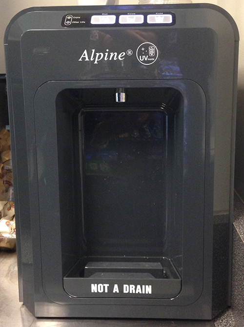
My Cup Runneth Over
Didn’t think I was going to become a magnet for this kind of stuff, but it would appear another water dispenser with bizarre dispensing rules has found me. Or I found it. Or one of my coworkers told me to go check it out. Whatever.
Yet another counter-top model, this particular design has three, flush buttons across the top on the angled surface, with a filter status indicator to the left. The buttons read, from left to right, Hot, Cook, and Cold. The labels are accompanied by icons supposedly representing the water temperature, Steam for “Hot,” C for “Cook” (whatever temperature that is; the button is in between Hot and Cold, so it’s Lukewarm?) and a Snowflake for “Cold.”
In order to dispense cold water, you press and hold the button labeled “Cold.” Pretty self-explanatory and it behaves just as expected. If you want “Cook” temperature water, you press and hold the button labeled “Cook.” 2 for 2. Now it gets crazy. If you want hot water, you logically press and hold the hot button and expect hot water to dispense. Wrong. No hot water dispenses. WTH? The only thing that happens is the Hot water button flashes at you and you stand there like an idiot, wondering what’s going on, is it broken, did I miss something, etc?

Yes, you did miss something: the very small instructions on the top of the machine that instruct you to push the “Hot” button and touch “Cold” button at the same time in order to dispense “Hot” water. Not only are these instructions so small that you easily overlook them, they’re also not in your line of focus. Furthermore, the “hot” and “cold” in the instructions aren’t capitalized like they are in the button label, causing a brief disconnect. Last but not least, what about having to “push” and “touch” two different buttons simultaneously. In an office environment where at least one of my hands is most likely clutching a phone, laptop, paperwork or any number of other objects.
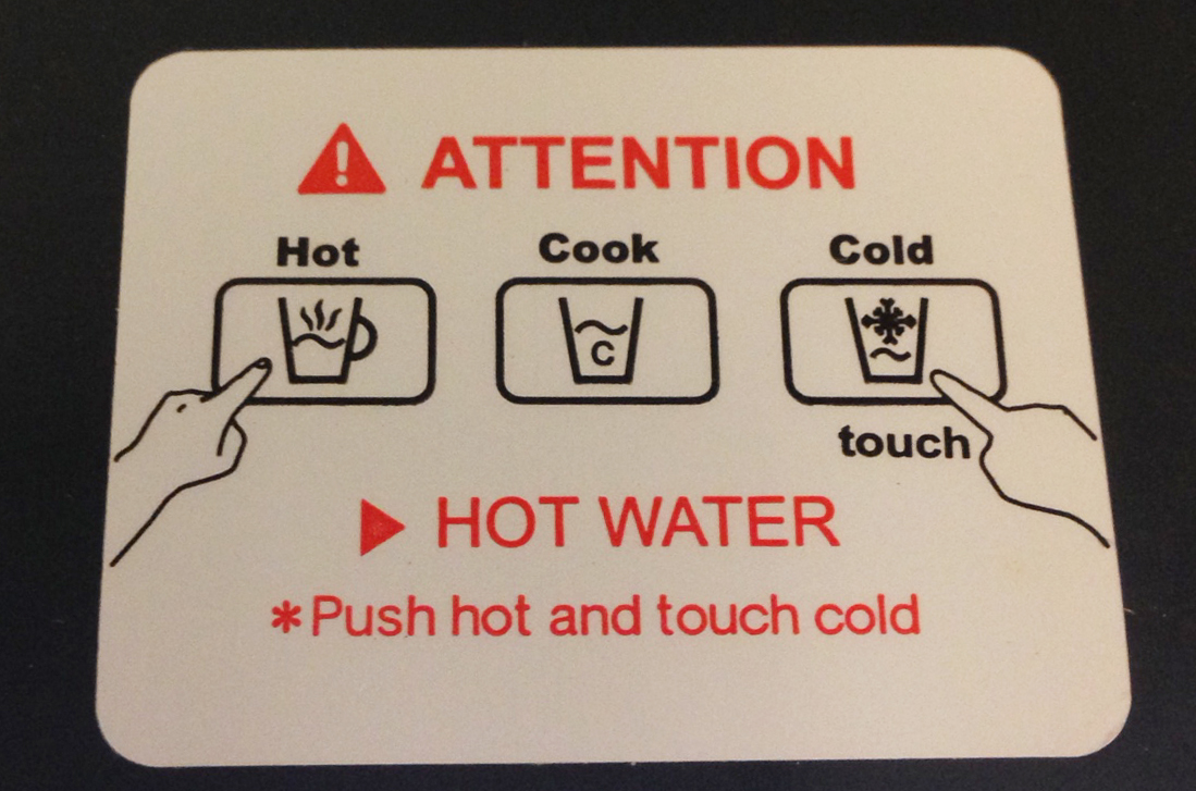
I can only guess that the reason this particular dispenser works this way is to avoid people suing them for accidentally burning themselves by not paying attention. I get it. But, multi-tasking to get a cup of hot water for tea. Who would have thought?
Everything That’s Wrong with Healthcare.gov
The HealthCare.gov launch did not go so well. Some people paid the website a visit only to be greeted by a blank screen. Others found error messages or talked to misleading call center reps or had their personal information compromised. The whole thing is borked, and everybody knows it. Read it on Gizmodo.
