I consider myself to be a savvy internet user; I’ve shopped at eBay and Amazon for years, I do my banking and investing online, pay my bills, etc. I’ve also designed e-commerce experiences and workflows–so it’s safe to say, I have some serious expectations of how certain things SHOULD WORK.
Which brings me to the subject of this post: when something happens opposite of what I expect to happen, and I actually catch myself thinking about calling customer service. And that really IRRITATES me because I think at this point in time that with all the analytics, data, testing, best practices and conventions, I shouldn’t find myself thinking “What is going on?”
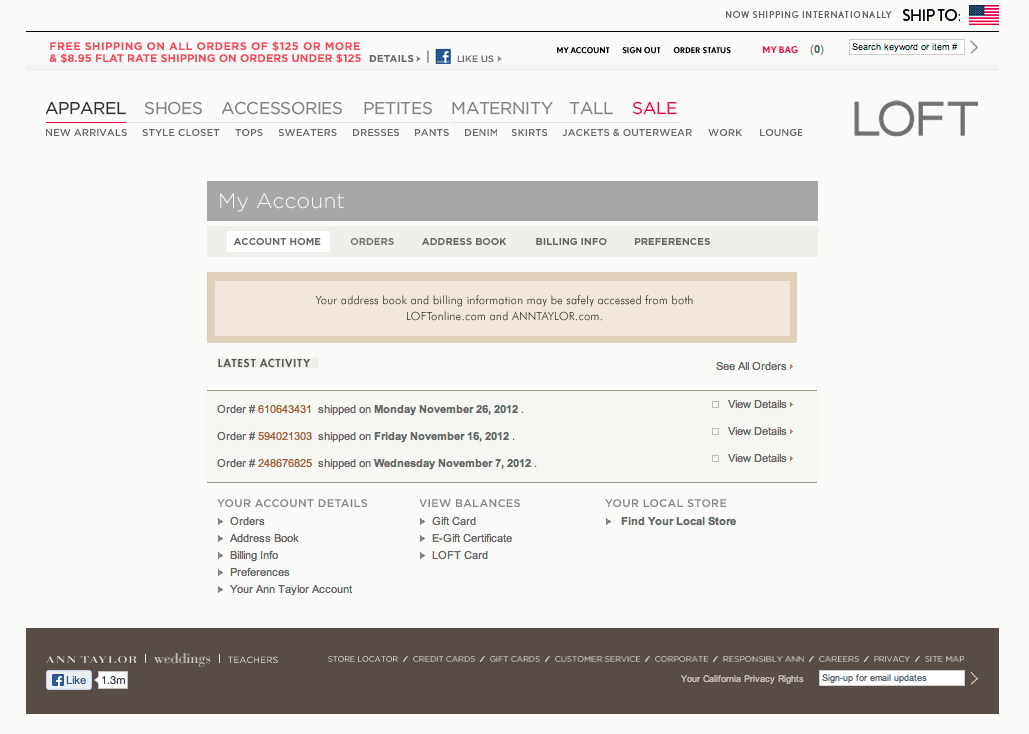
Case in point: I love shopping at The Loft (part of the Ann Taylor family). The clothes are less expensive but still well constructed, they’re comfortable but stylish, and usually go on sale right away. Since there is a store so close to where I live, I don’t normally shop on their website, but I do shop using their store credit card. I recently got a reminder email that my statement was ready and that I could pay online. So, I went to the website, and logged in to my account (screen shot below):

If you look towards the bottom of the screen, there is a column labeled “View Balances,” with the last link called “Loft Card”. That’s what I need to click on, and I should a screen similar to my AMEX statement online or my bank account. Right?
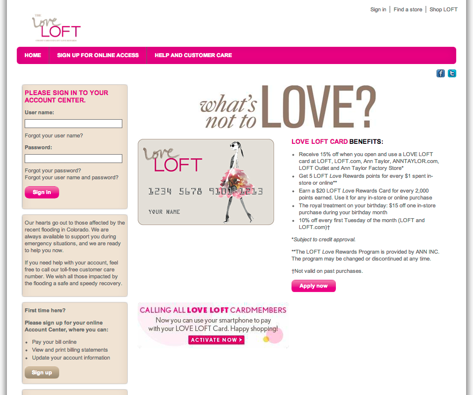
No, click the link, and this is what I encounter (see screenshot).

My first thought, “Did I just get redirected to the home page (of the site) and I’m being encourage to sign up for a Loft card?” My second thought, “Is this (Loft Card) link incorrectly linked?” I click the browser back button to return to the My Account landing page and begin clicking other links on the page. Everything I clicked on behaved accordingly; I click on the “Loft Card” link, and the same bright-colored, happy page as before.
My confusion grows because the right-side of the page says “Hello! Log in » Apply now ».” Aren’t I already logged in? When I look at the site masthead, I can tell I’m logged in because two key indicators of confirming a logged in state are displayed: “My Account” and “Sign Out.”
I proceed to click the browser back button (again), click a few more links on the account landing page (test, test, test), then click the Loft Card link again, with the same results. Definition of insanity.
Now I’m annoyed. This shouldn’t be taking as much time as it is. This is a common scenario, it shouldn’t be this mysterious. There is NOTHING OBVIOUS on this page indicating what I should do, given my expectations.
I scan the page again, more intently, looking for anything that might help me figure this out. Somewhere in the back of my mind I recall that the email reminder was sent from “Comenity Bank-LOFT”. Maybe this whole Loft card thing is managed by a separate bank? Maybe I have to log in to manage my card, separate from the shopping site?
I click on the “Log in »” button/link. And wouldn’t you know…

The indicator I’m looking for is revealed: “Log in” slides to the left displaying “Love Loft Card” and “Love Loft MasterCard.” I click on “Love Loft Card.”
(By the way, by clicking on this does it mean I love Loft, or is that the actual name of the card?)

Ermahgawd. New page opens over the one I was just on. COMPLETELY. NEW. UI. “What’s not to Love?”(I am not “Loving Loft” at this moment.) I eventually get to the page where I can pay my bill. But not before I thought about looking up a phone number to make the payment over the phone, or getting in my car and driving to the store. I came away feeling like I been in the center ring of a 3-ring circus – and no net.
My recommendations:
1) Link directly from “Loft Card” to the actual sign in page (above). Also, consider adding “Loft MasterCard” and “Apply for a card” links to the same column.
2) Make it more visually consistent with the rest of the website for continuity and to reduce potential visitor confusion. If anything, add text to the landing page that helps direct the visitor, such as, “Already a card holder, sign in by…” It seems obvious, but it’s amazing how small details are so often overlooked.