
I was recently on the Microsoft Support website (I don’t recall the exact URL) and was interrupted by one of their overlays asking if I would be willing to take a survey after using the site. (See the screenshot below).
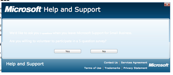
Now, I’m guessing that was the intent of the overlay based on previous experiences, because I can’t actually read the text at all. In fact, even attempting to makes my head hurt.
The lack of contrast between the text color and the background color, a basic accessibility, usability and readability tenet, is obviously lacking. It makes the attempt to gather potentially useful user input a useless exercise. Even more regrettable is that this is on a Help and Support website, which should be as accessible and usable as possible. Not to mention how poorly it reflects on the Microsoft brand–which is very legible with its two logos–a fair example of admissible contrast.
