Personal Recommendation Systems, Part 2

Sounds great in theory, but what about reality?

Part Two (P1 click here) of the discovery process is focused on looking at (auditing) real-world implementation of product recommender systems in various products and services.

Google search for any service or site for “best recommendation system website or app” and you will inevitably see the following on the list, somewhere near the top:

  • Spotify
  • Netflix
  • Hulu

The aforementioned streaming media companies ARE the most often mentioned example of a “Personalized Recommendation System” that gets “it” right (“it” being whatever the user deems it to be with regard to personalization); nearly everyone I’ve spoken to holds them up as a positive example of a correctly implemented and working system. Netflix is a slightly different use case in that they had user profiles and preferences from their red mailer days, compared to Spotify.

Since these platforms are so often mentioned for their product recommendation systems, so often listed, so talked about and discussed, algorithms dissected, I’ll not go into too much depth on their observed strategies and displays.

For the quantitative-oriented, the all up numbers for the audit are:

  • 18 comparative brands
  • 26+ tags (e.g., “Signal type”, “User status”, “Inputs”, “Platform” etc)
  • 200+ screens across app and web
  • Streaming media
  • Publishing
  • E-commerce retail & marketplace
  • Social media
  • Ride share
  • Specialty/curated

Comparative Audits

Competitive audit spreadsheet with corresponding screens and flows

What is a comparative audit and why do we do it?

User experience professionals conduct comparative audits in order to understand the problem/solution space being investigated. We often look for and capture competitive experiences (if applicable) BUT equally as important we look outside the competitive landscape to gain a more holistic view and understanding of the space

In this case, with regard to product recommendations:

  • Our customers browse and shop on other sites and apps; it is in our best interest to understand recommendations in those environments
  • Looking at different product and service models exposes us to different types of recommendation strategies and implementations
  • Auditing comparative sites gives us a more informed, broader view of product recommendation strategies that can inspire our own explorations and provide examples we can point to

Competitive audits often have the lens of the subject matter applied to them to make cogent observations. Using the content and information recorded in my research of product recommendation systems (Part 1), I created a set of specific “product recommendation” tags and created a lexicon for audit notes. It enabled me to be more aware of what I was looking for and accurately describe it. The lexicon and established vernacular proved useful for other team members because we all used the same language to identify and discuss our observations.

In this case, with regard to product recommendations, I purposefully:

  • Audited for different types of recommendation strategies (global, contextual to product, personalization, custom or hyper-personalization)
  • Reviewed product grain/tier, individual page location and context, content and mechanics
  • Captured results of both implicit and explicit inputs, such as user type, signed in/out status, likes, searches, filters, list creation, product page views, onboarding and feedback loops
  • Additionally observed changes based on frequency of visits and cross device browsing
Examples of product recommendation tags

Capturing observations and flows

Information, flows and screen level observations were captured and recorded simultaneously in Excel and in Figma. I inserted both call outs at the flow and screen levels correlating to specific points of data in the spreadsheet. Both the mobile website and App experience were reviewed

Nordstrom App and Mweb home screen
Nordstrom App and Mweb spreadsheet entries

Key observations

Various audited sites and platforms

Of the 18 or so product and service companies I audited I’ll limit my observations and examples to the following:

  • Nordstrom (retail fashion)
  • Etsy (retail marketplace)
  • Wayfair (retail home)
  • Twitter (social media)
  • Medium (publishing platform)
  • Spotify (streaming service)

Qualifier text provides credible connection and builds confidence

Qualifying text is necessary to build trust and a logical connection between user behavior and the recommendations being provided to her. Examples of qualifying text are, per the above images “Based on your reading history”, “Selected for you”, “Based on your likes”, “Inspired by your browsing and purchase history.”

  • Medium and Twitter provide contextual qualifiers at both article and tweet level respectively when applicable and appropriate
  • Nordstrom was the only retailer who provided qualifier text with recommended products on the home screen

User feedback functions facilitate more relevant, personalized experiences

In order to refine recommendations the system needs relevant signal from the user and ideally reason as to why the suggestions are acceptable or not acceptable. Providing feedback mechanisms in appropriate context enables the user to quickly and easily provide feedback to the content or products being displayed to her. It’s worth noting that these types of feedback controls were only visible in publishing, social media and streaming services. Retail did not have explicit controls.

  • None of the retailer sites/apps provide a method for users to give direct feedback on “recommendations” or “suggestions” resulting in heavy reliance on implicit data interactions and/or less frequent explicit data sources
  • Medium and Twitter platforms provide users with ability to provide content feedback at most granular level, individual articles and tweets respectively; both platforms have an “onboarding” process initially with suggestions throughout
  • Medium and Twitter provide user controls in context of the current screen view; do not require the user navigating “away” to a profile or preferences section

Individual recognition sets a personal tone

One of the quickest ways to create a sense of personalization is to playback a user’s name or username. Additionally, layering in language with respect to recency, such as “Welcome back”, “Pick up where you left off” further enhances the perception of recognition. Additionally, acknowledging the time of day a user is visiting, such as “Good afternoon” in the case of the Spotify (above), which was accurate at the time of the observation.

  • Only Nordstrom and Etsy display customer or user name with a greeting on the home screen; Spotify displays user name next to profile pic (paid account)
  • User recognition (mentioned above) further strengthens relative context and continuity product recommendations that follow, especially, Nordstrom
  • Nordstrom is the only company that acknowledges user on both App and Web experience
  • Not including is a missed opportunity to provide small, simple user recognition feature that could be expanded to include time past since last visit, time of day when visiting etc

Customer recency leads content personalization on home screens
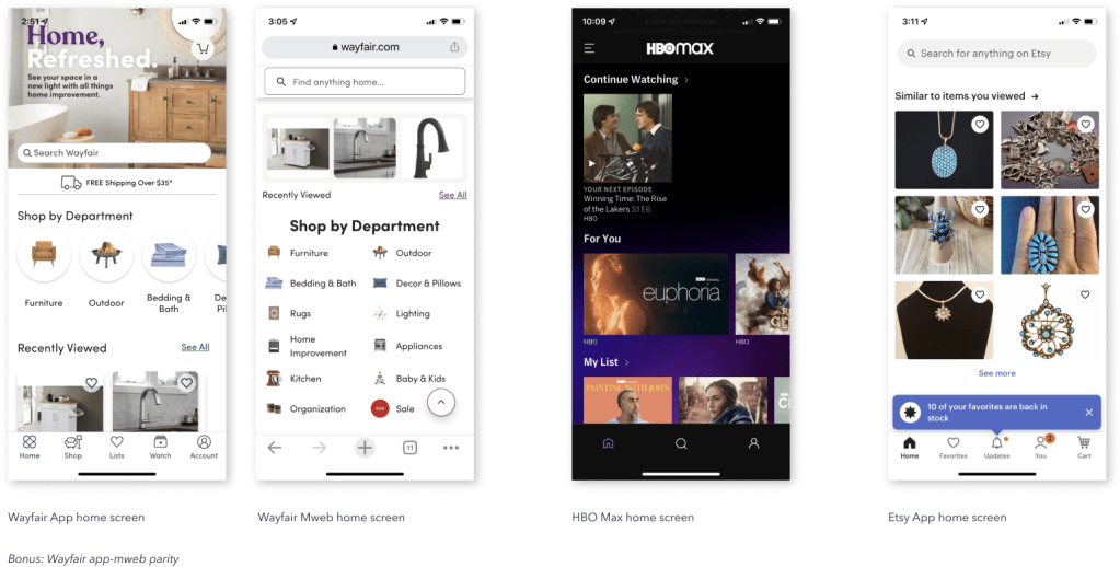
Personalization on the home screen tends to replay most recent user behavior and/or state. Replay helps orient and remind the customer of her previous goals or tasks when she last visited or used the service (HBO Max) which helps to jump start and facilitate re-engagement.

  • Recommended products with personalization language appear at the top of the screen and are more likely to be based on recent user behavior (however “recent” is defined)
  • Most if not all sites display one group of recommendations based on recency; most are labeled in a manner to remind the customer what she was looking at or how she was interacting, such as “Previously Viewed” “Previously Saved” “Pick up where you left off”. Products may be outwardly labeled, “Recommended for you”
  • Product groupings further down the screen may be less specific and more broad in scope, such as “Suggested searches”

Product detail screens provide comparison to products, collections, or cohorts

Product-based recommendations are more common at the product detail level than explicit “personalized” recommendations.

  • Product detail pages focus on same or similar products to the one being viewed such as “Similar products” or “More from this collection.” Suggestions may include at least one set that is more “relevant” to the individual, such as “Customers also <…> “
  • Nordstrom was the only retailer with a variety of customer/user-centric labels across different products; simultaneously personalizing and providing product suggestions
  • Nordstrom had only 1 alternative product carousel on the PDP while all other retailers had more than 1 suggestion

Small instances provide big opportunities to surprise and delight
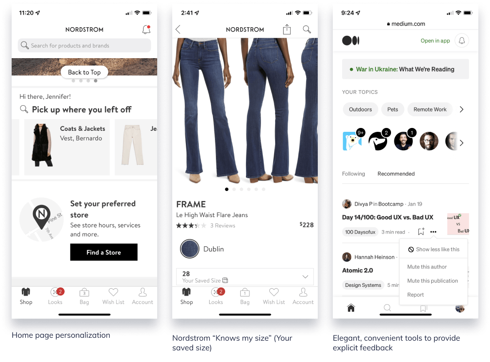
Personalization and recommendation experiences aren’t necessarily about how many different recommendation configurations can be displayed at once. Sometimes it’s the small instances that demonstrate the business is paying attention and listening.

  • Home page personalization with welcoming message
  • Nordstrom “Size” recommendation
    Nordstrom app not only recognizes the user but also knows what size to recommend based on previous browsing and shopping. When she’s on a PDP, it will display the size she normally adds to bag/purchases. It also adjusts to category or measurement (e.g., Size M in pants, Size 28 in designer jeans)
  • Ability to control the display: Medium and Twitter
    The ability to say “more of this” or “less of this” via an easy-to-use convenient menu gives the user more control over the content that competes for her attention and provides the business with a clearer direct signal. A win win.

In all three of these examples (exception: Welcome message), the user does not need to leave the current screen to visit a profile or preference page–these are small enough that they can be managed within the context of the current page. In the Nordstrom size example, the user never filled out a profile page for Nordstrom to indicate the different size types for all the applicable women’s categories.

Who sets the bar?

We all know about Spotify and Netflix.

Nordstrom
Designer and high-end fashion ecomm
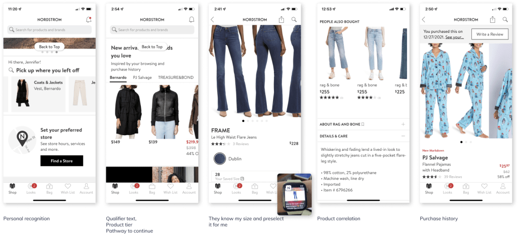
Nordstrom brand is famous for its legendary customer service and personal shoppers. It doesn’t surprise me that the online version would follow suit where it can.

  • Immediate personal recognition with display of name
  • Replays previous product, at brand and category level, customer was looking at previously and provides pathway to continue browsing
  • Utilizes qualifier text to qualify why the product/brand suggestions are appearing
  • Auto-selects customer size and displays in size selector; applies across different types of product (NOTE: this was NEVER selected in a profile–this is learned)
  • Correlates the other product suggestions with customers (“people”) like me; only one carousel of related product

Medium
Publishing platform
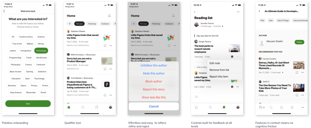
Medium’s experience is so well thought out it’s magical. It literally anticipates the user’s next-best-action across it’s various use cases and achieves what I consider to be a transparent UI.

  • User centric experience from top to bottom
  • From onboarding, to preferences management, to page level controls the user is able to reflect, refine and reject quickly and painlessly
  • Providing feedback is effortless and does not require user to leave context in most instances
  • Entire experience (language, display, interaction, algorithms) has the qualities of complete attention to detail at every touchpoint; there are no paper cuts in this experience

Next up on ittybittyusability: My perspective on the HCD (Human-centered design) process

Personal Recommendations Systems: Part 1

Not too hot. Not too cold. This one is just right.

I’m diving into the realm of Personal Recommendations systems, and it’s like the never ending task of peeling an onion. Fascinating, but there are lots of layers with some known knowns, as well as a few known unknowns.

As a UX professional, I’m well versed in the display best practices and interaction experience required in order to make it a purposeful, worthwhile tool and delightful experience for the user.

What’s been interesting (and a little unnerving) is how many people in my industry and those connected to it don’t understand what it means when they say, “we want to deliver a relevant personal recommendation.”

It’s becoming a phrase that makes me twitch a little when I hear it.

So, without further ado, allow me to indulge myself and share my research so that maybe some day you won’t have to.


What is a Product Recommender System or Engine?

Recommendation Systems collect user, product, and contextual data, both on- and off-site, in order to predict products or services to a specific user. It is a technology that uses machine learning and artificial intelligence (AI) to generate product suggestions and predictive offers, such as special deals and discounts, tailored to each customer. The design of such recommendation engines depends on the domain and the particular characteristics of the data available.

Suggestions for books on Amazon, or movies on Netflix, are real-world examples of the operation of industry-strength recommender systems.

What is the best strategy for a Product Recommender system to achieve personalized recommendations?

In order to be able to run, one needs to learn to crawl first, then walk. The same for “personalized” recommendations. The key word here is “personalized.” Just like a new user is “new” (you’re only a new user once), a personalized recommendation can only be achieved after establishing a well known profile of the customer via segmentation, implicit and explicit data, etc.

Product recommender systems require a “crawl, walk, run” implementation strategy to successfully build a comprehensive system and account for both product and user status. From dynamicyield.com, there are three broad tiered strategies to achieve this outcome:

• Global
• Contextual
• Personalized


Global strategies
These strategies tend to be the easiest to implement, simply serving any user – both known and unknown – the most frequently purchased, popular, or trending products in a recommendation widget.

Contextual strategies
These strategies rely on product context, assessing product attributes, such as color, style, the category it falls under, and how frequently it is purchased with other products, to recommend items to shoppers.

Personalized recommendation strategies
Personalized strategies, the most sophisticated of the tiers, don’t just simply heed context, but also the actual behavior of users themselves. They take the available user data and product context into consideration to surface relevant recommendations for each user on an individual level. This means, in order to effectively deploy them, a brand must have access to behavioral data about the user, such as purchase history, affinities, clicks, add-to-carts, and more.

Source: Dynamicyield.com

Popular filtering systems

It’s likely that some of the approaches listed in the three tiers sound familiar, so let’s quickly unpack their meaning and how they work.

Content-based filtering system
A content-based filtering system analyzes each individual customer’s preferences and purchasing behavior; it analyzes the content of each item and finds similar items.

This type of filtering system is usually behind the “Since you bought this, you’ll also like this …” recommendations.

Source: Towardsdatascience.com


Collaborative-based filtering system
A type of personalized recommendation strategy that identifies the similarities between users (based on site interactions) to serve relevant product recommendations

Source: Towardsdatascience.com


Hybrid recommendation model
A hybrid recommendation system offers a combination of filtering capabilities, most commonly collaborative and content-based. This means it uses data from groups of similar users as well as from the past preferences of an individual user.

Affinity based recommendations
Affinity-based recommendations are product or content recommendations that are made based on the individual shopper’s profile. These recommendations are usually shown to the shopper on a website or app, in an email or in a notification.

Profiles that determine recommendations are derived from the shopper’s online behavior, the transactions they make, and their demographic data. All this data is used to map the shopper’s preferences—or affinities—across a wide range of visual and non-visual attributes, all of this is captured at every point in the shopper’s journey on the website or app.

In apparel retail, visual attributes could include colors, patterns, the length of a sleeve, or neckline and hem length. Non-visual attributes could include occasion, weather, etc.

Profiles map a shopper’s affinities to these attributes based on their activity and intent on the site.

Source: Dynamicyield


Product bundling

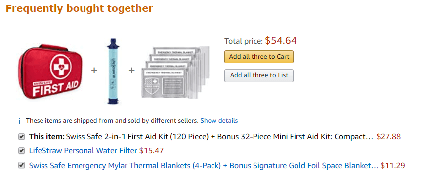
When two products, such as a scarf and coat, were popular choices together, or diapers and disposal bags, commonly referred to as “Frequently bought together.” This is a common recommender strategy on Amazon.com.

Now you know what it’s called, if you didn’t already.

Source: Amazon.com


It’s important to note the underlying purpose of each model: utilizing types of context and data that is either available or not available to essentially look for gaps to fill at the right place, right time. In other words, recommendation systems find the space that users share, and then fill or that space with the best possible product/service “match” it can.

A Recommender System will never be able to match User A to User B with perfect results, as their tastes will diverge at some point. The truth is, recommendation engines don’t set a threshold when looking for compatibility between people .

They look for the best possible match
.

Source: Murimee

Data requirements. The more detailed and accurate, the better.

Product recommender systems run on data, constantly ingest data, and produce data to stay relevant and evolve. Data is at the heart of engine. When I first started researching and gathering insights, I decided to capture data types and collection methods to better inform and set expectations for a personalization strategy including but not limited to:

Customer data

Personally Identifiable Information, or PII. PII involves any data tied to an individual, including email, address, phone number, an ID number — or anything else that can be used to identify a person.

Demographic data describes a customer’s characteristics. Demographic information can detail gender, geography, occupation and age.

Engagement data details the interactions a user has across all brand channels. This metric enables marketers to gauge a user’s level of interest, preferences and intentions, no matter the touchpoint.

Behavioral data is all about action. Site browsing, purchasing and email sign-ups are all considered behavioral data that aims to observe and infer customer intent. This type of data is similar to engagement data, however, it only tracks customer interactions with the brand online.

Source: https://signal.co/resources/what-is-customer-data/


Implicit and Explicit data

Implicit data tells you what a customer does, but forces you to guess about the why behind it. A customer views a product but does not make a purchase. A user watches a film trailer or reads an article about something. This is a statement of intent but no clear, affirmative action.

Implicit data is easier to collect, and there’s more of it. But, implicit data is harder to interpret, often requires clarification and observation. For example, websites where people browse and view but do not always leave a rating. In such cases, there is exponentially more implicit than explicit data being created by user activity.

Explicit data is information that a consumer deliberately volunteers. It validates implicit data and provides much-needed context, uncovering things like the preferences, motivations, and desires that inform a consumer’s behavior and allowing for more nuanced audience segmentation and personalization—in short, the why behind the buy.

A customer buys a product, rates a film, or gives a thumbs up or down to a post. The customer is clearly showing how they feel about a product. The data is clean and actionable.

Explicit data is a clearer signal than implicit data, but is harder to collect because it requires purposeful action on the part of the user. Simply listening to a song is not explicit data in itself. The system does not know for sure that the user likes that song. Actual explicit data is when the user adds a specific tune to a playlist or hits the heart icon to say that they enjoy listening to it.

Explicit data can also be shallow because while it does have a clear signal, that signal maybe no deeper than a like/dislike, thumbs up/down; a binary reaction.

Source: https://blog.mirumee.com/the-difference-between-implicit-and-explicit-data-for-business-351f70ff3fbf

Once you’ve got your arms wrapped around your user and product data, it’s time to start grouping and segmenting it passed on specific parameters, such as behaviors, affinities, demographics etc in order to begin “personalizing.” Be careful not to interchange segmentation for personalization and vice versa.

Segmentation and personalization

Segmentation involves dividing customers into audiences based on broad factors like location or product interest. It usually requires a CRM or CRM-type system, normalized data and attributes tied to a targetable ID, as well as some broad-based understanding of different buyer types that coordinate to different product or offer affinities.

Segmentation: it’s about the Marketer
Segmentation is a principal marketing strategy that involves identifying similar groups of potential customers according to relevant information that can be used to deliver a mix of strategies to receive results.

Segmentation typically follows a set of descriptors, including a potential customer base’s demographic or psychographic variables.

Source: https://www.progress.com/blogs/segmentation-vs-personalization

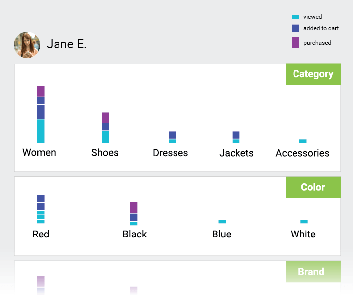
Source: MobileMonkey

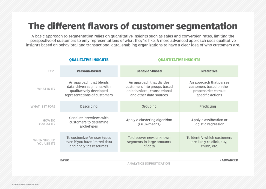
Timeout: I really love this customer segmentation graphic from Forrester Research. So I’m sharing it.

Source: Forrester Research


Personalization
Personalization takes segmentation much further by drilling down on specific behaviors and actions of an individual to provide her with the necessary information to move to the next step in her buyer’s journey.

Personalization: It’s about the Customer
Personalization involves identifying a specific customer within a segment.

Personalization is all about how the brand can solve that individual’s pain point or need. That involves understanding the customer’s intent and creating personalized experiences around that intent. Identifying a customer’s intent means that considering various data points using rules-based logic.

A customer’s intent can change each time they interact with a brand. Their intent can also change throughout one interaction.

Source: https://www.progress.com/blogs/segmentation-vs-personalization

Source: Smartinsights

Irrelevant Personalization (is bad, you don’t want to do this)

When segmentation and personalization are interchanged, we hear cases like a shopper being recommended mosquito nets after purchasing a mosquito net a week back. Or a person waking up to a dozen of promotional emails about baking trays after buying an oven.

This example doesn’t imply that they aren’t ‘personalization’. It implies ‘irrelevant personalization’, which would be regarded as a failure.

For example, out of the 100% oven buyers, there might be a percentage that needs trays. However, sending all of them a prompt to buy ‘tray’ reflects that the brand has put everyone from that group under one category, instead of mapping their individual needs. This illustrates the outcome of confusing segmentation with retail personalization.

Source: https://www.progress.com/blogs/segmentation-vs-personalization

Segmentation vs Personalization: A side-by-side comparison

Source: Moengage

Macro and Micro segmentation

I briefly want to introduce macro and micro segmentation. Macro segmentation is more or less segmentation as described earlier: larger groupings customer based on similar attributes. Micro organization takes it a step further with applying additional refinement. Not quite personalization, but getting closer. This could also be interpreted as a curated segmentation; creating smaller segment slices from larger pieces of the pie.

Macro segmentation refers to the practice of dividing online traffic into a few sub-groups of visitors who differ from one another in one or two basic attributes like location, gender, or an identified browsing pattern.

Demographics: age, gender, education, income, children, ethnicity, marital status
Geography: Country, area, population growth, population density
Psychographic: lifestyle, beliefs, social classes, personality
Behavioral: use, commitment, awareness, affection, buying habits, price sensitivity

Micro-segmentation is a marketing technique that uses knowledge to classify people’s interests and to influence their perception or behavior. We have all the data that we need to answer our client’s questions in the ideal world. However the ideal is not always our reality, so we need to find new approaches to meet the needs of the consumer.

Micro-segmentation encourages customers to be grouped into more targeted, oriented markets within the segmentation and market of the customer—enhancing specificity and, amid limited customer data, creating a micro-segmentation marketing strategy.

Examples:
Upscale Tourists & Buyers: consumers interested in elevated goods and travel amenities with high discretionary travel and shopping budgets.
Good Living: buyers interested in good and sustainable living as well as wellness and fitness (including advertisements and articles on these subjects)
Cultural Fanatics: Consumers involved in performing arts and entertainment

Source: https://vue.ai/glossary/

User types


User
 types can be described as user profiles associated with different categories of user groups. Each user type is characterized with a particular usage pattern. We identify user types in order to understand how the site or app is being used; where users are coming from, new vs repeat (return) users, how often or frequency of visits and time in-between visits, etc. Depending on the visitor and visit frequency we can better set recommendation expectations and more accurately implement them.

Plus it’s a great refresher.

New visitors or new users are defined as people visiting your site for the first time on a single device — so each first visit on your laptop, smartphone, and tablet counts as a separate new visit. You can only be a new user once.

A user makes “sessions”, therefore a first session on a website receives a ‘new’ label. Subsequent sessions receive a ‘returning’ label.

(Google Analytics defines a new visitor as anyone who has never been on your website before, according to their tracking snippet.)

Return visitors are users who have been to your site before.

Unique visitors, or new users, describe the number of unduplicated visitors to your website over the course of a specific time period.

Return visitor labeled as a new visitor
If a person is on a website in incognito or private browsing mode.
If a person visits a site initially from their laptop and then browses it later on their smartphone. If they are not logged into Chrome on both devices, then when they view the site again on their smartphone, they’ll be counted as a new visitor.
If a person visits a site once and then comes back a second time.
If a person visits a site, and then clears their browser cache before viewing it again.

Frequency and recency data


Frequency and recency data are helpful to better understand the customer journey of your users, as well as their needs and behaviors. They can help create or maintain your personas, and also discover how to better support not only your visitors, but also your business goals.

Frequency of site visits indicates the overall number of visits made by each user on your site. This metric allows you to assess the percentage of new users on the site as well as the familiarity level of all returning users

Recency measures the number of days that have passed since each user’s last visit. This measure allows you to see the average amount of time between visits for your user base.

https://www.nngroup.com/articles/frequency-recency/

I hope that you’ve found this information helpful and useful. Stay tuned for Part 2 where I delve into an audit to discover best examples of design and implementation of Product Recommender systems.

15 Tech Experts Share Essentials of ‘Good’ UX Design In An Evolving Market

15 members of Forbes Technology Council share their predictions for what will be considered essential features of “good” UX design in the near future.

Raise your hand if you’ve been advocating for some of these features for a LONG TIME. Personally, I’ve been (screaming) asking/begging/demanding:

A focus on the customer journey
Honest to God, the journey does not begin nor end on just the screens a specific team is “responsible for.”

Thorough customer research at the ideation stage
Testing the final product is just too late. Sure, it’s testing, but I think we all know how this will end.

Simplicity
Simplicity doesn’t mean a dumbed down design. It represents a solid focus on the customer, her needs/goals, and a direct route from A to B.

Well tested user flows
OMG yes this. See “focus on the customer journey” x “number of screens a customer interacts with.”

I was a little surprised to see the Accessibility and Inclusion not specifically called out, but I think we can all agree that those should be a part of each feature.

Read the entire article here.

Slow down. Take a moment. Journal.

How many of us have found ourselves struggling with a challenge and seemingly can’t break through to the solution? And at some point we decide to get up and grab a snack or coffee, maybe a bio break, and as we’re walking to our desk the solution just comes to us?

(Doesn’t happen to you? Maybe it’s just me then.)

Regardless, my point is sometimes you just need to walk away. Literally, go think about something completely unrelated. (Like, what kind of snack do I want? Fruit? The clouds are so pretty today. I wonder what happens in the next episode of the TV show I’m watching.) Not only does it provide a mental break, but also gives the body an opportunity to move a bit.

(A engineering friend of mine told me once that his aha moment is when he’s getting ready in the morning before work; called them “shower thoughts.” )

Which leads me to share a semi-related article I came across in the Harvard Business Review, “The More Senior Your Job Title, the More You Need to Keep a Journal.” The author describes the act of journaling as a purposeful exercise of pause and reflect, with strategies for creating meaningful entries. Similar to taking a mental break for a few minutes, the act of reflecting and event playback helps us mentally unpack and revisit scenarios, as well as take learnings from them for later. With information coming at us on all sides 24/7, we aren’t giving our brain the break it may need, making it harder to solve those challenges. And whether we realize it or not, during that walk to the kitchen is we’re giving our gray matter the space it needs

So, do your brain a favor. Take a time out and just give your brain a break. While watching the clouds.

Ignore your customers at your own peril

I’ve been in the UX/design/product biz long enough to know it’s your ass if you don’t listen to your customers.

I’ve also been in the biz long enough to know that sometimes you think you’re going to lose your mind because: your customers tell you they know exactly what they want, or they don’t know what they want until they see/use it (stakeholders too), or they tell you what they think they want and then decide no, that’s not what they wanted. Regardless, no matter how stir crazy you may feel, it’s important to continue Listening. Not hearing, but listening. Taking an active, empathetic mindset.

The benefits of this are a thousand fold and are tried-and-true tested. You take care of your customers, and they will, in turn, take care of you. It’s a reciprocal trust that generates brand loyalty to the nth degree. But once you stop listening, and maybe instead pretend you know what’s best, you’ve broken trust, and it’s open season on your brand/product/experience. Your customers will no longer take care of you as much as they once did. You might even lose a few. And we all know it costs more to get new customers than it does to retain the ones you have.

And here’s the thing. I’ve seen this happen So Many Times you’d think that someone would have figured it out. Maybe someone has and I missed that story. But honestly, businesses do a great job of not reading the room.

Your customers are your tribe; a family of fiercely loyal and protective users, but so long as you continue to bring them joy. Failure to admit you got it wrong, while insisting that you got it right, is a one-way ticket to shit-island.

Failure to bring joy comes in many forms, such as a poor update or feature release or less than satisfactory components used in an upgrade. You name it, you’ve likely experienced it yourself. One of the most common howl-worthy scenarios in the digitalsphere is the “brand refresh” or a “system upgrade.” In an attempt to make things “better” e.g., more transparent, stylish, findable, easier to use, less quirky etc something crucial to the experience inevitably gets touched, modified, moved, or tweaked and your tribe loses its mind. Why? We are creatures of habit, and we don’t like being forced to spend time relearning something that to us worked “perfectly fine” and now it’s changed and crap, now I have to think, and not only that I’m really disappointed, and worse part is the company doesn’t seem to care. WTH?

Case in point:
Tesla recently updated its dashboard UI (badly) and it REALLY pissed off the Teslaholics.

(Updates are a Big Thing in the Tesla community. Kind of like when Apple used to release a completely new product once in awhile–iPhone, iPad anyone? It’s pretty damn exciting.)

Anyway, in the case of Tesla, it didn’t help that Elon Musk poo-poohed the whole thing. Especially when UI/UX designer Hans van de Bruggen designed and built a working prototype that solved the pain points, published it for feedback, and the Tesla owners who used it clamored forTesla to use it. Elon Musk in this case not only didn’t listen to his customers, he insisted he knew what they wanted. (Which proves that just because you have more money than 3/4 of America doesn’t mean shit if you treat your tribe like the human equivalent of toilet paper. )

Considering how much a Tesla costs and the investment it requires, I’d be seriously rapid too. I might even be thinking about the other EV that are coming on the market. Remember the tribe has a long memory.

Read on about Hans van de Bruggen in two posts where he dissects the Tesla update, and recounts his Elon vs. Hans and the internet. Can’t wait to hear more about this saga.

Empathy vs Sympathy

User experience peeps use the word “empathy” frequently. We are “empathetic.” We “empathize” with the users of our product/service. Do not disturb me, I am “empathizing.”

But if asked, what is the difference between empathy and sympathy, would you know how to answer? I might, barely, only because someone once shared this animated video short with me, featuring a portion of a talk by Brené Brown . Thank goodness for Ms. Brown, who can, through beautiful storytelling examples make us better professionals as well as human beings.

Great case study of a case study

Whether you’re designing a product for planning travel, shopping for groceries, or the next music platform, knowing your audience and their pain points is THE most critical aspect of any approach.

This is a total DUH, but you’d be surprised (and maybe you’ve experienced this) how frequently a user and said pain point recedes as other priorities surge (e.g., business goals, technical limitations, internal processes.) And then it’s left to the UXer to be the squeaky wheel. Squeak, squeak, squeak….squeaky squeak. Yes, that’s what we’re supposed to do/paid to do, but having the same conversation over and over again is really deflating and a bad version of Ground Hog Day.

So where am I going with this? Being able to experience what your user experiences, or empathize, is essential. Capturing and executing brilliantly amidst the twists and turns of product design is a super power. Then, being able to write about the experience and share – even more cause for celebration. It’s easy to forget things, the wins, the learns, and the challenges as time passes, and you’ve moved on to the next thing. (Like when you go to interview and have there’s a portfolio review and the details are a little fuzzy – frustrating, right?)

Which brings me to my point. A WONDERFUL example case study (in my humble, subjective opinion); lots of (good) visuals and a well crafted writing style. The author,
Roja Patnaik
, clearly knows what she is talking about, and does an excellent job of explaining it (always a challenge) without walls of copy. I won’t give anymore away, you’ll just have to read it yourself and judge.

Enjoy.

https://medium.muz.li/helping-travelers-plan-trips-with-ease-using-crowdsourced-itineraries-ui-ux-case-study-593f0a1269c1

(A few) Figma shortcuts

It seems like each new job asks you to learn a new design/wireframe/prototyping app. While yes, they are all more or less the same, there’s always a learning curve. And while tutorials are helpful, nothing beats learning while doing.

When I arrived at my current employer, I had to transition from Sketch to Figma. One thing I did to speed up my learning process was to copy other designers files and deconstruct their designs. All while working on a design and prototype. Lots of head banging, but I’ve come out the other end of it smarter and more efficient.

And yet, I only know a fraction of what Figma can do. Some of this is due in part to using an existing design system, so I don’t “need” to apply certain design techniques because the components I need are prebuilt and on brand. Until a proof of concept (POC) came along that is so dramatically different it presented a great opportunity to copy and deconstruct.

Once again, I am learning about the design capabilities by deconstructing a very advanced user’s files. I’m also searching the web for shortcuts and design-related how to’s. I thought I’d share the links in case, like me, you’re wondering too. (Yeah, I know, they are total “duhs”)

Gradients

Blurs

Keyboard shortcuts ( I was looking for flip horizontal/vertical)

Another great way to learn by do is to check out Figma’s Community; you get files and examples of features and functions.