
Users don’t hate change. Users hate change that doesn’t make their life better, but makes them have to relearn everything they knew.
UX bad-ass Christina Wodtke nails it with her take on change and consumers/users/customers and the companies/products they love and hate depending on the update. While Wodtke centers her article, “Users don’t hate change. They hate you.” primarily around the latest iOS from Apple (and rightfully so), the same discussion can easily include Window 8 and undoubtedly the upcoming Windows 8.1.
I’ve never been able to understand the decision to introduce a drastically, mega-huge change to such a widely used and very familiar operating system. I mean, what did Microsoft think was going to happen? They took a UI designed for a mobile context (phone), and dumped it on top of a operating system that 90% of the world uses. Brilliant. Innovative. Modern.
Much has been written and discussed about the OS and the hardware, with most ifnot all notable UX professionals weighing in. Jakob Nielsen summarized, “Hidden features, reduced discoverability, cognitive overhead from dual environments and reduced power from a single UI window and low information density.” I can’t disagree. When I first started using an RT, it was a constant running dialogue of “whoa” and not in a good way.
Granted, once you put aside all your iPad or iPod expectations and mental models, and hopefully don’t have to do a lot of back and forth between the two environments (desktop and Start screen) it’s just about tapping and swiping. But heaven forbid having to use desktop mode. Ever tried to use Desktop mode on a tablet with your finger tip? Hashtag I can’t hit the target my fingertip is too fat.
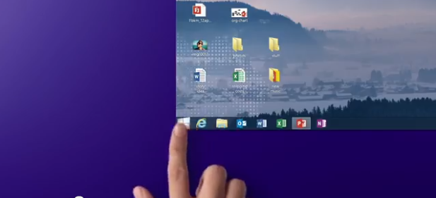
The WTH list is a mile long, but the one that crawled to the top of the list was the removal of the almighty Start Button. Never mind consciously removing (crapping on) usability best practices, removing the Start Button was too much change.
From what I’ve seen of the new ads, the Start Button appears to be an icon in the lower left corner of the Desktop mode that when tapped or clicked, opens the Start Menu. I’m assuming that tapping or clicking the Start Icon in the Charms bar will continue to open the Start Menu, as well as tapping on the window icon on the tablet hardware.
So what exactly is this solving? Is this a digital version of a placebo? There’s still no “menu” like in previous versions of the OS prior to 8 (unless you count the Start screen it links to and the horizontal scrolling patchwork quilt information design), but I digress. Yeah, the Start Button is back, but will it make up for all the other issues that are backsliding user-centered design?
