
15 members of Forbes Technology Council share their predictions for what will be considered essential features of “good” UX design in the near future.
Raise your hand if you’ve been advocating for some of these features for a LONG TIME. Personally, I’ve been (screaming) asking/begging/demanding:
A focus on the customer journey
Honest to God, the journey does not begin nor end on just the screens a specific team is “responsible for.”
Thorough customer research at the ideation stage
Testing the final product is just too late. Sure, it’s testing, but I think we all know how this will end.
Simplicity
Simplicity doesn’t mean a dumbed down design. It represents a solid focus on the customer, her needs/goals, and a direct route from A to B.
Well tested user flows
OMG yes this. See “focus on the customer journey” x “number of screens a customer interacts with.”
I was a little surprised to see the Accessibility and Inclusion not specifically called out, but I think we can all agree that those should be a part of each feature.
Read the entire article here.
OMG. Sometimes I love the internet.
The ultimate Norman Door.
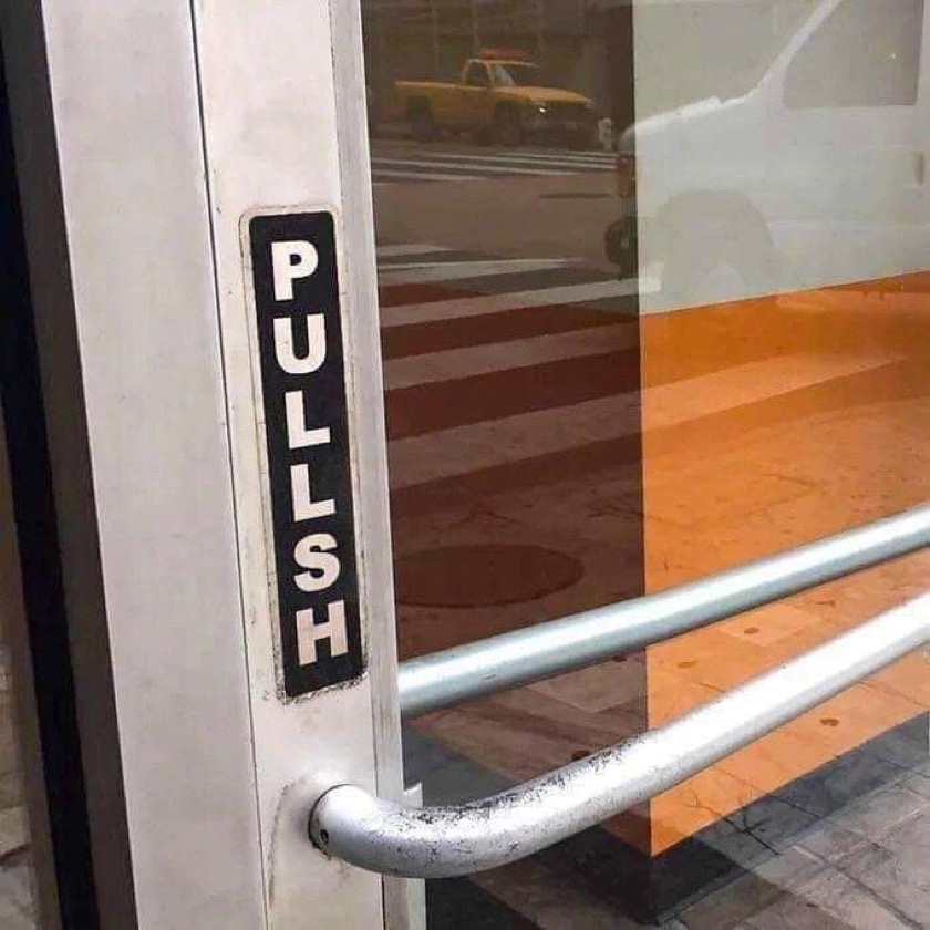
Sorry, author for photo credit is unknown. It’s not me, truly, I wish.
(A few) Figma shortcuts
It seems like each new job asks you to learn a new design/wireframe/prototyping app. While yes, they are all more or less the same, there’s always a learning curve. And while tutorials are helpful, nothing beats learning while doing.
When I arrived at my current employer, I had to transition from Sketch to Figma. One thing I did to speed up my learning process was to copy other designers files and deconstruct their designs. All while working on a design and prototype. Lots of head banging, but I’ve come out the other end of it smarter and more efficient.
And yet, I only know a fraction of what Figma can do. Some of this is due in part to using an existing design system, so I don’t “need” to apply certain design techniques because the components I need are prebuilt and on brand. Until a proof of concept (POC) came along that is so dramatically different it presented a great opportunity to copy and deconstruct.
Once again, I am learning about the design capabilities by deconstructing a very advanced user’s files. I’m also searching the web for shortcuts and design-related how to’s. I thought I’d share the links in case, like me, you’re wondering too. (Yeah, I know, they are total “duhs”)
Gradients
Blurs
Keyboard shortcuts ( I was looking for flip horizontal/vertical)
Another great way to learn by do is to check out Figma’s Community; you get files and examples of features and functions.
Read this article once a week.
Read this article, “10 design principles every designer should know”, until you have it memorized.
That’s it. That’s the post.
Great UI/UX peer website
I stumbled across a great peer website today and wanted to pass it along. If you already know about Michael Locke (UI/UX Design, Training & Education), then feel free to leave “Old” in the comment section for this post.
Michael Locke is a Lead UX Designer with ADP with over 15 years web design experience, front end web development proficiency, marketing, photography, and a ton of groovy, savvy knowledge in related fields. From his “About” section, “I have a huge passion for helping people succeed.” Boom. There it is.
I highly recommend bookmarking his website and checking in now and then.
The same, but different, sign-in experience
Many of us who work in the business of designing interactive experiences would agree that most days we’re pretty savvy when it comes to identifying less than optimal designs and working through them to get to where we need to be. To be fair, we all have moments when maybe our synapses aren’t firing on all cylinders, or our situational awareness isn’t at 100% (aka: distracted).
But on those off days, we need better visual affordances to help us along.
Case in point. Pandora. I recently found myself trying to log into my Pandora account from the Pandora home/landing page (I’d obviously been logged in forever), and for the life of me couldn’t figure out what was happening (or not happening) to the sign in page.
Briefly, I was repeatedly clicking the “sign in” link in the upper right corner, expecting the page to refresh and do something sign-inny, like a refresh, alert or instructions, highlighting…something, anything.
Troubleshooting kicks in, and I switch browsers, believing that something must be wrong with the site in Chrome. Hey, it happens, right? But even switching browsers (to Safari) nothing changes on the Pandora home page.
Since I was focused on the page more than usual, I realized that the primary focus of the home page content (in a signed-out state) is to sign in. (How come I never noticed this before? Or overlooked it so easily?) Studying the components more closely, it became apparent there was no large, bold type directing me to “Sign in below.” (That would have been super helpful in my case.) Instead, the copy on the page was introducing me, the account holder, to the concept of Pandora, “It’s a new kind of radio – stations that play only the music you like” followed by text fields for “Your email” and “Password” with a sign in button. At the bottom of the sign in module read tiny text, “Create an account for free.” with a contextual link, “Register.”

Okay, I get that once you start dissecting and breaking down what the text says and the labels in the text fields with the corresponding Sign in button, it’s more obvious that the page is intended for existing members to sign in. (Though I do question the introductory nature of the copy and it’s close relationship to the sign in fields for existing members. Seems like Pandora could have done a better job of directing members to sign in while using the intro copy for creating new accounts. But I digress somewhat.)

Recall I was clicking the upper right corner “sign in” link, and there was no visual response on the page. Each time I clicked, the page appeared to remain “static” with no error message instructing me to enter my email and password while highlighting the required fields on the page. When I clicked the “register” link in the upper right had corner, the page refreshed to the Register experience. Same with clicking the “help” link. So naturally my expectation was, in my distracted limited attention state, that something should happen to the page.
(In fact, I figured out what I was overlooking when I clicked “Sign in” from the Register page, and was directed to the Pandora home page. Where I’d started from.)

What I needed to happen is what the page did when I clicked the “Sign in” button next to the sign in fields – I got red text directing me to specify my email address and password. As I would expect. (And now I know that I can sign in using the fields on the home page.)
Now granted the upper corner is navigation, and the button is for input. But even the other navigation items (register, help) have a distinct page change, so at minimum I’d expect the page to briefly refresh when clicking sign in. And maybe some language to the tune of, “You’re obviously having a stupid moment, clicking the same link expecting something different to happen.”
Lesson learned here. Language should go with the action. And, secondarily, despite the fact that both the sign in link and Sign in button are “relatively” identical calls to action, the post-click visual affordances are different. Small discrepancy, yes, but the inconsistency affecting the user from quickly and easily accessing her account is the larger issue.
Designing Solutions for Unpleasant Tasks
We can all agree that there are tasks out there that aren’t fun at all, such as filing taxes, paying bills, creating a will, etc. When it comes to designing UX for an unpleasant task, the first thing to accept (and remind oneself throughout) is that the task itself sucks because it just does, and that the UX professional should do as much as possible to not make it suck more. From UXMatters.com comes a FANTASTIC piece discussing design strategies for unpleasant tasks, starting with:
Accept That You Can’t Make Some Tasks Pleasant
A positive user experience can help minimize the pain and avoids adding more unpleasantness, but it’s not going to completely take the pain away. As UX designers, our job is to help people get through their unpleasant tasks smoothly, without piling on more difficulty. Ease of use and efficiency are especially important in easing the way through unpleasant situations.
Stay Out of the Way
Ensure that the UI you design doesn’t get in the way or cause more problems. Remove unnecessary features, distractions, questions, and interruptions so users can focus on their icky tasks.
Be Careful What You Say
When writing messages and other text relating to unpleasant tasks, it’s best for the tone of the content to remain neutral or perhaps mildly encouraging. Being cute or irreverent is not going to go over well.
Avoid Overwhelming People
Too much information or too many options can easily overwhelm people who are already stressed, anxious, fed up and pissed off. Keep in mind the following techniques:
Ease into Things
Dashboards present an overview that eases users into complex information by presenting a simplified view first before they dive into the details. This approach may be more appropriate than dumping a user into complicated screen right away.
Show What’s Coming Up
Another way to ease into a process is by telling users what to expect. People are more likely to begin and complete a process if you give them a reason to do so and show them what’s involved. Consider a quick text overview before a new section to better set expectations, or a progress indicator like those used in a check out process in e-commerce transactions.
Focus on One Step at a Time
How do you eat an elephant? Exactly. For some activities it’s best to break the task into smaller, more manageable “bites.” This makes the overall task feel less overwhelming and allows the user focus better on requirements.
Use Progressive Disclosure
Provide only the information and options users need to see in order to accomplish the tasks they’re dealing with now.
Hide Complexity
Don’t expose users to information they don’t need to see. Duh, right?
Minimize the Need to Read (when appropriate)
It’s widely accepted that people don’t like to read online instructions. Under normal circumstances, they’ll skim just the content they need to get through. When people are stressed out, this is even more true. So for stressed out users, do them a favor and keep the content concise and make it easy to scan with headings, bullet points, and format text that needs to be emphasized.
Automate Actions
Automate frequent, repetitive actions, or make it easy for the user to set an automated preference. Then make it obvious that it’s been completed in case the user wants to undo the action.
Provide Common Defaults
Provide time-saving defaults to users so they don’t have to input the values themselves.
Avoid Surprises
Enough said. Keep users informed and set proper expectations.
Give Users Control
Give users a sense of control by providing them with options instead of constraining them to a specific path. Advanced, knowledgeable users will appreciate skipping the screens and information they’ve seen before. Also, in the same vein:
Provide Options For Different Audiences
E.g, Novice vs Advanced users.
Give a Sense of Progression to Encourage Users
“Are we there yet?” Not knowing makes just about everyone nuts. Especially in the midst of an unpleasant task. So let users see how their progressing to remind them that relief is in sight.
Provide Various Levels of Help
Instructional text, tool tips, contextual help, live chat access, call center access, email, contact us, progressive disclosure tips.
Help Users Make Difficult Decisions
Provide information, suggestion and recommendations. Especially when tasks and/or subjects may be unfamiliar or infrequent.
Oh yeah, avoid being annoying. “Clippy” anyone?
Read the complete article with relevant examples at UX Matters:
“Designing Solutions for Unpleasant Tasks”
Button Identity Crisis
Came across this beauty of a button in the upper right-corner of a lightbox overlay.

The value of identity of course is that so often with it comes purpose.
– Richard R. Grant
A case of the hiccups
Earlier this week I was creating an online account in order to start a trial for a cloud wireframing prototype tool. The form itself was easy to scan and follow, aesthetically pleasing from a visual standpoint, and was using real-time field validation instead of “on submit.” It was all good until I had to enter, in order, a username and password. Then I encountered an unforeseen hiccup in the validation implementation.
After I entered my first choice for my username, I received the following alert and error messaging. 
“Nice error message design”
So I deleted my first choice and proceeded to type my second choice for my username.
“That’s weird. What are the odds”
So I deleted my second choice and proceeded to type my third choice for my username.

Did I create an account once and forget? WTH is going on?”
And other colorful commentary.
Then realization hit through happenstance of clicking away from the field. The form field didn’t recognize that I was typing in a different username after I had deleted the first. It was “stuck” on the original choice I entered. The field wouldn’t “clear” until I tabbed or clicked away, then entered a new choice for username.
Success! I wasn’t losing my mind. I wonder how many users of the same cloud software tried half a dozen usernames and passwords (yep, same issue) before they gave up or (luckily) figured it out. And/or lost their minds trying.
But, lesson learned. When implementing real-time form-field validation make sure legacy messaging validation, specifically in the case of error messaging, clears appropriately in order to better inform the user.
Dueling remote buttons
 This remote has two buttons, in shades of red, in key positions at the top of the remote. The one on the left is labeled “POWER” while the one on the right is labeled “ON/OFF.” To a remote novice like myself, my first instinct was to press the “ON/OFF” button to turn the television “on.” Makes some manner of sense, right? After several failed attempts, I was forced to turn to a fellow co-worker and ask WTH? Turns out, the “ON/OFF” button is to turn the button lights “on” so they’re visible in the dark. (!?!?!?!) Lesson learned, but I still question the: 1) size 2) relative position and placement 3) use of color 4) and labeling applied to the Power and the On/Off buttons. It seems the On/Off button could be given a little less prominence, a different color, and don’t we have technology to make them glow in the dark or react accordingly with sensors?
 ittybittyusability