
I’m probably a little late to the party (better late than never), but I wanted to briefly mention the newly unveiled virginamerica.com. The Beta site came out earlier this spring, generating lots of commentary and speculation about its approach.
Essentially, Virgin America took everything off the home page in order to shift focus to the booking process in a fully responsive website. VA looked at their site analytics about how people use the site and determined that people primarily want to book airline tickets. Book ’em.
The beauty of the new site is its inherent simplicity and the fact that the screen is dedicated to helping the user make one decision or choice at a time. Instead of a website, it feels like a web app. The process is so transparent it more or less fades into the background.


Upon arriving at the homepage, the site uses geolocation to determine my current location and shows me only the destination options available to me based on my location. (Naturally, I can override the current location in case I’m not going to be flying out of Seattle.)
After each selection, the page scrolls down to the next section (number of adults, departure date, arrival date, etc) while the booking information is displayed at the top of the page where the information is locked. The site responds quickly to each choice with a quirky, VA style, easy to read summary of my selection followed by instructions for the next section. Additionally, the top of the screen keeps a running tally of the cost of the tickets.
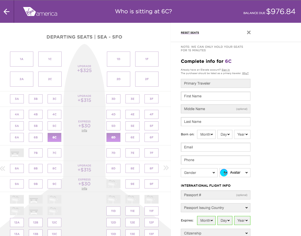
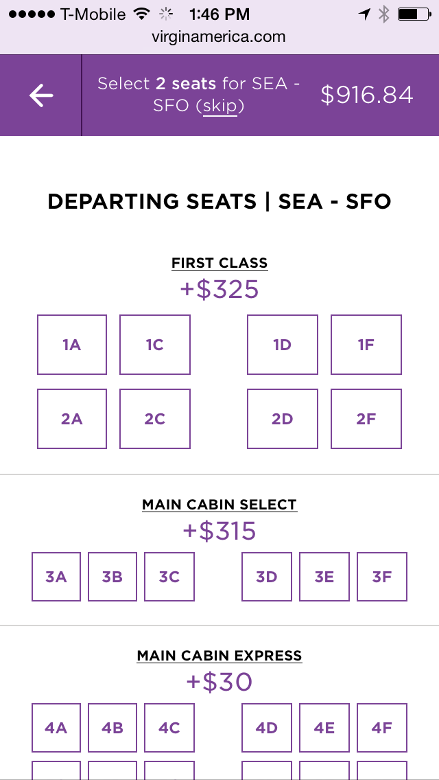

I can easily go “back” by scrolling up the page or using the omnipresent left arrow indicating the previous step.
Inputs and fields are designed for touch with finger tip/finger pad sized dimensions (at a minimum).
An interesting flavor of criticism of the website has been around the functions the site can’t or won’t do. Which reminds me vaguely of the criticism Steve Jobs/Apple got when the first iPad was unveiled. People complained that they couldn’t put Word on it. Which was the point. The iPad wasn’t intended to be a computer. And look where we are now.
Kudos to Virgin America for flipping the industry on its head. I just wish I had somewhere to fly to.
