How The Guardian gets image management done – right

GuardianGrid_1
The Grid image service allows very fast search across our library of over 3 million pictures. Illustration: The Guardian

I’m currently in the midst of architecting and designing an image “management” tool for users to be able to upload, tens, if not hundreds, of images for the purposes of matching them to products to sell online, once the images have been submitted through an internal workflow (yet another tool – but not on my plate).

A fellow co-worker suggested that I look into the Guardian’s case study of the Grid; the Guardian’s now open-source image management system tool.

I’m in LOVE. L-O-V-E. with the approach.

Not only does has the Guardian open-sourced the tool, they’ve shared the methodology behind it’s creation (Programmer Anarchy), and presented insights from the UX perspective on how the entire team was able to get on the same page, at the same time, and work together to champion all the users–an actual shared Vision complete with succinct goals and KPIs.

Not to mention, a drool-worthy short video sizzle reel of the Guardian’s UX Studios.

Read the entire case study here.

Then bring on the anarchy.

How not to accidentally start a war

A very interesting article from the online magazine the Verge regarding the company that created and supplies the software alert system that was responsible for the near disastrous incoming BM warning issued to residents and visitors in Hawaii earlier this week.

When considering how our brains function, or don’t, during extreme conditions (an incoming missile being one of them), it’s rather unfathomable that there is no visual differentiation or confirmation between a “test” message and a “real” message.

The company has confirmed that, if creating a message from scratch, there are eight steps involved; if creating from a template: three steps. So users technically can’t just click a button and issue an alert – there are at least three steps. (I personally can’t imagine being able to keep my sh*t together to get through three steps, but then again, what we imagine we’ll do in an emergency situation is often not the case.)

What surprises me is that there is NO FINAL CONFIRMATION messaging when sending out a “live” message. As in, “Are you really sure you want to send an entire state into panic?” Or, “Are you really sure you want to start a war?” Maybe even a second one (a final final confirmation message) just in case cognitively the person isn’t thinking clearly, possibly adding bells, whistles and starbursts.  (Studies show the same thing happens to pilots in crash scenarios. The brain can only handle so much at once.)

Word of the day: Confirmation.

Are you sure you want to start a war? Really sure? This action cannot be undone.

Were did nearly 2 years go?

For those who look at time stamps and time in-between posts, you undoubtedly notice that there are few posts in 2016 and 2017–maybe four or five total.

It’s not that I’ve forgotten to write,  or become bored with writing, or fell off the planet.

Sometimes you make plans and then life gets in the way.

Well, I think I’m back.

Directional signage, anyone?

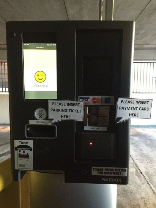
Recently, when exiting the parking garage, I noticed some signage updates to the new payment system installed by the garage. Since I’m a monthly card holder, I just have to flash my card and the gate automatically opens. Based on the labels and dialog windows, my guess is that the process for paying to get out of the garage is not intuitive.

img_1101

Solar power genius

Take a good look at the photo below and tell me how absolutely genius this set up is.

ParkingLotNormanDoor
Genius

For starters, the smaller item on the far right with the slick rounded top is an electronic parking meter. You put in money or a credit card, select how much time you want to pay for, and it spits out a little piece of paper you stick on your dashboard.

Note that the parking meter has a solar panel on top of it, presumably to keep it powered or partially powered.

Now take notice of the larger “thing” to the left of the electronic parking meter. This is signage informing the would-be parker about parking rates, instructions on how to pay for  parking, and undoubtedly some language that says something about the parking company takes no responsibility for lost, damaged or stolen stuff.  Aka, fine print.

The designers of said signage thoughtfully included an awning over the signage, presumably to shelter is reading the instructions from the rain (this is Seattle, after all.) The awning manages to stretch over the a portion if not all of the solar panel on top of the parking meter. Again, I’m sure, to keep the Seattle downpour off of whomever while the parking people get their money.

Both of the signage and electronic parking meter are situated somewhat under a very large tree, the branches of which create a leafy canopy.

Now, I get that solar power has come a LONG way, but this is genius.

A brief time-out: Norman Doors

I have no IDEA why I’ve been thinking about “Norman Doors” lately; it may have been while watching an older episode from Modern Family where Claire gives herself a shiner while being boss for the day at her dad’s closet company.

Most in the UX community are familiar with the phenomenon, but for those unaware it’s relative simple. A “Norman Door” is simply a door that one simply cannot determine exactly if it is meant to be pushed open or pulled open. (The title is named after the well-known Donald Norman.)  Conflicting handle design (vertical or horizontal) and signage (“Push” or “Pull”) may often be at odds with one another.

I found a nifty little blog post with great examples of Norman Doors at 703 Creative.

NormanDoor_703
Photo credit: 703 Creative

The post has some great examples that will generally leave you head scratching, but hopefully wary next time you approach the entrance to your local shopping mall.

Redesigning the Apple Watch UI

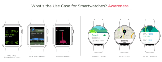
Luke W (a.k.a. Luke Wrobleski) gives us a brief and informative breakdown of the Apple Watch UI and interaction model, with recommendations for improvement. I really like his take on the suggested model of use: notifications, glances, apps.

applewatch_awareness_2x
Illustration: Luke Wrobleski

Not an owner of an Apple Watch, yet, I can appreciate how iPhone owners (myself included) would look for a similar interaction model to access information. It only makes sense, right?

Read the full article here.

Designing with color blindness – a color blind designer perspective

Aaron Tenbuuren, a color blind designer, offers perspective on how we can consider color blindness when designing, as he writes in his recent post,  “Designing For (And With) Color Blindness.”

I didn’t realize (or maybe I forgot the number) that one in ten individuals are color blind. While a relatively small portion of the population, they are still users of apps, sites, experiences. Multiply that number and it leads to a large percentage of potential users/visitors/customers who find using your site or app difficult and/or not worth the effort.

I’ll find nice photographs that have great color palettes, pieces of furniture, paintings, anything. These already established and proven pieces are a great source of color influence.

I appreciate Aaron’s inspiration for color palettes – particularly since it exists in the physical world, outside the online one. Even more so when you consider how he experiences color. Not an absence of (which I previously associated color blindness with), but difficulty in labeling or telling one color from another.

I once had a color blind, color photography instructor in school. We would constantly ask him (to the point of annoyance, I’m certain), to identify colors in our photos, or in the subject matter we were photographing. He’d get it right 100% of the time, which just blew me away. And his photographs were equally as stunning.

There is something to learn from a different approach seeing and experiencing color. Perhaps Aaron and my instructor understand color better then individuals with normal sight do.