I am a huge fan of (Ann Taylor) LOFT. The price point (everything eventually goes on sale within a week or two), quality, and style suite my budget and fashion sense just fine. I have a LOFT card to earn points towards more clothing, and I submit payments online.
The LOFT recently updated the account center where you manage your payments, balance, account activity, etc, because when I logged in today it announced the new account center “is even better.”
Yes, most of it’s cleaner and more suitable for multi-device and screen accessibility. But for whatever reason, there are square shapes showing up for almost everything, except text. And I mean everything.
The use of the square is so widespread I can’t be certain if something is broken, or whomever just got carried away. It’s a static visual, it’s part of the navigation menu, it’s part of the interactive features and selection mechanics in the UI. I’m really hoping something is wrong with their image server.
The worst part is that it just broke nearly every mental model I have when it comes to a square. Square = check box. Click/tap = select/unselect. I thought I was losing my mind. I kept tapping on my iPad expecting a check to appear.
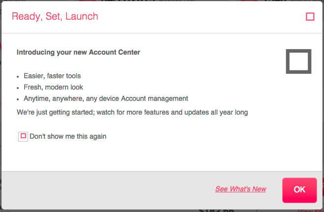
Post Log-in Experience:
After the log-in screen I was presented with an overlay introducing the new account center. Initially, I wasn’t paying attention to the use of the square shape in this window. Not until I went to check the box “Don’t show me this again.” (See below).

Instead of a “check” in the box (or square), I got a square–in the box (or square). Is it broken or is this intentional? Good Lord, I hope this is broken.
Home Page and Menu:
 It just keeps getting worse. There are squares everywhere, and the intended use or purpose is a mystery to me. In the menu to the left of the page, the square is not used to visually demonstrate the “on state” (like filled in). Instead, a pink, vertical line is the indicator.
The three smaller gray squares in the upper right hand corner are navigation elements to the My Profile section, Message Center, and Help and Customer Care. I didn’t even know where I was going to end up until the page loaded. There is no label on hover state or otherwise.
When I click on the square next to the label “Recent Activity” it just rotates and reveals inline my recent account activity.
And at the top of the screen I don’t even know what the white squares in the pink circles are supposed to be.
Make a Payment:
The shot below is from my tablet, which is where I initially encountered this experience. Each time I tapped on the square, I kept waiting for the check mark. I must have tapped on “Other amount” half-a-dozen times before it occurred to me that the change in background color (light gray to dark gray) was the visual indicator for “selected.” Holy crap, is this intentional?
Not to mention, in the Select Checking Account and Select Payment Date columns, there are selections with TWO squares. What on earth are they meant to represent?

The Aftermath:
I managed to make my payment. (I logged back in this morning to double check). But the scenario raises several questions.
The first question, obviously: is the use of the squares for all static and interactive UI assets intentional? I mean, was there a cognitive decision to use the shape to represent nearly everything?
Question number two: how many UI icons and assets are really necessary? A squint test on this page reminds me of a shooting gallery with lots of targets.
Final question, did this get a scrub and Q/A before it went live?
I really, really, REALLY hope something is temporarily wrong, because overall it’s an improvement to the previous experience.