Apple.com navigation needs to work the kinks out

For the past one or two years I’ve had discussions with fellow creatives and UX-ers about Apple.com not getting on Responsive/Adaptive website bandwagon. (“Bandwagon” back then; today the approach to website strategy and design.) Most of us were mystified, considering Apple more or less set the bar on how to interact with devices, especially phones and tablets.

Well, now we can discuss the “new” Apple.com. In this case, their approach to the navigation. (Maybe “new” isn’t the most accurate term, since it has from my perspective, maintained the same architecture and visual design.)

Apple.com has updated the look and feel of their global navigation to a “flat” design. They’ve removed the chrome-y buttons and etched type and implemented a simple, dark grey background with white type. Great for fluid transitions in between break points as the links and masthead collapse and adapt more easily.

newAppleDotComNav
New Apple Menu/Masthead
oldAppleDotCom
Previous Apple Menu/Masthead

The global categories, visible on desktop/tablet widths, are accessible when the hamburger menu (two buns only) is tapped. Interestingly, the menu loads horizontally from left to right, indicating that the menu is swipe-able in order to access the menu items that are off-screen to the right.

newAppleDotCom_mobileNav
New Mobile Apple Menu/Masthead
Global Navigation open on mobile

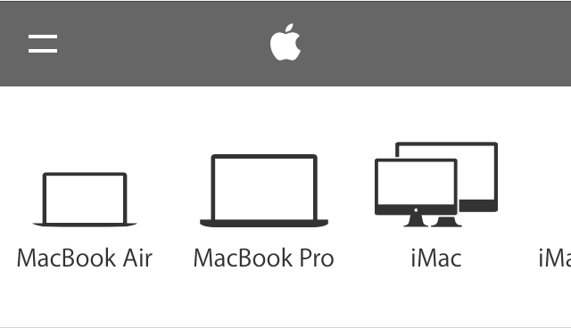
I appreciate what I believe is Apple recognizing that small images in the sub-category navigation won’t work well in a smaller viewport, as details can be difficult to see and differentiate between. Thus, in some categories, the sub-category navigation are represented by vector graphics, instead of the images on the larger tablet and desktop screen widths.

Screen Shot 2014-10-24 at 11.50.14 AM
Sub category navigation for iPad on desktop/tablet
newAppleDotcom_subCatNav_mobile
Sub category navigation for iPad category on mobile

Unfortunately, Apple.com hasn’t applied this approach across the board for mobile (images > vectors). Which is kind of weird, I think, because of the crazy inconsistency between the desktop/laptop experience and the mobile experience.

NewAppledotCom_Watch_mobile
Sub category navigation for Watch on Apple.com.

Additionally,  if you’re not paying close attention, you may miss the fact that on the desktop, some categories, such as “Mac” have groupings of sub categories, like “Mac”, “Apps”, “Pro Apps” “Accessories” and “Server”. It doesn’t help that these are very small links that get lost when combined with the images, and the only indication that they relate to anything is the darker, horizontal bar above the group label.

Screen Shot 2014-10-24 at 12.59.00 PM
“Mac” sub category group

On the desktop, if the user clicks on “Apps”,  a whole new set of sub categories slide into view.

Screen Shot 2014-10-24 at 12.58.29 PM
“Apps” sub category grouping

On the mobile view however, it’s just one long horizontal list with a combination of vector graphics (instead of image counterparts) and skeumorphic icons. Kind of hodge-podgy feeling. I can definitely see how it’s going to be difficult to find (and then recall) the “deeper” items; a true case of out of sight out of mind.

NewAppleDotCom_macMenu1
“Mac” sub category grouping on mobile
NewAppleDotCom_MacMenu2
Mac “Apps” sub category grouping on mobile. There technically is no differentiation between the groups, unlike the desktop/tablet version.

While I like the horizontal scrolling mechanic Apple.com has introduced for their global menu, its use at sub category level starts to fall apart when a sub category has more than two groups of items. Apple is asking the visitor to work harder to find and then recall menu items. While lists of items in today’s “hamburger” icon aren’t always sexy, at least the vertical approach lets users scan easily while being able to “tier” items in a manner that is relatively intuitive.

Additionally, I’d love to see a consistent vector approach to the mobile version, instead what appears to be a bit of a mashup.

All in all, the jury is still out on this one. I’m glad to see Apple.com moving in the direction of design that their products have enabled, I just wish it was up to the standard their products reflect.

Icons open to interpretation

Icons and symbols have been a part of human communication since Homosapiens began drawing cave walls. Fast forward to the symbols on our computer desktops for “Trash” and “Hard Drive.” Now we discuss “Hamburger menu” icons and debate Flat Design versus Skeumorphism.

Regardless of your preference, when considering using icons for communicating, approach with caution. Humans are multi-faceted beings who do not necessarily interpret signs and symbols the same way.

Case in point, the following icon menu in a high-priority location on a regularly visited website for app developers

windowsDev_icons_restState
Icon Menu – Rest State

Without hovering over the icons, the only one I genuinely feel confident I can correctly interpret is the first symbol on the left, “Download”, and the magnifying glass, “Search.” The remaining 5, I’m uncertain. Let’s see:

windowsDev_State1
Down Arrow Underscore = Download SDK
windowsDev_State2
Brackets = Sample Code
windowsDev_State3
Paintbrush (?) = App Studio
windowsDev_State4
Up Arrow Overscore = Submit App
windowsDev_State5
Bar Graph = Get App
windowsDev_State6
Eye = Preview App

The  App Studio and Get App icons had me at a loss until I hovered over them.

Now, the caveat to this particular site is that if there are regular visitors, they will become familiar to the icon system. However, the overall message around usage of icons is valid – approach them with caution, not all human beings see and interpret icons and symbols the same way. For a system to be as useful and usable as possible, so must icons be quickly, easily and correctly interpretable. Or not used at all when text may suffice.

The same, but different, sign-in experience

Many of us who work in the business of designing interactive experiences would agree that most days we’re pretty savvy when it comes to identifying less than optimal designs and working through them to get to where we need to be. To be fair, we all have moments when maybe our synapses aren’t firing on all cylinders, or our situational awareness isn’t at 100% (aka: distracted).

But on those off days, we need better visual affordances to help us along.

Case in point. Pandora. I recently found myself trying to log into my Pandora account from the Pandora home/landing page (I’d obviously been logged in forever), and for the life of me couldn’t figure out what was happening (or not happening) to the sign in page.

Briefly, I was repeatedly clicking the “sign in” link in the upper right corner, expecting the page to refresh and do something sign-inny, like a refresh, alert or instructions, highlighting…something, anything.

Troubleshooting kicks in, and I switch browsers, believing that something must be wrong with the site in Chrome. Hey, it happens, right? But even switching browsers (to Safari) nothing changes on the Pandora home page.

Since I was focused on the page more than usual, I realized that the primary focus of the home page content (in a signed-out state) is to sign in. (How come I never noticed this before? Or overlooked it so easily?)  Studying the components more closely, it became apparent there was no large, bold type directing me to “Sign in below.” (That would have been super helpful in my case.) Instead, the copy on the page was introducing me, the account holder, to the concept of Pandora, “It’s a new kind of radio – stations that play only the music you like” followed by text fields for “Your email” and “Password” with a sign in button. At the bottom of the sign in module read tiny text, “Create an account for free.” with a contextual link, “Register.”

Pandora.com Home Page
Pandora.com Home page

Okay, I get that once you start dissecting and breaking down what the text says and the labels in the text fields with the corresponding Sign in button, it’s more obvious that the page is intended for existing members to sign in. (Though I do question the introductory nature of the copy and it’s close relationship to the sign in fields for existing members. Seems like Pandora could have done a better job of directing members to sign in while using the intro copy for creating new accounts. But I digress somewhat.)

pandora_2
Pandora “Register” page

Recall I was clicking the upper right corner “sign in” link, and there was no visual response on the page. Each time I clicked, the page appeared to remain “static” with no error message instructing me to enter my email and password while highlighting the required fields on the page. When I clicked the “register” link in the upper right had corner, the page refreshed to the Register experience. Same with clicking the “help” link. So naturally my expectation was, in my distracted limited attention state, that something should happen to the page.

(In fact, I figured out what I was overlooking when I clicked “Sign in” from the Register page, and was directed to the Pandora home page. Where I’d started from.)

pandora_3
Error messaging

What I needed to happen is what the page did when I clicked the “Sign in” button next to the sign in fields – I got red text directing me to specify my email address and password. As I would expect. (And now I know that I can sign in using the fields on the home page.)

Now granted the upper corner is navigation, and the button is for input. But even the other navigation items (register, help) have a distinct page change, so at minimum I’d expect the page to briefly refresh when clicking sign in. And maybe some language to the tune of, “You’re obviously having a stupid moment, clicking the same link expecting something different to happen.”

Lesson learned here. Language should go with the action. And, secondarily, despite the fact that both the sign in link and Sign in button are “relatively” identical calls to action, the post-click visual affordances are different. Small discrepancy, yes, but the inconsistency affecting the user from quickly and easily accessing her account is the larger issue.


Designing Solutions for Unpleasant Tasks

We can all agree that there are tasks out there that aren’t fun at all, such as filing taxes, paying bills, creating a will, etc. When it comes to designing UX for an unpleasant task, the first thing to accept (and remind oneself throughout) is that the task itself sucks because it just does, and that the UX professional should do as much as possible to not make it suck more. From UXMatters.com comes a FANTASTIC piece discussing design strategies for unpleasant tasks, starting with:

Accept That You Can’t Make Some Tasks Pleasant
A positive user experience can help minimize the pain and avoids adding more unpleasantness, but it’s not going to completely take the pain away. As UX designers, our job is to help people get through their unpleasant tasks smoothly, without piling on more difficulty. Ease of use and efficiency are especially important in easing the way through unpleasant situations.

Stay Out of the Way
Ensure that the UI you design doesn’t get in the way or cause more problems. Remove unnecessary features, distractions, questions, and interruptions so users can focus on their icky tasks.

Be Careful What You Say
When writing messages and other text relating to unpleasant tasks, it’s best for the tone of the content to remain neutral or perhaps mildly encouraging. Being cute or irreverent is not going to go over well.

Avoid Overwhelming People
Too much information or too many options can easily overwhelm people who are already stressed, anxious, fed up and pissed off. Keep in mind the following techniques:

Ease into Things
Dashboards present an overview that eases users into complex information by presenting a simplified view first before they dive into the details. This approach may be more appropriate than dumping a user into complicated screen right away.

Show What’s Coming Up
Another way to ease into a process is by telling users what to expect. People are more likely to begin and complete a process if you give them a reason to do so and show them what’s involved. Consider a quick text overview before a new section to better set expectations, or a progress indicator like those used in a check out process in e-commerce transactions.

Focus on One Step at a Time
How do you eat an elephant? Exactly. For some activities it’s best to break the task into smaller, more manageable “bites.” This makes the overall task feel less overwhelming and allows the user focus better on requirements.

Use Progressive Disclosure
Provide only the information and options users need to see in order to accomplish the tasks they’re dealing with now.

Hide Complexity
Don’t expose users to information they don’t need to see. Duh, right?

Minimize the Need to Read (when appropriate)
It’s widely accepted that people don’t like to read online instructions. Under normal circumstances, they’ll skim just the content they need to get through. When people are stressed out, this is even more true. So for stressed out users, do them a favor and keep the content concise and make it easy to scan with headings, bullet points, and format text that needs to be emphasized.

Automate Actions
Automate frequent, repetitive actions, or make it easy for the user to set an automated preference. Then make it obvious that it’s been completed in case the user wants to undo the action.

Provide Common Defaults
Provide time-saving defaults to users so they don’t have to input the values themselves.

Avoid Surprises
Enough said. Keep users informed and set proper expectations.

Give Users Control
Give users a sense of control by providing them with options instead of constraining them to a specific path. Advanced, knowledgeable users will appreciate skipping the screens and information they’ve seen before. Also, in the same vein:

Provide Options For Different Audiences
E.g, Novice vs Advanced users.

Give a Sense of Progression to Encourage Users
“Are we there yet?” Not knowing makes just about everyone nuts. Especially in the midst of an unpleasant task. So let users see how their progressing to remind them that relief is in sight.

Provide Various Levels of Help
Instructional text, tool tips, contextual help, live chat access, call center access, email, contact us, progressive disclosure tips.

Help Users Make Difficult Decisions
Provide information, suggestion and recommendations. Especially when tasks and/or subjects may be unfamiliar or infrequent.

Oh yeah, avoid being annoying. “Clippy” anyone?

Read the complete article with relevant examples at UX Matters:
“Designing Solutions for Unpleasant Tasks”

A case of the hiccups

Earlier this week I was creating an online account in order to start a trial for a cloud wireframing prototype tool. The form itself was easy to scan and follow, aesthetically pleasing from a visual standpoint, and was using real-time field validation instead of “on submit.” It was all good until I had to enter, in order, a username and password. Then I encountered an unforeseen hiccup in the validation implementation.

After I entered my first choice for my username, I received the following alert and error messaging. uname3
Nice error message design

So I deleted my first choice and proceeded to type my second choice for my username.uname4
That’s weird. What are the odds

So I deleted my second choice and proceeded to type my third choice for my username.
uname2
Did I create an account once and forget? WTH is going on?

And other colorful commentary.

Then realization hit through happenstance of clicking away from the field. The form field didn’t recognize that I was typing in a different username after I had deleted the first. It was “stuck” on the original choice I entered. The field wouldn’t “clear” until I tabbed or clicked away, then entered a new choice for username.

uname5
Success! I wasn’t losing my mind. I wonder how many users of the same cloud software tried half a dozen usernames and passwords (yep, same issue) before they gave up or (luckily) figured it out. And/or lost their minds trying.

But, lesson learned. When implementing real-time form-field validation make sure legacy messaging validation, specifically in the case of error messaging, clears appropriately in order to better inform the user. 


Dueling remote buttons

ImageThis remote has two buttons, in shades of red, in key positions at the top of the remote.  The one on the left is labeled “POWER” while the one on the right is labeled “ON/OFF.” To a remote novice like myself, my first instinct was to press the “ON/OFF” button to turn the television “on.”  Makes some manner of sense, right? After several failed attempts, I was forced to turn to a fellow co-worker and ask WTH? Turns out, the “ON/OFF” button is to turn the button lights “on” so they’re visible in the dark. (!?!?!?!) Lesson learned, but I still question the: 1) size 2) relative position and placement 3) use of color 4) and labeling applied to the Power and the On/Off buttons. It seems the On/Off button could be given a little less prominence, a different color, and don’t we have technology to make them glow in the dark or react accordingly with sensors?


UX Mobile Immersion Conference 2014 – Day 3

I begged the powers-that-be to send me to the UX Mobile Immersion Conference (#UXIM) in Denver, Colorado this year. I started submitting requests and rationale in November 2013. Since I got a passive aggressive “nope,” I’m living vicariously through Twitter right now, following #UXIM. There are some amazingly fun and informative tweets coming from the conference right now, my favorites listed below.

Creating apps that are ‘usable’ are the equivalent to food being ‘edible’ ” – Jared Spool

Jason Grigsby: When Responsive Design Meets the Real World

  • Jason Grisgby has led us all down a responsive workflow, now he is going to tell us how wrong we all are.
  • “I now use progressive JPEGs, the algorithms have gotten better”
  • “Answer to responsive tables: “What are you using the table for?” Then plan #RWD around that.”
  • To do responsive web design correctly, you are probably going to need more than responsive web design”

Nate Schutta: Coding Prototypes, Even if You’ve Never Tried

  • “If a picture is worth a thousand words, how many meetings is a prototype worth?”
  • “Friends don’t let friends use IE 6.”
  • jQuery Mobile is a HTML5-based user interface system designed to make responsive web sites and apps that are accessible on all smartphone, tablet and desktop devices.”

Karen McGrane: Adapting Your content for Mobile

  • “Print is awesome. You put the words on the paper and they stay there!”
  • “Whatever the next big thing is going to be, we are going to have to get our content onto it.”
  • “Thinking about where content will ‘live’ on a ‘web page’ is pretty 1999.” – Lisa Welchman via Karen McGrane
  • “Imitating paper on a computer screen is like tearing the wings off a 737 & using it as a bus on the highway” Ted Nelson via Karen McGrane
  • “We need systems that allow us to create content hierarchy programmatically to better translate into other platforms.”
  • “Truncation is not a content strata…”
  • We have to treat content management as UX. Content creators often want to crawl back to Word & a simple WYSIWYG.”
  • The purpose of doing the inventory is not so you have an inventory, it is so you can make decisions about the content.”
  • The user’s goal is not to look at a table. It is to give them the info they need in order to complete a task.”

UX Mobile Immersion Conference 2014 – Day 2

I begged the powers-that-be to send me to the UX Mobile Immersion Conference (#UXIM) in Denver, Colorado this year. I started submitting requests and rationale in November 2013. Since I got a passive aggressive “nope,” I’m living vicariously through Twitter right now, following #UXIM. There are some amazingly fun and informative tweets coming from the conference right now, my favorites listed below.

Luke W:

  • Hotel Tonight – 4 taps/swipes and 8 seconds to book a room. So easy babies and cats were booking rooms…
  • Hotels.com – 40 taps/109sec b/c they couldn’t let go of desktop method…

Bkuva7KCAAEXoJ_

  • “If it’s important, it should be visible.”
  • “The evil lord fold, who is a tyrant… Controls the scroll.”
  • “The problem isn’t is it visible above the fold, it’s about having it visible when the user needs it.”
  • “When the hamburger icon is paired with the word ‘menu’, it’s 7.2% better. When made to look like a button it’s 22.4%” (Facebook)
  • “Long pages, in mobile, create a flat hierarchy, heavy download and lack context generally.”
  • “We’ve been at it for 30 years designing for personal computers and ~6 years designing for mobile.”

Karen McGrane:

  • “You don’t get to decide which device people use to go on the internet. They do.”
  • “Responsive design won’t fix your content problem.”
  • “It’s not a strategy if you can’t maintain it.”
  • “Theres no such thing as how to write for mobile, there’s just good writing.”
  • “88% of Americans without a high school diploma don’t have internet access at home.”

Jason Grigsby:

  • “Resolution does not define the optimal experience.”
  • “We can no longer make assumptions about input based on screen size or form factor…and we probably never should have.”
  • “The web never had a fixed canvas.”
  • “Any attempt to draw a line around a device class has as much permanence as a literal line in the sand.”
  • “Phone, tablet and desktop interfaces are fundamentally different platforms with different usability considerations.”
  • Design for a user need not for a specific form factor or input.

Jared Spool:

  • We are not creating designers fast enough to meet the demand for user experience. Big companies are building out an army of user experience designers.
  • Experience designer (also known as a design unicorn) → information architecture, user research practices, visual design, interaction design, editing and curating, copywriting, design process management, information design.
  • Specialist → having more expertise in one area over others (really good designers, having specialization in an area outside of design)
  • Generalist→ having equal expertise in most areas
  • Compartmentalist → having expertise in only one area (a career-limit decision)
  • How to become a design unicorn:

1. Train yourself (absorb everything)

2. Practice your new skills

3. Deconstruct as many designs as you can (learn from others)

4. Seek out feedback (and listen to it)

5. Teach others