This isn’t a real blog “post” – more like a UX rant.
While checking out the pttrns.Beta site, I encountered a banner for “iPhone 6 Mockuuups.” And I continued to encounter it as I scrolled the page up and down.
Resizing the window didn’t keep it from obscuring the page content (I hoped it would shift out to the margins). Clicking on the banner itself and returning to the page didn’t remove it either. I tried grabbing it (which I could) and pushing/dragging it off the screen (nope.)
Yes, I looked for a close button.
Is there some new advertising model I wasn’t aware of? Is this a Beta site thing?
According to a recent post by Pure Oxygen Labs, 2014 saw retailers shifting away from Mdots to Responsive and Dynamic Serving. Here’s a look at the numbers:
59% used dedicated mdot sites – down (significantly) from 2013
15% used dynamic serving – up slightly from 2013
9% used responsive design – up (significantly) from 2013
14% had no mobile web presence at the time (OMG)
Pure Oxygen Labs points out that while mdot usage is sliding, the biggest obstacle and conundrum for retailers adopting responsive design is page speed and it’s potential effect on conversion. Despite this “Achilles’ Heel”, POL expects responsive to surpass 15% retail adoption in 2015.
The lines between designers and developers continues to blur, and what is old is new again in terms of challenges of designing for the web. As responsive design moves forward, coming to terms with image use, design patterns and components instead full page comps, and maintaining style guides are the new challenges and headaches we get to tackle.
The mobile web continues to grow, with reports over Christmas showing mobile commerce accounted for 37% of all online retail sales. While brands are improving mobile experiences for users, there are still pitfalls and problems out there for customers and users.
A recent NY Times article, Are Tiaras the New Power Scrunchies?, and a second article on Jezebel.com,How to Choose the Perfect Business Tiara, highlight the tiara as the latest power accessory; completely acceptable as part of a woman’s business-wear ensemble, and not to be taken lightly when selecting and wearing. Yes, there are rules about wearing tiaras; whatever it takes, embrace your personal glitter power.
In the spirit of the Holiday Season and the 3%, I give you my possible tiara choices. Enjoy.
Bespoke 1920’s Style Headband by StanAndMay on Etsy.com
Simple Crystal Bridal Headband by EdenLuxeBridal on Etsy.com
Greek Goddess Laurel Leaf Tiara by AnneMarguerite on Esty.com
A bloated ratio of links with little value to human visitors placed at the top of the page is like an oversized sugary topper with no nutritional value. Bruce Clay – The Cupcake Effect
(Mmmmmm, frosting. Good on cupcakes, not so good on most web pages.)
I discovered this fantastic analogy (Thank you Bruce Clay!) for how to describe the effect of too many links at the top of a web page. Links that serve virtually no purpose to the site visitor, other than to get in the way of her ability to orient herself and explore the page.
It all began with a request for a page-level, contextual menu component be able to display up to 80 links. 80 LINKS. Not a mega menu (and even then I’d balk) or a filter menu, not an index page or site map. Instead, a content rich page with a menu component linking to corresponding top sub-categories (keyword here: “Top” not “All”) in addition to contextual navigation throughout the page.
There is a ginormous concern with this request.
To begin with, try rendering this in a mobile scenario. Since this is page level and not a global navigation menu, one option (albeit a bad, terrible, horrible one) is to list all the links on the screen and let the user just scroll away and away and away from the site. Option 2 is to concatenate the section with a “more” functionality in order to view the remaining links.
A third option is to adapt the list into a single call-to-action (CTA) component that, when tapped, opens up a menu on a second screen with hide/reveal functionality or links to secondary menu screens. At least with this option the list isn’t perceptively long and difficult to scan through, to a point.
Regardless, can you say, “link-gate”?
Imagine how much scrolling up-and-down or back-and-forth the visitor is going to have to do to find what she wants, much less understand what the links and the page have to do with each other.
More links on a content level category page do not help. They don’t help to orient the visitor to the section, the page and/or its contents. Instead, they have the opposite effect. The links add more noise and create more chaos. Dropping the visitor into a page with a menu of 80 links is a bat-shit crazy if you think it’s going to be helpful.
Which brings me to the looming issue with the request – no matter what device – the additional cognitive load the links WILL ADD to the visitor’s experience. That’s a bad thing.
Cognitive load is defined as the amount of mental resources or brain power required to understand and operate the system. Dropping the visitor into a page with a menu of 80 links is bat-shit crazy if you think it’s going to be useful or helpful.
Human brains have limited amount of processing power, and when the amount of information coming in exceeds our ability to handle it, our performance suffers. We may take longer to understand the information, miss important details, or even get overwhelmed and abandon the task. Says Nielsen Norman Group.
The best recommendation for this request is to approach the links in terms of quality, not quantity. The better the links or labels, the better the chance of the visitor exploring the page, finding what she’s looking for, and having a positive experience.
For the past one or two years I’ve had discussions with fellow creatives and UX-ers about Apple.com not getting on Responsive/Adaptive website bandwagon. (“Bandwagon” back then; today the approach to website strategy and design.) Most of us were mystified, considering Apple more or less set the bar on how to interact with devices, especially phones and tablets.
Well, now we can discuss the “new” Apple.com. In this case, their approach to the navigation. (Maybe “new” isn’t the most accurate term, since it has from my perspective, maintained the same architecture and visual design.)
Apple.com has updated the look and feel of their global navigation to a “flat” design. They’ve removed the chrome-y buttons and etched type and implemented a simple, dark grey background with white type. Great for fluid transitions in between break points as the links and masthead collapse and adapt more easily.
New Apple Menu/MastheadPrevious Apple Menu/Masthead
The global categories, visible on desktop/tablet widths, are accessible when the hamburger menu (two buns only) is tapped. Interestingly, the menu loads horizontally from left to right, indicating that the menu is swipe-able in order to access the menu items that are off-screen to the right.
New Mobile Apple Menu/MastheadGlobal Navigation open on mobile
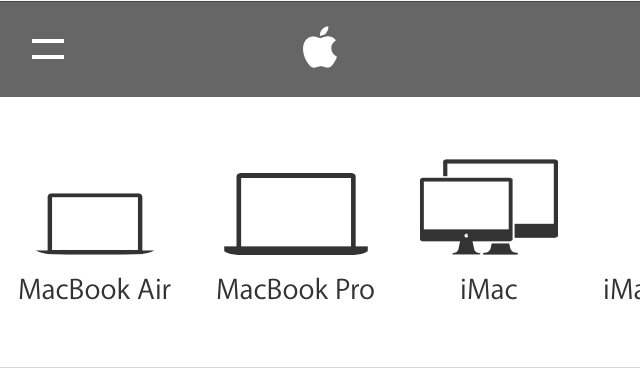
I appreciate what I believe is Apple recognizing that small images in the sub-category navigation won’t work well in a smaller viewport, as details can be difficult to see and differentiate between. Thus, in some categories, the sub-category navigation are represented by vector graphics, instead of the images on the larger tablet and desktop screen widths.
Sub category navigation for iPad on desktop/tabletSub category navigation for iPad category on mobile
Unfortunately, Apple.com hasn’t applied this approach across the board for mobile (images > vectors). Which is kind of weird, I think, because of the crazy inconsistency between the desktop/laptop experience and the mobile experience.
Sub category navigation for Watch on Apple.com.
Additionally, if you’re not paying close attention, you may miss the fact that on the desktop, some categories, such as “Mac” have groupings of sub categories, like “Mac”, “Apps”, “Pro Apps” “Accessories” and “Server”. It doesn’t help that these are very small links that get lost when combined with the images, and the only indication that they relate to anything is the darker, horizontal bar above the group label.
“Mac” sub category group
On the desktop, if the user clicks on “Apps”, a whole new set of sub categories slide into view.
“Apps” sub category grouping
On the mobile view however, it’s just one long horizontal list with a combination of vector graphics (instead of image counterparts) and skeumorphic icons. Kind of hodge-podgy feeling. I can definitely see how it’s going to be difficult to find (and then recall) the “deeper” items; a true case of out of sight out of mind.
“Mac” sub category grouping on mobileMac “Apps” sub category grouping on mobile. There technically is no differentiation between the groups, unlike the desktop/tablet version.
While I like the horizontal scrolling mechanic Apple.com has introduced for their global menu, its use at sub category level starts to fall apart when a sub category has more than two groups of items. Apple is asking the visitor to work harder to find and then recall menu items. While lists of items in today’s “hamburger” icon aren’t always sexy, at least the vertical approach lets users scan easily while being able to “tier” items in a manner that is relatively intuitive.
Additionally, I’d love to see a consistent vector approach to the mobile version, instead what appears to be a bit of a mashup.
All in all, the jury is still out on this one. I’m glad to see Apple.com moving in the direction of design that their products have enabled, I just wish it was up to the standard their products reflect.
Microsoft CEO Satya Nadella, when asked what advice he would give young women in the tech industry regarding asking for a pay raise, offered this:
Which is, it’s not really about asking for the raise, but knowing and having faith that the system will actually give you the right raises as you go along.
And that, I think, might be one of the additional superpowers that, quite frankly, women who don’t ask for a raise have. Because that’s good karma. It’ll come back because somebody’s going to know that’s the kind of person that I want to trust. That’s the kind of person that I want to really give more responsibility to. And in the long-term efficiency, things catch up,
Essentially ladies, even if you don’t ask for a raise, you’ll eventually get fair pay. If this were true, I’d be making six figures annually.
The comments he made were a ramble, and hopefully do not really express his actual feelings on the matter. If not, it reflects abysmally on Microsoft, and its culture/attitudes.
Perhaps Mr. Nadella should speak at The 3% Conference, championing creative female talent and leadership.
3 Reasons Why Responsive Rebuilds Can Reduce E-Commerce Revenue
From our experience working with enterprise e-commerce companies in a wide range of product categories, it all comes down to one (or a combination) of the following three reasons:
A retailer treats Responsive Design as a conversion-centered solution, which it inherently isn’t.
A team makes improvements to the under-performing mobile layouts but ends up affecting desktop layouts as well, negatively impacting conversion rates.
Lack of internal expertise with this relatively new design methodology leads to site speed issues that go undetected during the rebuild project but then shatter conversion rates and organic search traffic after the new site is released.
Icons and symbols have been a part of human communication since Homosapiens began drawing cave walls. Fast forward to the symbols on our computer desktops for “Trash” and “Hard Drive.” Now we discuss “Hamburger menu” icons and debate Flat Design versus Skeumorphism.
Regardless of your preference, when considering using icons for communicating, approach with caution. Humans are multi-faceted beings who do not necessarily interpret signs and symbols the same way.
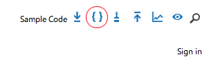
Case in point, the following icon menu in a high-priority location on a regularly visited website for app developers
Icon Menu – Rest State
Without hovering over the icons, the only one I genuinely feel confident I can correctly interpret is the first symbol on the left, “Download”, and the magnifying glass, “Search.” The remaining 5, I’m uncertain. Let’s see:
The App Studio and Get App icons had me at a loss until I hovered over them.
Now, the caveat to this particular site is that if there are regular visitors, they will become familiar to the icon system. However, the overall message around usage of icons is valid – approach them with caution, not all human beings see and interpret icons and symbols the same way. For a system to be as useful and usable as possible, so must icons be quickly, easily and correctly interpretable. Or not used at all when text may suffice.


 ittybittyusability