Personal Recommendation Systems, Part 2

Sounds great in theory, but what about reality?

Part Two (P1 click here) of the discovery process is focused on looking at (auditing) real-world implementation of product recommender systems in various products and services.

Google search for any service or site for “best recommendation system website or app” and you will inevitably see the following on the list, somewhere near the top:

  • Spotify
  • Netflix
  • Hulu

The aforementioned streaming media companies ARE the most often mentioned example of a “Personalized Recommendation System” that gets “it” right (“it” being whatever the user deems it to be with regard to personalization); nearly everyone I’ve spoken to holds them up as a positive example of a correctly implemented and working system. Netflix is a slightly different use case in that they had user profiles and preferences from their red mailer days, compared to Spotify.

Since these platforms are so often mentioned for their product recommendation systems, so often listed, so talked about and discussed, algorithms dissected, I’ll not go into too much depth on their observed strategies and displays.

For the quantitative-oriented, the all up numbers for the audit are:

  • 18 comparative brands
  • 26+ tags (e.g., “Signal type”, “User status”, “Inputs”, “Platform” etc)
  • 200+ screens across app and web
  • Streaming media
  • Publishing
  • E-commerce retail & marketplace
  • Social media
  • Ride share
  • Specialty/curated

Comparative Audits

Competitive audit spreadsheet with corresponding screens and flows

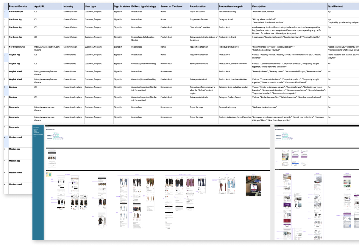
What is a comparative audit and why do we do it?

User experience professionals conduct comparative audits in order to understand the problem/solution space being investigated. We often look for and capture competitive experiences (if applicable) BUT equally as important we look outside the competitive landscape to gain a more holistic view and understanding of the space

In this case, with regard to product recommendations:

  • Our customers browse and shop on other sites and apps; it is in our best interest to understand recommendations in those environments
  • Looking at different product and service models exposes us to different types of recommendation strategies and implementations
  • Auditing comparative sites gives us a more informed, broader view of product recommendation strategies that can inspire our own explorations and provide examples we can point to

Competitive audits often have the lens of the subject matter applied to them to make cogent observations. Using the content and information recorded in my research of product recommendation systems (Part 1), I created a set of specific “product recommendation” tags and created a lexicon for audit notes. It enabled me to be more aware of what I was looking for and accurately describe it. The lexicon and established vernacular proved useful for other team members because we all used the same language to identify and discuss our observations.

In this case, with regard to product recommendations, I purposefully:

  • Audited for different types of recommendation strategies (global, contextual to product, personalization, custom or hyper-personalization)
  • Reviewed product grain/tier, individual page location and context, content and mechanics
  • Captured results of both implicit and explicit inputs, such as user type, signed in/out status, likes, searches, filters, list creation, product page views, onboarding and feedback loops
  • Additionally observed changes based on frequency of visits and cross device browsing
Examples of product recommendation tags

Capturing observations and flows

Information, flows and screen level observations were captured and recorded simultaneously in Excel and in Figma. I inserted both call outs at the flow and screen levels correlating to specific points of data in the spreadsheet. Both the mobile website and App experience were reviewed

Nordstrom App and Mweb home screen
Nordstrom App and Mweb spreadsheet entries

Key observations

Various audited sites and platforms

Of the 18 or so product and service companies I audited I’ll limit my observations and examples to the following:

  • Nordstrom (retail fashion)
  • Etsy (retail marketplace)
  • Wayfair (retail home)
  • Twitter (social media)
  • Medium (publishing platform)
  • Spotify (streaming service)

Qualifier text provides credible connection and builds confidence

Qualifying text is necessary to build trust and a logical connection between user behavior and the recommendations being provided to her. Examples of qualifying text are, per the above images “Based on your reading history”, “Selected for you”, “Based on your likes”, “Inspired by your browsing and purchase history.”

  • Medium and Twitter provide contextual qualifiers at both article and tweet level respectively when applicable and appropriate
  • Nordstrom was the only retailer who provided qualifier text with recommended products on the home screen

User feedback functions facilitate more relevant, personalized experiences

In order to refine recommendations the system needs relevant signal from the user and ideally reason as to why the suggestions are acceptable or not acceptable. Providing feedback mechanisms in appropriate context enables the user to quickly and easily provide feedback to the content or products being displayed to her. It’s worth noting that these types of feedback controls were only visible in publishing, social media and streaming services. Retail did not have explicit controls.

  • None of the retailer sites/apps provide a method for users to give direct feedback on “recommendations” or “suggestions” resulting in heavy reliance on implicit data interactions and/or less frequent explicit data sources
  • Medium and Twitter platforms provide users with ability to provide content feedback at most granular level, individual articles and tweets respectively; both platforms have an “onboarding” process initially with suggestions throughout
  • Medium and Twitter provide user controls in context of the current screen view; do not require the user navigating “away” to a profile or preferences section

Individual recognition sets a personal tone

One of the quickest ways to create a sense of personalization is to playback a user’s name or username. Additionally, layering in language with respect to recency, such as “Welcome back”, “Pick up where you left off” further enhances the perception of recognition. Additionally, acknowledging the time of day a user is visiting, such as “Good afternoon” in the case of the Spotify (above), which was accurate at the time of the observation.

  • Only Nordstrom and Etsy display customer or user name with a greeting on the home screen; Spotify displays user name next to profile pic (paid account)
  • User recognition (mentioned above) further strengthens relative context and continuity product recommendations that follow, especially, Nordstrom
  • Nordstrom is the only company that acknowledges user on both App and Web experience
  • Not including is a missed opportunity to provide small, simple user recognition feature that could be expanded to include time past since last visit, time of day when visiting etc

Customer recency leads content personalization on home screens

Personalization on the home screen tends to replay most recent user behavior and/or state. Replay helps orient and remind the customer of her previous goals or tasks when she last visited or used the service (HBO Max) which helps to jump start and facilitate re-engagement.

  • Recommended products with personalization language appear at the top of the screen and are more likely to be based on recent user behavior (however “recent” is defined)
  • Most if not all sites display one group of recommendations based on recency; most are labeled in a manner to remind the customer what she was looking at or how she was interacting, such as “Previously Viewed” “Previously Saved” “Pick up where you left off”. Products may be outwardly labeled, “Recommended for you”
  • Product groupings further down the screen may be less specific and more broad in scope, such as “Suggested searches”

Product detail screens provide comparison to products, collections, or cohorts

Product-based recommendations are more common at the product detail level than explicit “personalized” recommendations.

  • Product detail pages focus on same or similar products to the one being viewed such as “Similar products” or “More from this collection.” Suggestions may include at least one set that is more “relevant” to the individual, such as “Customers also <…> “
  • Nordstrom was the only retailer with a variety of customer/user-centric labels across different products; simultaneously personalizing and providing product suggestions
  • Nordstrom had only 1 alternative product carousel on the PDP while all other retailers had more than 1 suggestion

Small instances provide big opportunities to surprise and delight

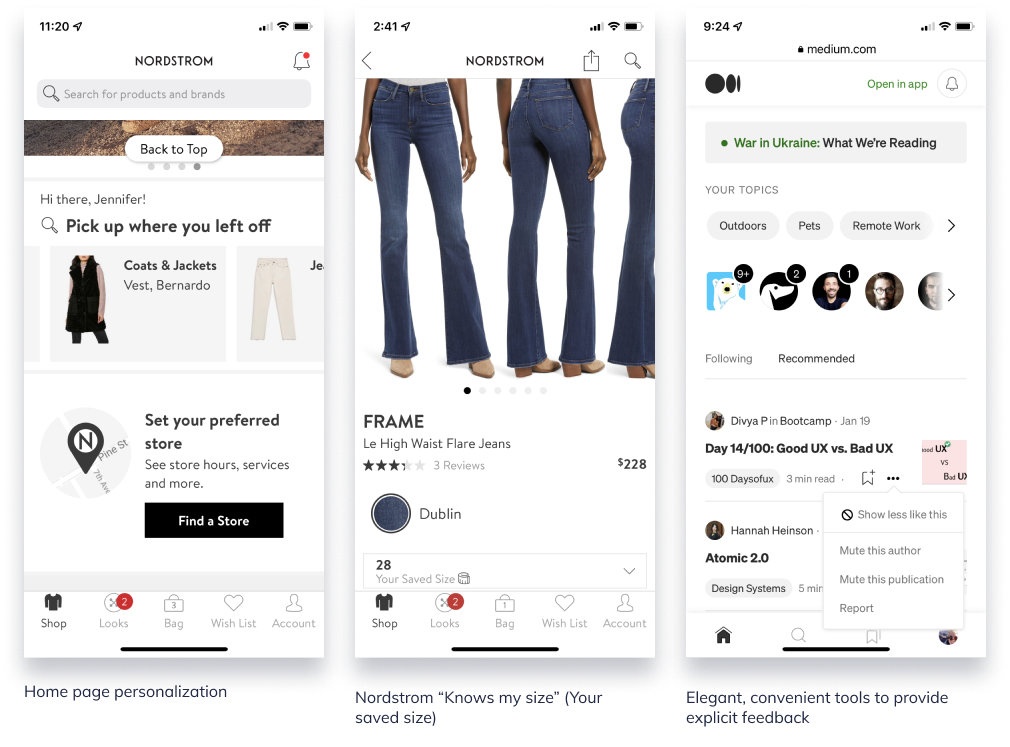
Personalization and recommendation experiences aren’t necessarily about how many different recommendation configurations can be displayed at once. Sometimes it’s the small instances that demonstrate the business is paying attention and listening.

  • Home page personalization with welcoming message
  • Nordstrom “Size” recommendation
    Nordstrom app not only recognizes the user but also knows what size to recommend based on previous browsing and shopping. When she’s on a PDP, it will display the size she normally adds to bag/purchases. It also adjusts to category or measurement (e.g., Size M in pants, Size 28 in designer jeans)
  • Ability to control the display: Medium and Twitter
    The ability to say “more of this” or “less of this” via an easy-to-use convenient menu gives the user more control over the content that competes for her attention and provides the business with a clearer direct signal. A win win.

In all three of these examples (exception: Welcome message), the user does not need to leave the current screen to visit a profile or preference page–these are small enough that they can be managed within the context of the current page. In the Nordstrom size example, the user never filled out a profile page for Nordstrom to indicate the different size types for all the applicable women’s categories.

Who sets the bar?

We all know about Spotify and Netflix.

Nordstrom
Designer and high-end fashion ecomm

Nordstrom brand is famous for its legendary customer service and personal shoppers. It doesn’t surprise me that the online version would follow suit where it can.

  • Immediate personal recognition with display of name
  • Replays previous product, at brand and category level, customer was looking at previously and provides pathway to continue browsing
  • Utilizes qualifier text to qualify why the product/brand suggestions are appearing
  • Auto-selects customer size and displays in size selector; applies across different types of product (NOTE: this was NEVER selected in a profile–this is learned)
  • Correlates the other product suggestions with customers (“people”) like me; only one carousel of related product

Medium
Publishing platform

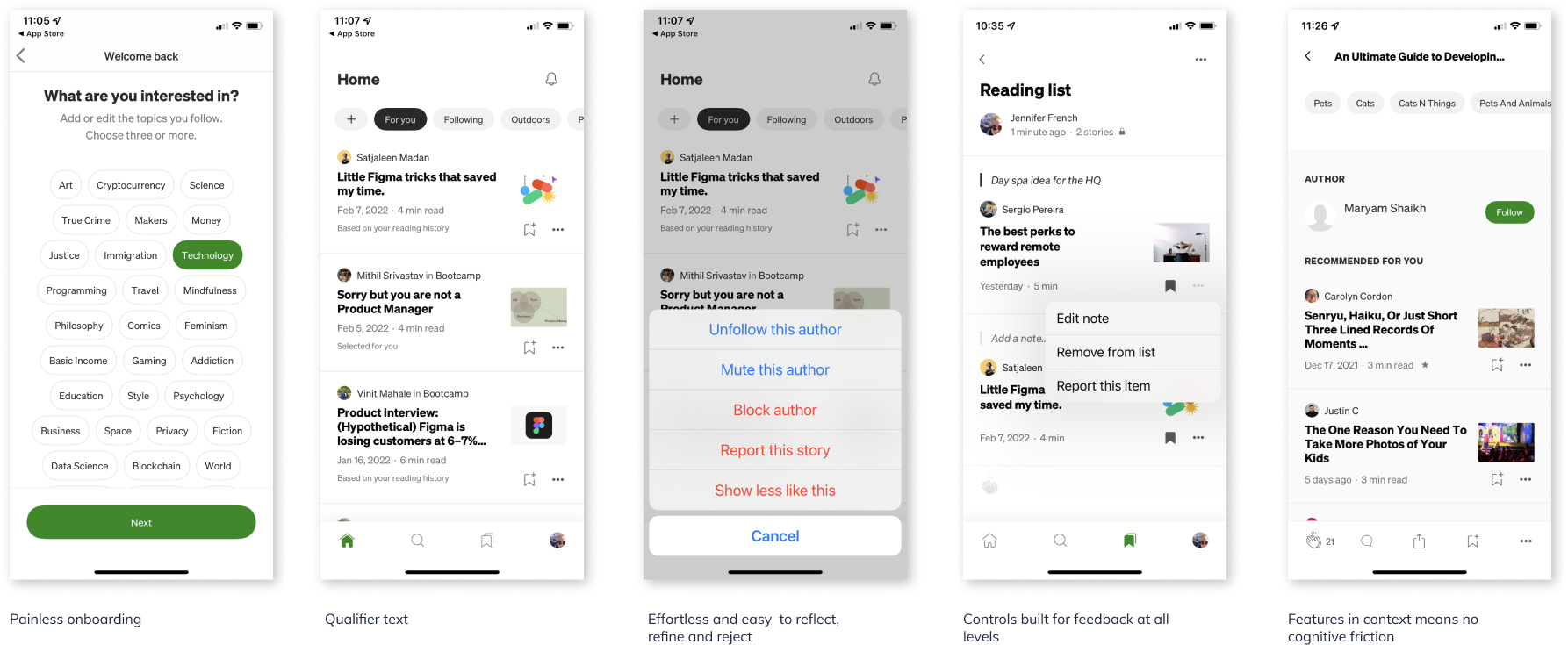
Medium’s experience is so well thought out it’s magical. It literally anticipates the user’s next-best-action across it’s various use cases and achieves what I consider to be a transparent UI.

  • User centric experience from top to bottom
  • From onboarding, to preferences management, to page level controls the user is able to reflect, refine and reject quickly and painlessly
  • Providing feedback is effortless and does not require user to leave context in most instances
  • Entire experience (language, display, interaction, algorithms) has the qualities of complete attention to detail at every touchpoint; there are no paper cuts in this experience

Next up on ittybittyusability: My perspective on the HCD (Human-centered design) process

Mobilegeddon – Adapt or Die.

On April 21 Google launched an algorithm, referred to as “Mobilegeddon,” that intended to favor websites that were “mobile-friendly.”

Starting April 21, we will be expanding our use of mobile-friendliness as a ranking signal. This change will affect mobile searches in all languages worldwide and will have a significant impact in our search results. Consequently, users will find it easier to get relevant, high quality search results that are optimized for their devices.

People using Google to search while on their mobile devices might find their favorite sites ranked lower in the results than before because the specific site is not optimized for their devices.

Many argued that the algorithm could mean huge losses for businesses that hadn’t updated their websites to be accessible for mobile devices. But let’s face it, the era of desktop-only experience is gone, and if a website isn’t accessible or is difficult to use on a small device, then there will be no repeat visits, no customers, no money. Sad face.

{Aside: The data out there suggests that the sooner businesses adapt for mobile, the better considering:

91% of Americans own a mobile phone
Mobile now makes up 20% of all web traffic, and it’s growing
68% of Americans access the web from a mobile device
33% of mobile, web capable Americans access the web solely through a mobile phone

Not to mention, it’s no secret that Responsive design is Google’s recommended site design approach. }

While the results of the algorithm were slow to see after the first week, it would appear that business that do not offer a “mobile friendly” site are clearly seeing their mobile search results rank drop. While the algorithm doesn’t affect any desktop searches, website TechCrunch found that 44% of Fortune 500 companies failed Google’s mobile friendly test. That’s a huge number of large businesses that have completely ignored mobile/small screens.

Adapt or Die.

Modern web design is responsive (with a lower case r)

A great article by Nate Voss of VML about how we need to start thinking about modern web design. Nate makes a fantastic point that as users of the modern web we have come to expect web experiences to just work, no matter the device or platform.
This expectation of connectivity and accessibility anytime and anywhere leads to the necessity that modern web design needs to be responsive (lower case “r” is intentional). “Responsive” (with a capital “R”)  is a viable technique among many, such as Adaptive, Progressive Enhancement, RESS–aspects of which enable us to achieve the best, most accessible experience for the end user.

Read on at: http://vml.com/news-and-trends

User Experience Mobile Immersion Conference 2015 – Recap

I recently attended the 3-day UX Mobile Immersion Conference (UXIM15) in Salt Lake City, Utah, hosted by UIE (User Interface Engineering). If you’ve ever had the opportunity to attend any previous UXIM Conferences, then you know how highly rated the conference is for the quality of the speakers and topics they cover. Each speaker is literally household name in the UX/UI realm and their workshops and talks are of the highest caliber.

Never been to the UXIM Conference? I’ve missed a few years, and it’s a bummer to feel left out.  Hopefully the recap below can give you a glimpse of wisdom and smarts from this year.

Kill your assumptions
Throw away all your working assumptions about input types, devices, screen sizes and user tasks because the lines are becoming more and more blurred. Technology, once iterating every 10 years is on course to iterate every 2-3. Instead of trying to keep up (and losing your mind in the process) in an industry of unpredictability, a more strategic, sane course of action is to approach web design with simplicity, accessibility and performance in mind by using tested, reusable components and patterns.

Input does not equal device does not equal input
We may no longer assume that a certain screen size, input type, or hardware equates to a particular experience. “Desktop” no longer equals a keyboard and mouse any more than a “Tablet” does touch. Moreover, how will web pages change with voice or gesture controls that sync with your devices? Input is not detectable in a reliable way – it is transitory and dynamic.

Device does not equal task does not equal device
“Mobile users will do anything and everything desktop users do, provided it’s presented in a usable way.” — Brad Frost (@brad_frost)

Assuming that a user will or won’t do something on a particular device, specifically a small screen, will get you into serious crap. It wasn’t too long ago we believed users wanted less content or only specific content on their mobile phones because mobile meant the user was on the go. We know now mobile users kill time on their devices while standing in a line or on the couch in front of the TV. Take note: 30% of global ecommerce sales come from mobile.

Device classes aren’t definitive anymore
“These days, trying to draw a line around device classes (mobile, tablet, desktop) is as fleeting as drawing a line in the sand.” — Jason Grigsby (@grigs)

Defining device classes these days is like trying to definitively classify a Labradoodle as either a Labrador or a Poodle. Desktop to tablet to mobile dimensions now either overlap or are separated by just a few pixels. Besides, what class does a watch fall into, or a refrigerator? The windshield of your car?  It’s best to think about devices by size (XS, S, M, L, XL) instead of by class.

Performance is a Design Requirement
“Being Responsive from a layout perspective should not preclude us from being responsive from a performance and interaction perspective.” –Scott Jehl

Performance may appear to be “invisible,” but it can have a direct correlation to whether or not your user decides experience your site. Performance needs to be an essential design principle, not just a technical responsibility. Good performance is good design.

Some sobering thoughts:

  • 1.97mb – that’s the average page size of today’s web.
  • 74% of mobile visitors will abandon a site if it takes longer than 5 seconds to load.
  • 85% of mobile users expect mobile sites to load as fast if not faster than desktop sites.
  • The top e-commerce sites are 22% slower than last year; user data confirms that slow sites result in lost revenue. A slow loading site is one of the primary reasons for site abandonment.

Don’t add the unnecessary in the first place.
If the quickest way between A and B is a straight line, Stephen Hay succinctly states that a lot of experiences out there have (consciously) put a lot of crap between A and B, making for some ridiculously complicated experiences.

The Zero Interface Approach
To help achieve the universal of goal of getting from A to B as quickly as possible, Stephan Hay uses “The Zero Interface” approach: UX/design starts with zero-base. You begin with nothing, what you need is added, stress tested, and refined. Concurrently, you ignore client/designer/developer baggage such as competitor patterns, sunk costs, design trends, pattern libraries because baggage focuses on existing solutions.

The goal of Zero Interface is to focus on solving the problem, versus applying existing solutions blindly without understanding the root of the issue. It forces you, at every step (UX, Design, Dev) to examine each component you add and implement to ensure that it is part of the solution, not adding complication. Train yourself to think, with each addition, is this one thing to many?

Responsive Web Design and Progressive Enhancement
“We in the web world Rube Goldberg everything.”  – Stephan Hay (@stephen_hay)

Responsive web design isn’t just about making web pages fluid and displayable across multiple screen sizes; not “one size fits all.”  Modern web design is about ensuring that design and technology aren’t keeping users from accessing the content they want or need. This means considering and solving for a vast array of scenarios, like devices that may just be a few months or a few years old, disabled script, unsupported touch, older browser compatibility, while simultaneously creating experiences for current technology and devices yet to exist.

Keep in mind: 68% Americans access the web from a mobile device, and ⅓ of mobile web capable Americans access the web solely through a mobile phone. This means if a user can’t access your content, your information, your products or services on mobile, then you don’t exist for those users.

“We have a moral obligation to make sure content and information is accessible across devices and inputs.” — Jason Grigsby (@grigs)

To achieve broader accessibility web design experts Jason Grigsby, Brad Frost, Stephen Hay (to name a few) recommend Progressive Enhancement: begin designing for the most baseline experience–a small screen, slow data plan, no touch capabilities. Once the baseline experience is determined, layer on enhancements such as visual aesthetics, interactivity, gestures–stuff more modern browsers, technologies, and devices will detect and render. The “fallbacks” created by the baseline considerations have two advantages: 1) content and information is accessible 2) the site potentially won’t fall apart with when the next greatest thing comes along. With proper planning and implementation, the site will be useful and usable in an industry of unpredictability, diversity, and disruption.

Atomic Design
Along the lines of RWD, Brad Frost uses an approach coined, “Atomic Design.” Atomic Design is a set of 5 principle stages that more or less occur concurrently: atoms, molecules, organisms, templates, pages. The goal of an Atomic Design approach is to bring together individual elements (atoms) to form a component (molecule) that when combined with other components creates a larger organism. These organisms, or patterns, are placed into content frameworks (templates) to test the pattern across multiple scenarios. As more and more patterns are added to the template, the page takes shape.

The benefit to Atomic Design is that it allows the team to focus on individual design patterns instead of trying to solve for a page of patterns all at once. The content framework infers where solutions will eventually be implemented (placeholders) with finished patterns introduced as they are designed and tested.

Key to the success of this approach is to get into the final environment (the web) as soon as possible; to stop thinking of websites as set of individual pages, but as a system of components combined together. With the near limitless number of devices, breakpoints, resolutions and technology, it is nearly impossible to create a mockup for every breakpoint in photoshop (not to mention, what happens when there’s an edit that needs to made across all the pages). Additionally, the static page is not an accurate representation of the final experience, which is why it is crucial to move out of static comps to code once the design aesthetic has more or less been established.

Is Design Metrically Opposed?
“Bounce rate is the most cited metric for pushing a content agenda.” — Jared M. Spool (@jmspool)

Measure: Something we count
Metric: A measure we track
Analytic: A measure software tracks
Missing: Are these useful?

All too often metrics and analytics result in inferences that are then translated into solutions without further examination. Google Analytics can’t tell you why;  what content is the most useful? What you should do to improve content?  Why people are spending money? Why did someone click?

Qualitative finds should drive our quantitative research; quantitative research should be focused on user frustration. By simultaneously overlapping a journey map of observed user frustration (and delight) of corresponding metrics, we are more likely to pinpoint and solve for the actual cause of user frustration, as opposed to a design decision based in inference. In short, user experience needs to own behavioral science.

See you at UXIM16!

A Sober Look at Why Responsive Rebuilds Fail for E-Commerce Websites

3 Reasons Why Responsive Rebuilds Can Reduce E-Commerce Revenue

From our experience working with enterprise e-commerce companies in a wide range of product categories, it all comes down to one (or a combination) of the following three reasons:

  1. A retailer treats Responsive Design as a conversion-centered solution, which it inherently isn’t.
  2. A team makes improvements to the under-performing mobile layouts but ends up affecting desktop layouts as well, negatively impacting conversion rates.
  3. Lack of internal expertise with this relatively new design methodology leads to site speed issues that go undetected during the rebuild project but then shatter conversion rates and organic search traffic after the new site is released.

Read on at Mobify.com to learn how to avoid these potential pitfalls.

UX Mobile Immersion Conference 2014 – Day 3

I begged the powers-that-be to send me to the UX Mobile Immersion Conference (#UXIM) in Denver, Colorado this year. I started submitting requests and rationale in November 2013. Since I got a passive aggressive “nope,” I’m living vicariously through Twitter right now, following #UXIM. There are some amazingly fun and informative tweets coming from the conference right now, my favorites listed below.

Creating apps that are ‘usable’ are the equivalent to food being ‘edible’ ” – Jared Spool

Jason Grigsby: When Responsive Design Meets the Real World

  • Jason Grisgby has led us all down a responsive workflow, now he is going to tell us how wrong we all are.
  • “I now use progressive JPEGs, the algorithms have gotten better”
  • “Answer to responsive tables: “What are you using the table for?” Then plan #RWD around that.”
  • To do responsive web design correctly, you are probably going to need more than responsive web design”

Nate Schutta: Coding Prototypes, Even if You’ve Never Tried

  • “If a picture is worth a thousand words, how many meetings is a prototype worth?”
  • “Friends don’t let friends use IE 6.”
  • jQuery Mobile is a HTML5-based user interface system designed to make responsive web sites and apps that are accessible on all smartphone, tablet and desktop devices.”

Karen McGrane: Adapting Your content for Mobile

  • “Print is awesome. You put the words on the paper and they stay there!”
  • “Whatever the next big thing is going to be, we are going to have to get our content onto it.”
  • “Thinking about where content will ‘live’ on a ‘web page’ is pretty 1999.” – Lisa Welchman via Karen McGrane
  • “Imitating paper on a computer screen is like tearing the wings off a 737 & using it as a bus on the highway” Ted Nelson via Karen McGrane
  • “We need systems that allow us to create content hierarchy programmatically to better translate into other platforms.”
  • “Truncation is not a content strata…”
  • We have to treat content management as UX. Content creators often want to crawl back to Word & a simple WYSIWYG.”
  • The purpose of doing the inventory is not so you have an inventory, it is so you can make decisions about the content.”
  • The user’s goal is not to look at a table. It is to give them the info they need in order to complete a task.”

UX Mobile Immersion Conference 2014 – Day 2

I begged the powers-that-be to send me to the UX Mobile Immersion Conference (#UXIM) in Denver, Colorado this year. I started submitting requests and rationale in November 2013. Since I got a passive aggressive “nope,” I’m living vicariously through Twitter right now, following #UXIM. There are some amazingly fun and informative tweets coming from the conference right now, my favorites listed below.

Luke W:

  • Hotel Tonight – 4 taps/swipes and 8 seconds to book a room. So easy babies and cats were booking rooms…
  • Hotels.com – 40 taps/109sec b/c they couldn’t let go of desktop method…

Bkuva7KCAAEXoJ_

  • “If it’s important, it should be visible.”
  • “The evil lord fold, who is a tyrant… Controls the scroll.”
  • “The problem isn’t is it visible above the fold, it’s about having it visible when the user needs it.”
  • “When the hamburger icon is paired with the word ‘menu’, it’s 7.2% better. When made to look like a button it’s 22.4%” (Facebook)
  • “Long pages, in mobile, create a flat hierarchy, heavy download and lack context generally.”
  • “We’ve been at it for 30 years designing for personal computers and ~6 years designing for mobile.”

Karen McGrane:

  • “You don’t get to decide which device people use to go on the internet. They do.”
  • “Responsive design won’t fix your content problem.”
  • “It’s not a strategy if you can’t maintain it.”
  • “Theres no such thing as how to write for mobile, there’s just good writing.”
  • “88% of Americans without a high school diploma don’t have internet access at home.”

Jason Grigsby:

  • “Resolution does not define the optimal experience.”
  • “We can no longer make assumptions about input based on screen size or form factor…and we probably never should have.”
  • “The web never had a fixed canvas.”
  • “Any attempt to draw a line around a device class has as much permanence as a literal line in the sand.”
  • “Phone, tablet and desktop interfaces are fundamentally different platforms with different usability considerations.”
  • Design for a user need not for a specific form factor or input.

Jared Spool:

  • We are not creating designers fast enough to meet the demand for user experience. Big companies are building out an army of user experience designers.
  • Experience designer (also known as a design unicorn) → information architecture, user research practices, visual design, interaction design, editing and curating, copywriting, design process management, information design.
  • Specialist → having more expertise in one area over others (really good designers, having specialization in an area outside of design)
  • Generalist→ having equal expertise in most areas
  • Compartmentalist → having expertise in only one area (a career-limit decision)
  • How to become a design unicorn:

1. Train yourself (absorb everything)

2. Practice your new skills

3. Deconstruct as many designs as you can (learn from others)

4. Seek out feedback (and listen to it)

5. Teach others

UX Mobile Immersion Conference 2014 – Day 1

I begged the powers-that-be to send me to the UX Mobile Immersion Conference (#UXIM) in Denver, Colorado this year. I started submitting requests and rationale in November 2013. Since I got a passive aggressive “nope,” I’m living vicariously through Twitter right now, following #UXIM. There are some amazingly fun and informative tweets coming from the conference right now, my favorites listed below.

  • People swap devices 21 times an hour… continuity matters.
  • #1 goal is to achieve content parity.
  • Start with a small screen first, then expand until it looks like shit. Time to insert a breakpoint. (Stephen Hay via Brad Frost)
  • Navigation (especially complex), should be scannable. There are lots of design patterns that are becoming de-facto standards.

From Brad Frost: Using Atomic Design to Create Responsive Interfaces

  • 5 Principles of Adaptive Design: Ubiquity, Content Parity, Performance, Enhancement, and Future Friendly
  • “Vocab word of the day: Interdigitate
  • “If you need to convince someone to care about the mobile web, all you need to say is ‘social.'”
  • “We’re not designing pages anymore; we’re designing systems of components.”
  • “Respect their users and their time. Road blocks and interstitials are bullshit.”
  • “Phablets – dirtiest word in technology.”
  • “More iPhones are sold every day than babies are born.”
  • “Responsive design is not expensive. The dynamic web is expensive, responsive design is not to blame.”
  • “Mobile First Design forces you to take a hard, cold, look at the priorities of your site’s navigation.”
  • ‘Don’t just do a content inventory… it’s just as important to do an interface inventory.”
  • “Carousels on home pages exist to keep people from beating the shit out of each other in meetings” #shouldiuseacarousel
  • “If you are hiding something for mobile, you are doing it wrong.”
  • If your content doesn’t make sense on mobile, you need to ask yourself if it makes sense at all.”
  • “We sell websites like paintings. Instead, we should be selling beautiful and easy access to content.”
  • “Atoms (HTML Tags) -> Molecules (functionality) -> Organisms (modules) -> Templates (content structure) -> Pages (content presentation)”

BkoT0NCCYAACs5D


From Ben Callahan: Workflow on Responsive Design (RWD) Projects

  • “You best solve problems using tools you are fluent with.”
  • “Do the dishes and people will follow.”
  • “The amount of process required is inversely proportional to the skill, humility, and empathy of your team.”
  • “If you don’t have the authority to say “no”, it’s not a collaborative process.”
  • “Constraints–you need them to create.”
  • “Our specializations of expertise are fragmenting the experiences we build.”
  • “Create guidelines instead of rigid process. “

Bko2bG2CMAAkHU8
Meeting Notes by James Matchett, Careerbuilder


The Fold. OMG, why are we still talking about this?

I was asked the other day for a brief POV on “the fold.” I know, cringeworthy.

The Fold 
The concept of content being placed “above the fold” is a carry over from long-established newspaper principles. Traditionally, anything on the front page and above the fold would be seen by a prospective customer. So, in order to sell more papers, newspapers put their top stories on the front page and “above the fold.”

Early Internet Use
Fast forward to the dawn of the masses starting to use Internet. At that time, the only mental model for presenting and consuming information was based on print: newspapers, magazines, brochures. Most monitors were a standard size and resolution, 800×600, and scrolling a page was unfamiliar to approximately 80% of people. It seemed logical at the time to place the most important content above 600 pixels; anything above that line, aka “the fold” would show up without scrolling.

The Internet is Everywhere
Today we have more resolution and screen sizes than we can count, much less target effectively. The fold exists differently on every device, monitor, setting, essentially nullifying the concept. It is more effective to disregard the fold and focus on clearly stating the value prop of the product or service. Compelling content drives attention. People scroll and read (or scan) based on interest, not based on pixels or placement. One user may skip over your top story because it’s not interesting to them, not because they didn’t see it. There is an ever-growing need to make words and pictures consumable across an ever-widening sea of options.

Users know how to scroll. So long as the site brings the user closer to their goals, their tasks, satisfices their needs, they will scroll and click. Know thy user, but also know how they’re viewing and interacting with your site and on what type of device(s).

Cramming tons of stuff above the fold may potentially inhibit users from being able to complete their tasks and goals, and create the perception that the brand doesn’t know it’s customers, nor care about them by making them work harder and spend more time to find what they need.

Sources:
Did somebody say: Above the fold, Erin Lentz,  August 23, 2013
Adapt or Die, and the Fold is Dead, Tracey Halvorsen, April 20, 2012
Above and Below the Fold: Stop Talking about the Stinkin Fold, Chris Lema, January 14, 2013
http://thereisnopagefold.com/