It’s Official. The Apple Watch.

Droolworthy, for sure.

Small things add up
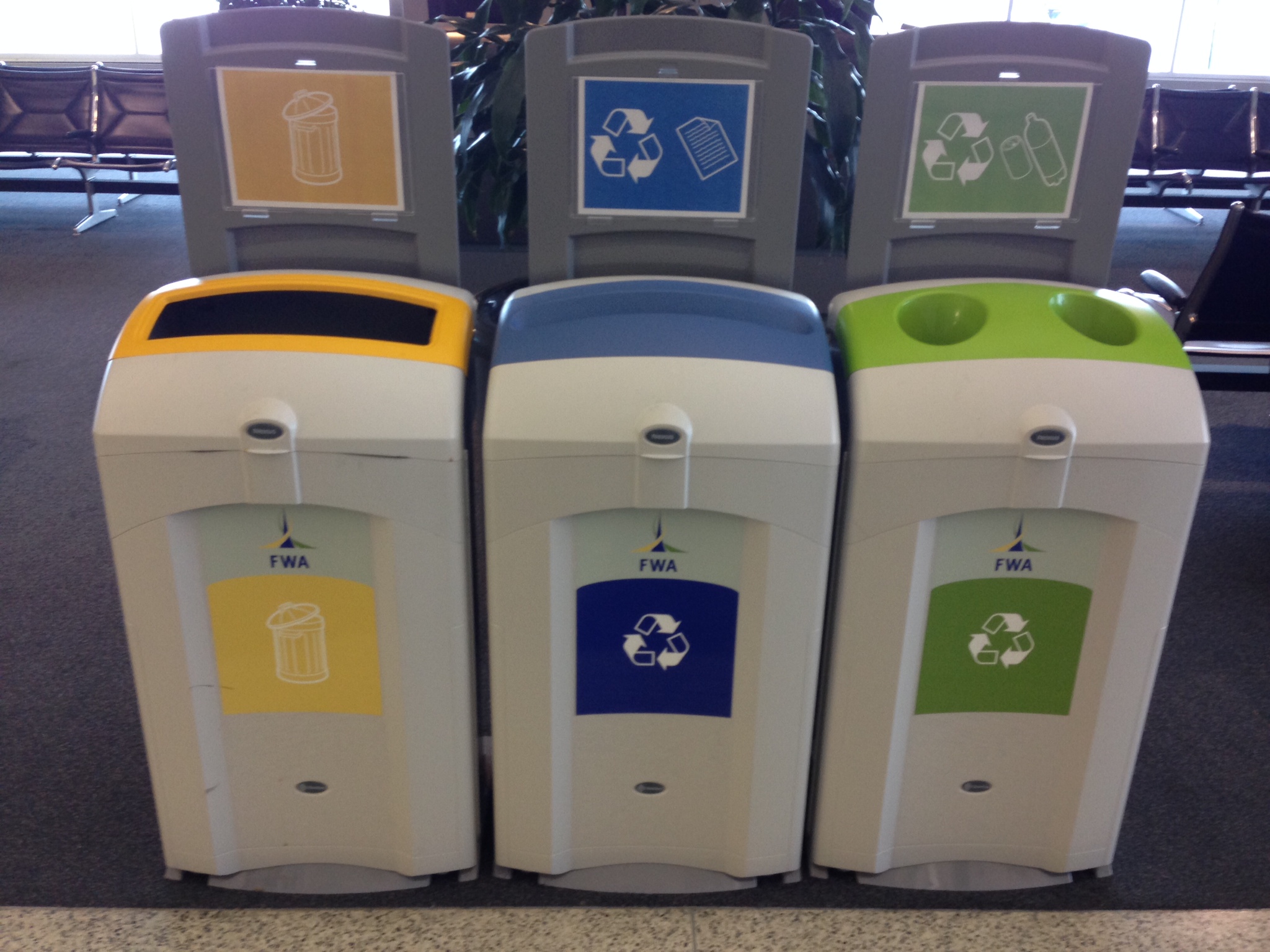
Recent travels made me aware of how airports are really into accommodating Trash, Recycle, and Compost and all the inherent iterations and separation requirements. Snapped this example at the Fort Wayne International Airport (Indiana). I thought the use of different shaped openings, color, and iconography was really interesting, particularly the use of yellow for garbage. At least, I’m assuming it’s for garbage even though the icon reminds me of the design-y countertop food waste containers.

Yep, when you stop to think about it, burrito design is hugely important as it relates to the experience of consuming it. Check out “Dear Guy Who Just Made My Burrito.”
Warning: if you don’t like to read f-bombs in upper case or can’t take a joke, don’t read the post.
Captain Obvious I am not.
It only recently occurred to me that there are two, well-known, UX professionals with nearly identical names. They both contribute frequently to A List Apart and UIE. (For those of you in the industry, you know who I’m talking about.)
Stephen Hay: is a front-end design and development consultant based in the Netherlands. He is the author of Responsive Design Workflow (Peachpit/New Riders 2013), a contributor to Smashing Book #3, and a frequent speaker.
Stephanie “Steph” Hay: is a content and UX consultant whose clients include Happy Cog and UIE.
I’m probably a little late to the party (better late than never), but I wanted to briefly mention the newly unveiled virginamerica.com. The Beta site came out earlier this spring, generating lots of commentary and speculation about its approach.
Essentially, Virgin America took everything off the home page in order to shift focus to the booking process in a fully responsive website. VA looked at their site analytics about how people use the site and determined that people primarily want to book airline tickets. Book ’em.
The beauty of the new site is its inherent simplicity and the fact that the screen is dedicated to helping the user make one decision or choice at a time. Instead of a website, it feels like a web app. The process is so transparent it more or less fades into the background.


Upon arriving at the homepage, the site uses geolocation to determine my current location and shows me only the destination options available to me based on my location. (Naturally, I can override the current location in case I’m not going to be flying out of Seattle.)
After each selection, the page scrolls down to the next section (number of adults, departure date, arrival date, etc) while the booking information is displayed at the top of the page where the information is locked. The site responds quickly to each choice with a quirky, VA style, easy to read summary of my selection followed by instructions for the next section. Additionally, the top of the screen keeps a running tally of the cost of the tickets.
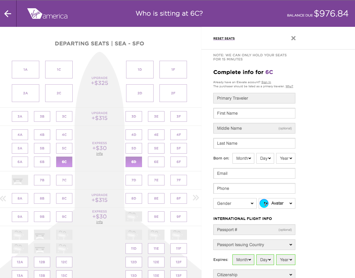
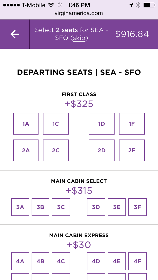

I can easily go “back” by scrolling up the page or using the omnipresent left arrow indicating the previous step.
Inputs and fields are designed for touch with finger tip/finger pad sized dimensions (at a minimum).
An interesting flavor of criticism of the website has been around the functions the site can’t or won’t do. Which reminds me vaguely of the criticism Steve Jobs/Apple got when the first iPad was unveiled. People complained that they couldn’t put Word on it. Which was the point. The iPad wasn’t intended to be a computer. And look where we are now.
Kudos to Virgin America for flipping the industry on its head. I just wish I had somewhere to fly to.
Many of us who work in the business of designing interactive experiences would agree that most days we’re pretty savvy when it comes to identifying less than optimal designs and working through them to get to where we need to be. To be fair, we all have moments when maybe our synapses aren’t firing on all cylinders, or our situational awareness isn’t at 100% (aka: distracted).
But on those off days, we need better visual affordances to help us along.
Case in point. Pandora. I recently found myself trying to log into my Pandora account from the Pandora home/landing page (I’d obviously been logged in forever), and for the life of me couldn’t figure out what was happening (or not happening) to the sign in page.
Briefly, I was repeatedly clicking the “sign in” link in the upper right corner, expecting the page to refresh and do something sign-inny, like a refresh, alert or instructions, highlighting…something, anything.
Troubleshooting kicks in, and I switch browsers, believing that something must be wrong with the site in Chrome. Hey, it happens, right? But even switching browsers (to Safari) nothing changes on the Pandora home page.
Since I was focused on the page more than usual, I realized that the primary focus of the home page content (in a signed-out state) is to sign in. (How come I never noticed this before? Or overlooked it so easily?) Studying the components more closely, it became apparent there was no large, bold type directing me to “Sign in below.” (That would have been super helpful in my case.) Instead, the copy on the page was introducing me, the account holder, to the concept of Pandora, “It’s a new kind of radio – stations that play only the music you like” followed by text fields for “Your email” and “Password” with a sign in button. At the bottom of the sign in module read tiny text, “Create an account for free.” with a contextual link, “Register.”

Okay, I get that once you start dissecting and breaking down what the text says and the labels in the text fields with the corresponding Sign in button, it’s more obvious that the page is intended for existing members to sign in. (Though I do question the introductory nature of the copy and it’s close relationship to the sign in fields for existing members. Seems like Pandora could have done a better job of directing members to sign in while using the intro copy for creating new accounts. But I digress somewhat.)

Recall I was clicking the upper right corner “sign in” link, and there was no visual response on the page. Each time I clicked, the page appeared to remain “static” with no error message instructing me to enter my email and password while highlighting the required fields on the page. When I clicked the “register” link in the upper right had corner, the page refreshed to the Register experience. Same with clicking the “help” link. So naturally my expectation was, in my distracted limited attention state, that something should happen to the page.
(In fact, I figured out what I was overlooking when I clicked “Sign in” from the Register page, and was directed to the Pandora home page. Where I’d started from.)

What I needed to happen is what the page did when I clicked the “Sign in” button next to the sign in fields – I got red text directing me to specify my email address and password. As I would expect. (And now I know that I can sign in using the fields on the home page.)
Now granted the upper corner is navigation, and the button is for input. But even the other navigation items (register, help) have a distinct page change, so at minimum I’d expect the page to briefly refresh when clicking sign in. And maybe some language to the tune of, “You’re obviously having a stupid moment, clicking the same link expecting something different to happen.”
Lesson learned here. Language should go with the action. And, secondarily, despite the fact that both the sign in link and Sign in button are “relatively” identical calls to action, the post-click visual affordances are different. Small discrepancy, yes, but the inconsistency affecting the user from quickly and easily accessing her account is the larger issue.
Great write-up by Brian Mills, Human Factors Engineer at Sprint. If you’re like me and conduct many user/stakeholder interviews, you’ll want to possibly modify or cross these questions off your list.
Enjoy.
Never Ask What They Want – 3 Better Questions to Ask in User Interviews.
A brief timeout and spoonful of hilarity from McSweeny’s.net: Client Feedback on the Creation of the Earth
Enjoy!
Check out this voice/dialect expert break down and demonstrate the potential origins of various southern accents. Just like researching users in order to understand their unique needs and goals, you’ll never again think all southern accents are all the same.
